
Wednesday, 4:25am
28 November 2012
Info design for children

The children’s books produced by Isotype combined child-centred focus with technical accuracy, writes Sue Walker
The Max Parrish Colour Books – described as ‘simple and vivid in colour’ in the publisher’s 1961 catalogue – were designed by Marie Neurath and her team of Isotype designers and artists in the 1950s and 1960s, including Kenneth James, Evelyn Worboys, John Ellis and Barbara Young, writes Sue Walker.
The books, in series such as ‘The wonder world of nature’ and ‘Wonders of the modern world’, were produced to a formula that was strongly influenced by production constraints and underpinned by team working. The process began with finding out about a particular topic and checking facts. Then Marie and her team sketched out ideas for visual presentation which they showed to experts in the field – accuracy was crucial. The sketches formed the basis for more detailed drawings and final artwork. Marie Neurath described it as, ‘a little factory making books … we make one after the other, it is great fun’.
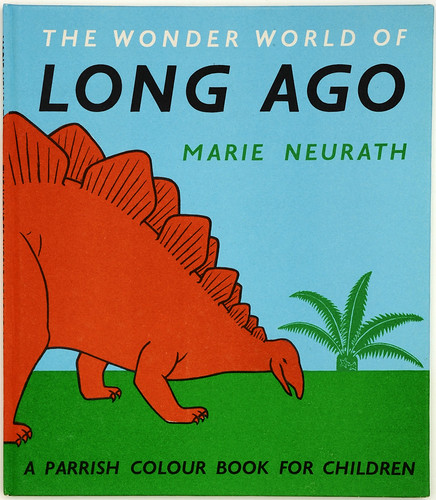
Long ago, 1954, from the series ‘The wonder world of nature’.
Top: Sketch and resulting cover for Too small to see, 1956.
The covers were designed at the same time as the internal pages of the books, produced first as sketches in coloured pencil or gouache. The main cover illustration was sometimes based on a drawing within the book – often enlarged. Sometimes they reflected rather than replicated the internal drawings. Many were designed with the main image wrapping around to the back of the book, interrupted by the spine, adding visual interest when handling the book.
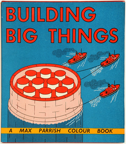
Building big things, 1958, from the series ‘Wonders of the modern world’.
The cover design was used for a wrap-around dust jacket as well as being printed on paper and stuck to the cover boards. The books were produced economically, normally with spreads alternating between black plus a second colour and black plus three colours on the others. This resulted in one side of a printed sheet being just two colours and the other side four colours. The cover was included on the side of the sheet for four-colour printing; this efficient way of arranging the pages meant also that there was visual continuity through the book. Once checked and agreed by the publishers the sketches were used as the basis for artwork, including type specification for galley proofs of the text to be used.
These idiosyncratic, bold and colourful designs are very much of their time, and in the 1950s were remarkable for their child-centred focus and technical accuracy. To quote from Max Parrish’s promotional material: ‘the clean, refreshing brilliance of the drawings never fails to appeal to children and to capture their enthusiasm.’ The books were widely used in schools until well into the 1970s.
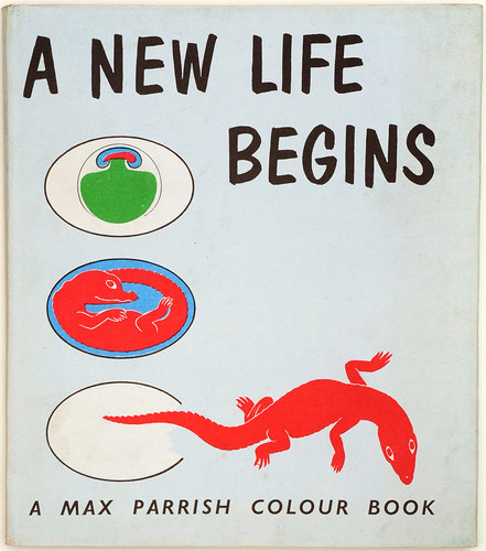
A new life begins, 1961.
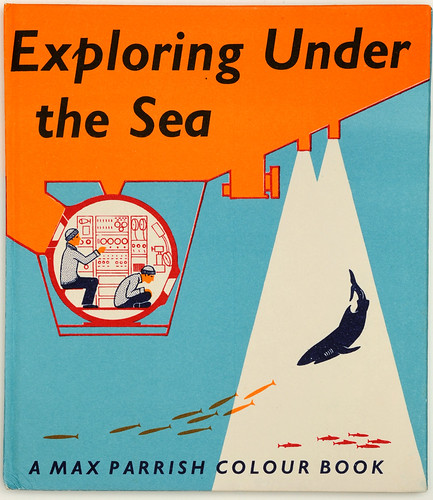
Exploring Under the Sea, 1958.
All books are authored by Marie Neurath and published by Max Parrish. They form part of the Otto and Marie Neurath Isotype Collection in the Department of Typography & Graphic Communication, University of Reading.
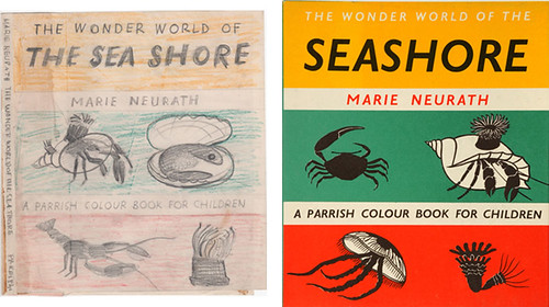
Sketch and resulting cover for The wonder world of the seashore, 1954.
Eye is the world’s most beautiful and collectable graphic design journal, published quarterly for professional designers, students and anyone interested in critical, informed writing about graphic design and visual culture. It is available from all good design bookshops and online at the Eye shop, where you can buy subscriptions, back issues and single copies of the latest issue. You can see what Eye 84 looks like at Eye before You Buy on Vimeo.