
Wednesday, 6:51pm
15 February 2012
A breed apart

Véronique Vienne reviews Pierre di Sciullo at Galarie Anatome in Paris
Véronique Vienne reviews ‘Pierre di Sciullo, En esthète de gondole’ at Galerie Anatome in Paris.
At the Musée des Arts Décoratifs, an exhibition of Stefan Sagmeister’s work – under the somewhat disillusioned (or ironic?) title ‘Another exhibit about promotion and sales material’ – is about to close. Meanwhile, a more modest show has just opened at the Galerie Anatome, five metro stops away, near the Bastille, featuring the work of Pierre di Sciullo.
The similarities between the two men are unnerving. How can two individuals, both obsessed with the declamatory power of slogans, both set on neutralising its sedative effect, finish up at opposite ends of the spectrum? While Sagmeister is celebrating the commercial dimension of his work, di Sciullo is defying it.
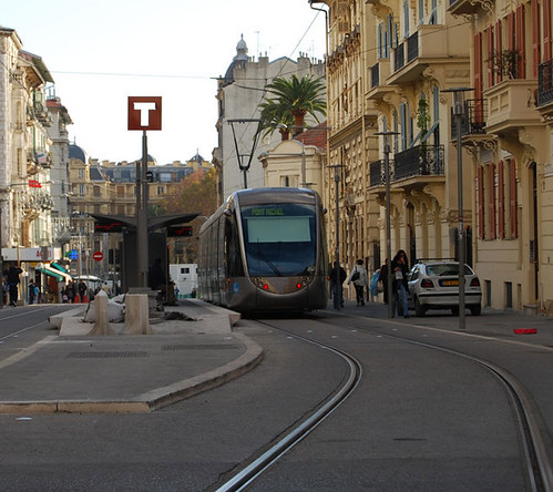
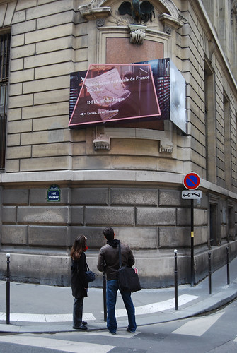
The di Sciullo show is not a retrospective but an installation. ‘The theme of this exhibition is not what I have done so far but what I am heading toward,’ he says, explaining why some of his major projects are not represented. On the ground floor of the gallery are three of his latest outdoor signage projects – for the tramway system in Nice (above), for Le Serpentin (a large residential development outside Paris), and for the Bibliotheque National de Richelieu, the venerable Paris public library (below).
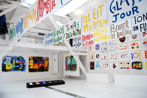
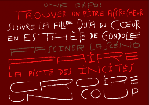
But the main event is upstairs, in the spacious white loft of the Galerie Anatome. There, near the rafters, a series of di Sciullo’s calligraphic posters (top and below) hang like laundry. Originally created for a street festival at Villeneuve-sur-lot in May 2011, the slogans on the hand-painted signs lampooning the work ethic.
Di Sciullo is a master of the spoonerism, the malapropism and other forms of wordplay. He is known for having designed a number of witty typefaces – Quantange, Minimum, Aligourance – that tease the eye as much as the brain. ‘But I decided not to show any of my computer-generated letterforms,’ he says. ‘I wanted to celebrate that part of my work that involves the entire body rather than just a couple of fingers tapping on the keyboard.’ Many of the items on display, from his large watercolours to his stained-glass tiles, are one-of-a-kind graphic artefacts.

For visitors unfamiliar with di Sciullo’s work, this abridged selection could be misleading. Much of his best known work is missing; but, in the French ‘Oulipo’ tradition, he believes that frustrations – omissions, restrictions and hindrances – are necessary to fuel the engine of creativity.
So I left the show feeling somewhat let down, but not cheated. I had not seen enough — but what I saw had reinforced my respect for eccentric French graphic artists, who are a breed apart. Di Sciullo’s installation is clearly not just ‘another exhibition’.
Pierre di Sciullo
En esthète de gondole
Galerie Anatome
38 rue Sedaine 75011 Paris
Jan 19 to March 24, 2012
Review by Véronique Vienne
See ‘Read this aloud’, Ursula Held’s article about Pierre di Sciullo’s experimental alphabets in Eye 23.
Eye is the world’s most beautiful and collectable graphic design journal, published quarterly for professional designers, students and anyone interested in critical, informed writing about graphic design and visual culture. It’s available from all good design bookshops and online at the Eye shop, where you can buy subscriptions, back issues and single copies of the latest issue. Eye 81, has the theme of ‘Designers and clients’; Eye 82 will be on press any moment.