
Sunday, 12:00am
19 June 2011
Andmoreagain
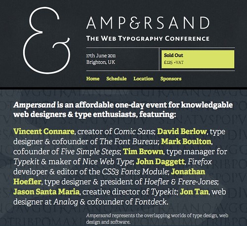
Web typography comes of age at Brighton’s Ampersand conference
Is the humble ampersand a symbol for our additive times? During the morning sessions for Friday’s Ampersand conference in Brighton, writes John L. Walters, we were reminded that design is no longer a matter of either / ors – ‘print or Web’; ‘Mac or Windows’; ‘word or image’ – but that we have to keep adding: glyphs, weights, languages, employees, knowledge … and ideas. All four speakers – Vincent Connare, Jason Santa Maria, Jon Tan and Jonathan Hoefler (top) – brought their intellects to bear on serious matters with a light touch.
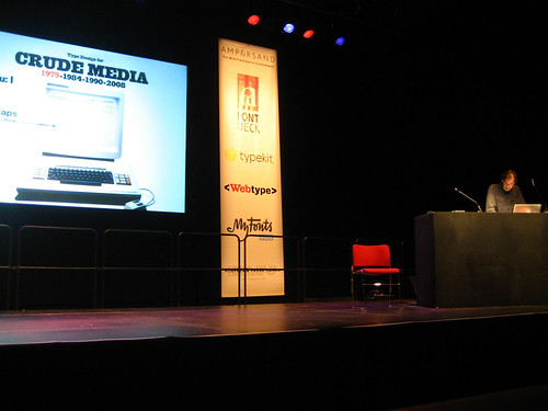
Jonathan Hoefler (almost) brought the house down with the announcement that ‘100 per cent (almost) of H&F-J’s typefaces’ are about to become available as webfonts’, but there was plenty of absorbing information earlier in the day, which started with Connare’s tales of the early days of Web typography, an almost unimaginably ancient time when green-on-black CRT screens got brighter as you added information, screensavers were products and Bill Gates’ future wife led the project to ship MS Bob, which begat Comic Sans.
‘Comic Sans matched the brief and that’s what you do in type,’ said Connare. ‘That’s what you do in design.’ [Applause.] Yet Connare described himself as a ‘type engineer’, not a type designer.
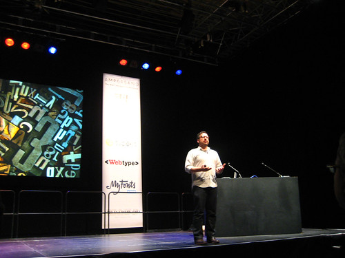
Designer Jason Santa Maria (below) began with evangelical fervour: ‘You’re the luckiest people in the world … you get to spend a whole day talking about type!’ He declared himself to be a ‘type geek’, and asked who else in the audience thought of themselves that way. Plenty of hands went up.
Above: Jason Santa Maria. Photograph by Jeremy Keith.
‘This is fantastic time to be a designer,’ he said, ‘because someone has opened the door again.’ Santa Maria was talking about the door to good typography on the Web. He drummed home his point some more: ‘I’m going to draw a line. If your type is bad, the design fails.’ There followed a heady mixture of common sense, inspiration, detail, and basic typography, quoting Matthew Carter’s ‘Typography is a beautiful group of letters, not a group of beautiful letters,’ pouring scorn on the Huffington Post’s poor typography and urging the audience to make things better: ‘We don’t have to resort to ugly typefaces.’
Jon Tan, who followed, had the relaxed demeanour of a Flash On The Beach presenter, asking the audience for feedback and improvising the commentary to an eclectic visual presentation. He asked for a show of hands to demonstrate the mix of designers, typographers and developers in the audience, reinforcing his point that the diversity of people who come into Web design meant that there was a ‘disconnect between type and the Web – we’re rediscovering typography.’
Speaking about the importance of the ‘lizard brain’ or Amygdala, Tan referenced Alan Fletcher’s logo for the V&A, Paul Rand and Bruce Lee’s famous command: ‘Don’t think, feel.’ He also waxed lyrical about Reid Miles’s designs for Blue Note; about Wall-E’s wordless opening 22 minutes; and indulged in a bit of brandspeak: ‘Brands are emotions.’
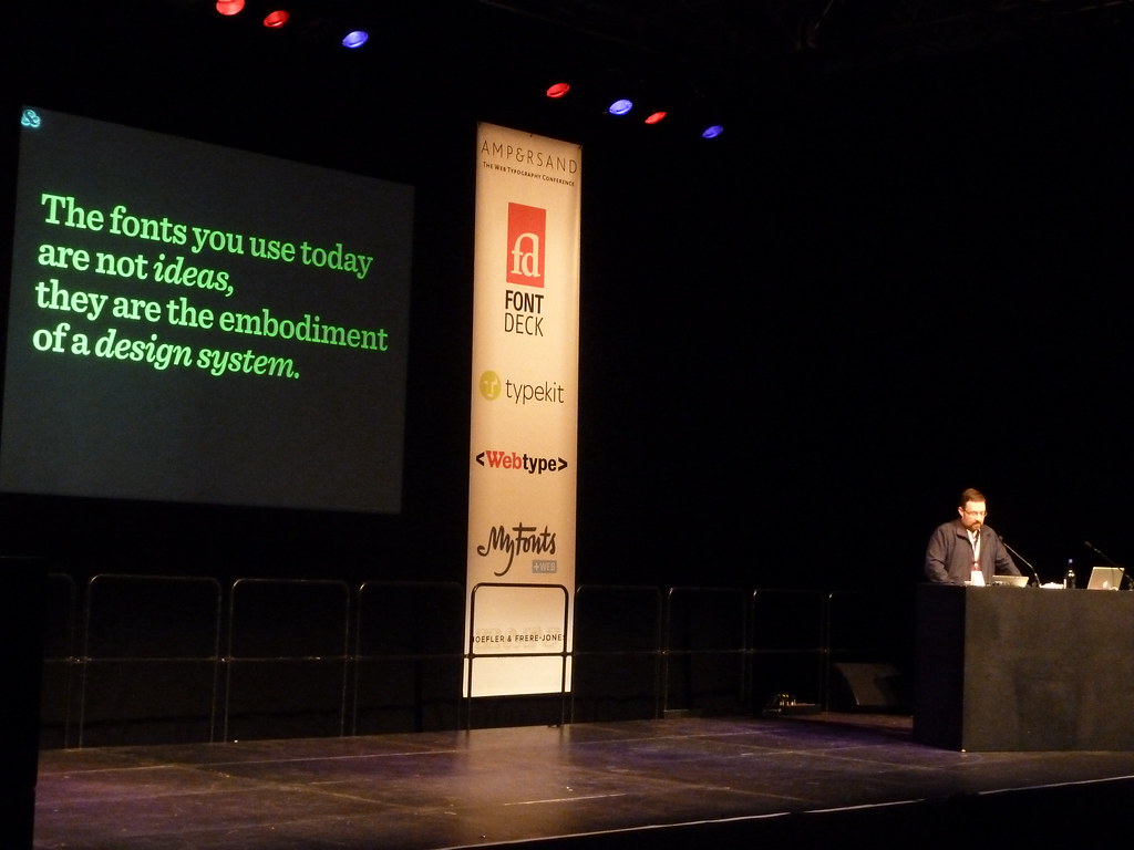
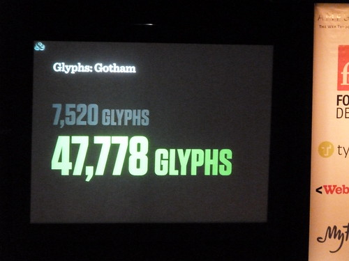
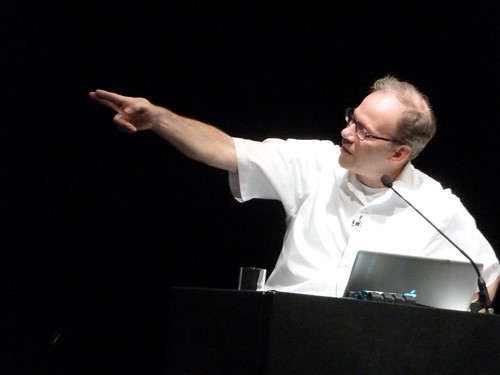
Hoefler (above) awed the crowd, presenting a series of precise visual / verbal statements and arguments with the reserved, sharp skill of a New York lawyer. It was a rollercoaster presentation, taking in the thinking behind some of his best known fonts, and spelling out the challenges of hinting and adapting print typefaces for the ‘screen’ (which, he pointed out, is a word that represents a multitude of variables).
And he had a card up his sleeve: the dramatic announcement about H&F-J’s fonts becoming available as webfonts, which prompted warm applause. Where Santa Maria urged us to believe and pledge allegiance to a brave new world of Web typography, Hoefler coolly demonstrated the evidence that there was no going back.
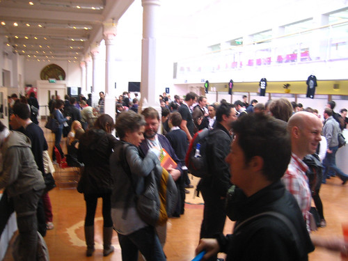
Above: Ampersand foyer. Photograph by Jeremy Keith.
Ampersand was one of those conferences where the audience was as starry as the speaker list: I bumped into A2’s Henrik Kubel, Phil Baines (aka @sarkytype), Gerry Leonidas, Veronika Burian of TypeTogether and Adam Twardoch, and there were many more distinguished type designers, typographers, Web designers and developers in attendance. And at least one drummer-typographer. Yves Peters (aka @BaldCondensed), who had driven straight to Brighton after a gig and a few hours’ sleep, Tweeted energetically all day.
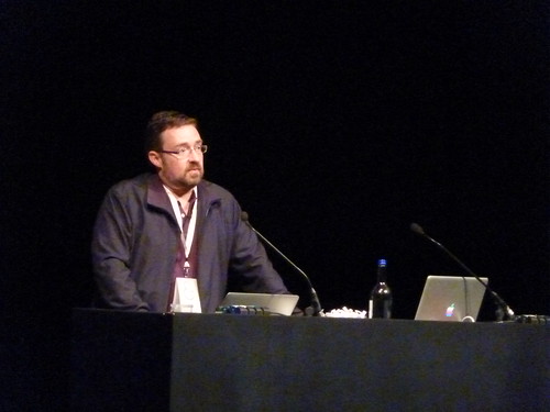
Below: David Berlow. Photograph by Jeremy Keith.
After lunch, writes Simon Esterson, David Berlow (above) gently reminded us all that at every stage in the development of digital type, since the early days of bitmaps, through the founding of Font Bureau to his present involvement with Webtype, he was there. If Jonathan H. was playing the NYC lawyer, David B. was the sheriff from True Grit: been there, solved that problem on type’s wild frontier.
To an old, inky print hand like me, the double presence of Jonathan Hoefler and David Berlow suggested the Ampersand Conference marks the coming of age of Web typography.
John Daggett (above) from Mozilla, the creators of Firefox, detailed the complexities of delivering the right fonts in the browser. He seemed that precious thing: a developer who understands what designers are trying to achieve.
Many of the day’s speakers paced up and down the stage as they presented: it sometimes made their delivery seem like a cross between Steve Jobs unveiling a new product and the leader of an American revivalist meeting. Tim Brown has a passion: he believes that if Web designers used historically derived ratios (such as the golden section) to determine their type sizes (modular scaling) everything would look great. I enjoyed his eloquence about discovering type and design history, but I am not a convert yet.
Below: Mark Boulton. Photograph by Jeremy Keith.
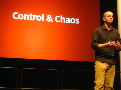
It had been a day of talking about the minutiae of type. Mark Boulton ended the schedule by stepping back and talking about layout. In fact he stepped a whole lot further back and talked about the problem of designing in a world where order turns to chaos … or ‘crap’ as he more realistically put it.
Grids, Massimo Vignelli and Jan Tschichold were all referenced and it was fascinating to hear a Web designer revisiting some of the ideas surrounding Modernist print design in the 1960s.
It was an intelligent, rousing conclusion and if it was, as John writes above, a day of &s, Mark Boulton may be the man who has something to say to both Web & print designers today. SE / JLW
Congratulations to Richard Richard Rutter and Sophie Barrett and all the Clearleft team for a splendid, sold-out conference.
Ampersand: The Web typography conference, Fri 17 July 2011
Brighton Dome Corn Exchange, Church Street, Brighton, BN1 1UG, UK
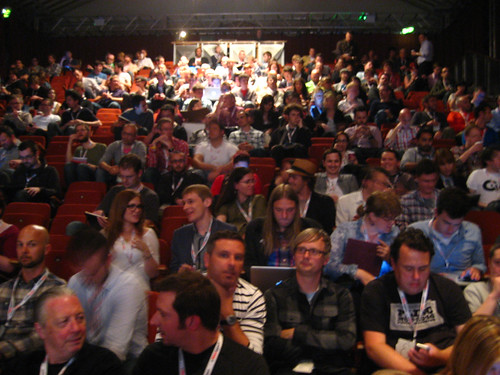
Above: the good-natured Ampersand audience. Photograph by Jeremy Keith. All other photos by JLW.
Read Jack Yan’s piece about webfonts, ‘New Dawn’, in the latest Eye. See also ‘End of default’, by Simon Esterson and Jay Prynne, in Eye 75.
Eye is the world’s most beautiful and collectable graphic design journal, published quarterly for professional designers, students and anyone interested in critical, informed writing about graphic design and visual culture. It’s available from all good design bookshops and online at the Eye shop. For a taste of the latest issue, see Eye before you buy on Issuu. Eye 79, Spring 2011, a type special, is out now.