
Thursday, 8:50am
24 November 2011
Art in your pocket?
Anthony Caro and Tom Phillips design gold and silver coins for the Olympics.

‘Coin design is not graphic design,’ said Christopher Frayling. ‘It’s relief sculpture … it’s art in your pocket.’ He was speaking at the launch of two 1 kilo coins struck to commemorate the Olympics, writes John L. Walters.
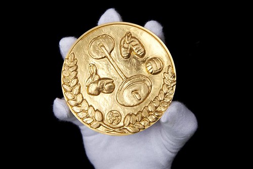
These big lumps of metal wouldn’t suit the pockets of anyone I know, but it seems there are collectors ready to buy Anthony Caro’s gold £1000 coin (above) for £100,000 (only 60 have been made). Quite an eye-watering example of the added value of art.
By contrast Tom Phillips’ silver £500 coin (top), of which they have manufactured exactly 2012, go for just £3000 a pop, and the first 100 buyers get a free print.

Above: obverse designs of the UK’s first Olympic Kilo coins, designed by Ian Rank-Broadley FRBS.
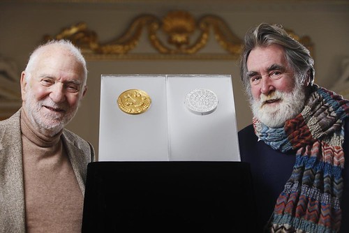
Both coins were on display, watched over by a policeman equipped with stab jacket and handcuffs, while Dr Kevin Clancy of the Royal Mint explained the project’s background. Frayling, chair of the advisory committee that recommended the two artists, described the ‘technical, legislative and artistic journeys that led to the coins’ creation.
Caro, whose design is a relief sketch of sporting items – dumb-bells, boxing gloves, etc. – was impressed by his trip to the Mint’s factory in Llantrisant: ‘I thought it would be a mess, with bits of gold hanging around, but no … it’s very clean, like an operating theatre.’ He chose the emblems that were ‘easiest to do’.
Below: Tom Phillips visits Llantrisant to supervise the manufacture of his silver coin.

Phillips based his design on a ring of flags, or bunting, which ‘made a sun-like shape for summer’, and devised a short poem for the outer part of the coin: ‘Unite our dreams / to make the world / a team of teams.’
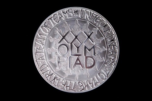
The words are set in the hand-drawn, dancing letterforms that Phillips often uses to ‘destabilise’ his compositions. He sought ‘to make a graphic design that worked in three dimensions,’ relying, he said, ‘on the incredible silent expertise of the Mint.’
However it’s hard to imagine the fattest of fat cats actually jangling these big lumps of precious metal in their pockets. Frayling, sucking loyally on a mint, admitted as much. ‘Your trousers would probably fall down.’
Caro (below, left) was impressed by Phillips’ use of the Olympics logo, as a full stop. ‘It wasn’t until I saw Tom’s coin that I realised it could be any smaller.’
Was there supposed to be a bronze coin? Phillips joked that Tracey Emin had been asked, but that her design was rejected for being obscene. Well I think he was joking.
See also: ‘The app of A Humument’ and ‘Olympic deliverance’ on the Eye blog.
Eye is the world’s most beautiful and collectable graphic design journal, published quarterly for professional designers, students and anyone interested in critical, informed writing about graphic design and visual culture. It is available from all good design bookshops and online at the Eye shop. The new issue, Eye 81 is out now – see Eye Before You Buy for a visual sample.