
Sunday, 10:45pm
31 October 2010
Blood and cleavage
A new book of scary posters and super creeps from the house of Hammer
The upcoming release of Let Me In, an English-language remake of the Swedish horror Let the Right One In (Låt den rätte komma in, 2008), marks the return to cinemas screens of the Hammer Films brand, writes Christopher Brawn.
The Art of Hammer is a curate’s egg of a book, but worth the attention of graphic designers who might otherwise dismiss it as a piece of genre puff.
Hammer movies, which continued the literary British horror tradition of writers such as M. R. James, are often seen as kitsch exploitation fare, relying on the combination of sex and death and the use of pints of bright red blood and heaving cleavages.
The films however, were made with integrity – often shot back to back with the same cast and crew in order to keep the budgets low and satisfy the expanding demand for scary movies.
Hammer was the only British production company to do distribution deals with every major American studio, often without stars or script – but rarely without a poster, thus demonstrating the power that graphic design can exert.
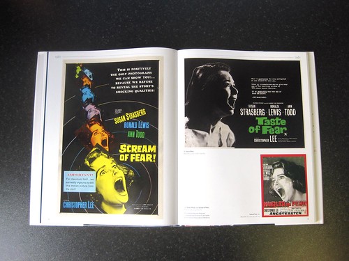
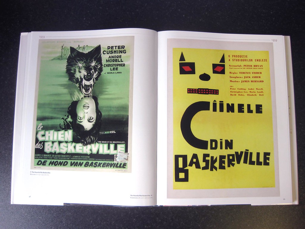
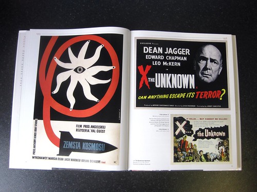
The same integrity characterises this first-ever collection of Hammer film posters, with nearly 300 examples drawn from Hammer’s own archive and private collections. The posters are shown in chronological order depending on the date the films were released in British cinemas, in chapters each showing a decade starting at 1950 and ending at 1979.
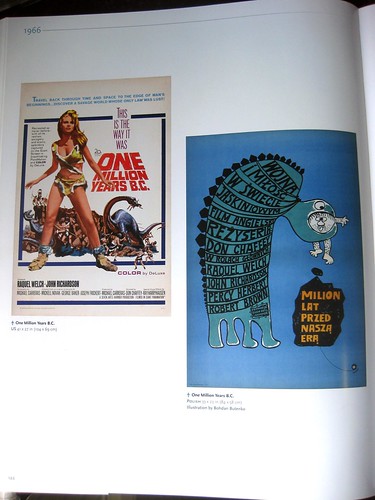
British and US posters dominate, but are often placed next to posters from other territories. This throws up some interesting juxtapositions, most notably for One million years BC. The US version has Raquel Welch in animal skin bikini, while the Polish one is an abstract illustration of a monster holding a man in its jaws (below).
The Art of Hammer is a simple book, well produced, and this is its strength. It allows the posters to be seen in an unfussy way, letting the viewer to make their own narrative between titles. The impressive and interesting content can show itself without interruption from overzealous design – so often a problem with coffee-table books.
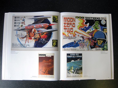
My favourites are from the 1950s and early 60s; screenprinted with a limited colour palette and stripped of the later clichéd signifiers, their graphic impact is impressive. An unsung hero of British poster design is revealed in the figure of Tom Chantrell, who illustrated the British posters for every Hammer film from 1965-70 including the aforementioned One million years BC and the forgotten Moon Zero Two (below).
The Art of Hammer: Posters from the Archive of Hammer Films
By Marcus Hearn, Titan Books, 192pp, hardback, £24.99 titanbooks.com.
Christopher Brawn is art director of Sight & Sound magazine.
Eye magazine is available from all good design bookshops and at the online Eye shop, where you can order subscriptions, single issues and back issues. The Autumn issue, Eye 77, is on its way to subscribers worldwide – see Eye Before You Buy on Issuu for a taste of its contents.
For regular updates, please sign up for the editor’s newsletter.