
Monday, 10:15am
23 February 2009
Collection by Matt Willey

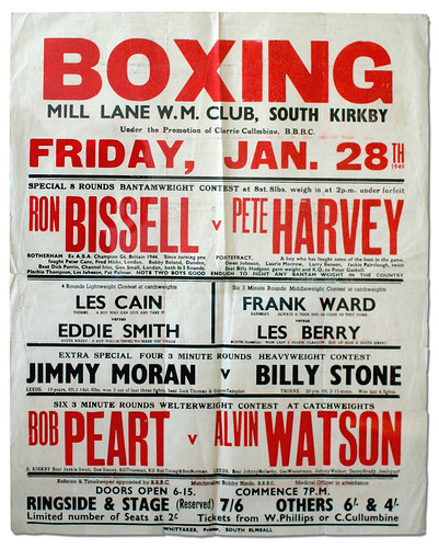
Scrapper vs. Slugger. Boxing posters: tough type; bare facts; no fuss
I found these old boxing posters recently and I think they are wonderful, writes Matt Willey. The typefaces and the way they are arranged appeal to me. The arrangement of the type is a result, I presume, of a simple need to get all this information on the poster – nothing more fancy than that.
They are probably more appealing now than they were considered at the time (I’ve hung one of them on my wall at home). There is a nostalgic way of looking at these things, I suppose, but most of all, I like the way they are so unfussy, so simple.

Two of these posters are prewar. Digger Bowers (‘This lad is a tough scrapper’) fought Battling Coxall (‘A real fast little slugger’) on a Friday night in March 1934 (top). Forty years before I was born.
Admission (including tax) cost two shillings for ringside, one and six for second seats. The telephone number is three digits long. The fearsome-sounding Dick Freezer fought at the Corn Exchange in Doncaster in 1940 (above).
The red and black postwar poster from 1949 (below) is my favourite.
I don’t know much about the jobbing printers responsible for these posters. It would be good to learn more – perhaps there’s someone out there who knows about them, the techniques they used and the type they chose. And their formidable clients, such as Clarrie Cullumbine.
But what they made is my current favourite example of graphic design.
Matt Willey is a founder of Studio8.
Other designers’ collections:
Ivan Chermayeff’s abandoned gloves.
Aporva Baxi’s Game & Watch consoles.
Eye is the world’s most beautiful and collectable graphic design journal, published quarterly for professional designers, students and anyone interested in critical, informed writing about graphic design and visual culture. It is available from all good design bookshops and online at the Eye shop, where you can buy subscriptions and single issues.