
Tuesday, 8:00am
4 April 2017
Dear Mr Johnston
A letter from Eiichi Kono to the designer of Johnston Sans, the famous London Underground typeface
Dear Mr Edward Johnston
May I take the liberty of introducing myself so that I can bring you up to date on the fate of your typeface?
I am a graphic / type designer. I was born in Japan and some hundred years after your birth I came to England to study. Almost as soon as I arrived I came face to face with London’s iconic typeface. I learnt that you were commissioned in 1913 to design an alphabet for London Underground station name signs and that Johnston Sans immediately became the vital ingredient for many renowned London Underground posters as well as signs and notices.
Your well proportioned, unfussy, utilitarian letterform could be easily reproduced from a master sheet by draughtsmen, sign writers or designer-artists with ruling pens and brushes, set squares and compasses. Such was its impact that, as you will know, in 1928, Monotype released Gill Sans, a typeface beautifully crafted by your onetime student, Eric Gill. Then, in 1930, Stephenson Blake released Granby, a somewhat heavy-handed lookalike, unashamedly adopting the distinctive diamond dots of Johnston Sans.
You will be aware that the production of metal types is expensive and time-consuming, since a large family of metal types will have many weights and styles, from Light, Medium, Bold, Extra Light and Bold, to Italics, Condensed, Shadow, Cameo and so on, and both Gill Sans and Granby were manufactured by big type foundries, two of the few big commercial entities that could afford it.
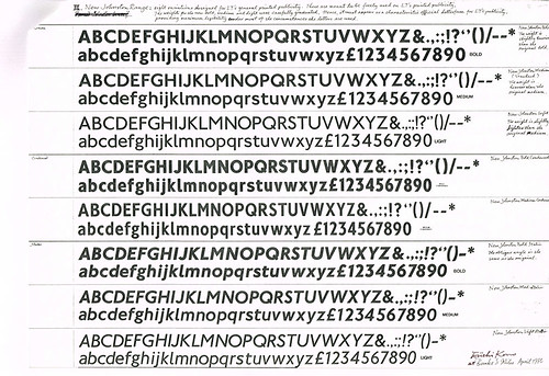
Right. The whole required range of New Johnston. Presentation diagram made in March / April 1980.
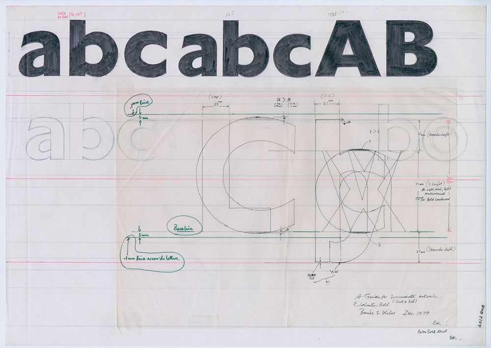
Top. Sketches and notes for trial design of New Johnston Extra Bold (which never materialised), just after the design of three weights (Light, Medium and Bold) had been completed in December 1979.
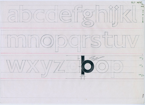
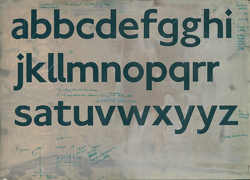
Sketches of varied x-heights for New Johnston Medium in the third week of July 1979.
When Frank Pick asked you to provide lettering for London Transport, the extent of application that was foreseen demanded only one weight, Regular, though Bold upper case was added later, and metal types and wood letters were made available in limited sizes. As its scale of operation expanded London Transport became one of the biggest customers of Granby, it is said.
Time passed by, you passed on, and London Transport’s level of activity surpassed probably most people’s wildest imagination. At the same time, certainly by the 1970s, typesetting technology moved from hot metal to photocomposition – much more efficient and economical as it became possible to reproduce any type sizes and some styles (not always successfully) from one ‘master drawing’. However, making master drawings was still largely done by hand and was therefore still expensive. Many of the popular typefaces, including Gill Sans and Granby, were not available for every photocomposition system, and these systems were costly to install and run. Technologically and economically, it became almost impossible for London Transport to continue with Johnston Sans.
So, in 1979, observing that London Transport was desperate, the graphic design company Banks & Miles offered to make master drawings reasonably quickly and cheaply as a trial, I suspect. This was the moment I came face to face with Johnston Sans again, this time in a very serious way, as the task was handed over to me, a trial perhaps for a novice who had just joined the company. You will not be surprised to learn that I took on this task with my ruling pens and brushes, set squares and compasses, although I did add other tools.
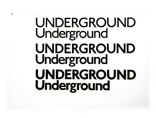
Introducing New Johnston Medium. Visual presentation at LT in the fourth week of July 1979. The original Johnston had two weights (Light and Bold).
To take full advantage of photocomposition systems, a typeface ought to be designed to work in very small sizes up to big display sizes seamlessly, which is ideal but almost impossible. In the case of a typeface in metal, multiple masters are needed to generate different type sizes. You will not be offended by my remarking that Johnston Sans had a weakness in small type sizes, because it was designed to work best in display sizes for signs, notices and posters. Adjustments had to be made, but always with very careful attention to the style of the original. The aim was to provide useful weights for the wide range of type sizes now required. I made New Johnston Sans Medium from scratch, with an x-height slightly increased and overall weight slightly heavier than your original Johnston Regular, and used optical adjustment in the same way to redraw the original Johnston Regular weight as New Johnston Light and the original Johnston Bold as New Johnston Bold. Thus Johnston Sans was preserved but revitalised as New Johnston with three weights.
Altogether I produced eight variations of New Johnston: Light, Medium, Bold, with italics for these, plus Condensed Medium and Bold. You will be interested to know that I drew every letter by hand; it took me a year and a half including design time and presentation. Nearly 1000 pieces of the final drawings were sent to the United States to be digitised for a computerised photocomposition system. Naturally, you will have no idea what this means, but I include this information as historical fact. In 1983, London Transport started using New Johnston, but I’m sure you would have observed that the letter spacing was awful. When DTP systems became the norm in the 1990s, Monotype corrected the spacing problem more or less at last, which was a relief.
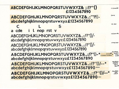
The first sketches of New Johnston based on the original Johnston Regular (Light) weight and x-height, reproduced by an copier machine with chemical liquid, the first and second week of July 1979.
Row 1. Johnston Bold.
2. Stephenson Blake’s Granby in 1930.
3. Colin Banks’ trial drawing of Johnston Bold in June 1979.
4. Johnston regular in 1916.
5. Johnston regular designed by Walter Tracy in ca.1975.
6. New Johnston Medium in July 1979 with the same x-height as the 4th and 5th.
7. New Johnston Medium in July 1979 with the x-height larger than the 6th.
8. New Johnston Bold.
New Johnston Medium, as the new standard, has turned out to be extremely legible in small sizes and very robust in display size. It is very versatile, and we could say the Medium is often the message, but that would not make much sense to you. Suffice to say that Johnston Sans is alive and well as New Johnston, used exclusively by Transport for London and by the Mayor of London. I think you will be surprised and, I hope, pleased to know this. Johnston Sans exists in other typefaces too, digitised and remastered from the original, renamed and extended, borrowed and worked over. It has had enormous influence.
These days, issues of copyright and plagiarism are rampant, and we need to look for the origins of the originals, and draw our own conclusions. This is the place to look for the key to open up possibilities for designing something new and unique. I think you will be gratified that your book Writing & Illuminating & Lettering has continued to inform and inspire.
I have been fortunate to come into close face-to-face interaction with your work, and I continue to learn from it and from the many others who have been influenced by it.
Yours sincerely
Eiichi Kono
Eiichi Kono, type designer, London
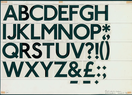
The final drawing of New Johnston Medium, reproduced with Agfa PMT machine in December 1979.
Eye is the world’s most beautiful and collectable graphic design journal, published quarterly for professional designers, students and anyone interested in critical, informed writing about graphic design and visual culture. It is available from all good design bookshops and online at the Eye shop, where you can buy subscriptions and single issues.