
Tuesday, 9:00am
9 December 2008
Dutch character?
Versa spreads its wings to become Rijksoverheid, the national type
A few weeks ago, the Dutch Prime Minister announced a new identity for the national government, which aims to rationalise the identities of its thirteen ministries and more than 200 departments under a single mark. The ‘1 Logo’ project is by Studio Dumbar, and has two main parts: a logo that recycles the Netherlands coat of arms on a kind of metaphorical ribbon, and a new typeface by Peter Verheul. Somehow the project’s ideals of clarity and unity of communication come across more naturally in the type than the logo, which seems burdened by history.
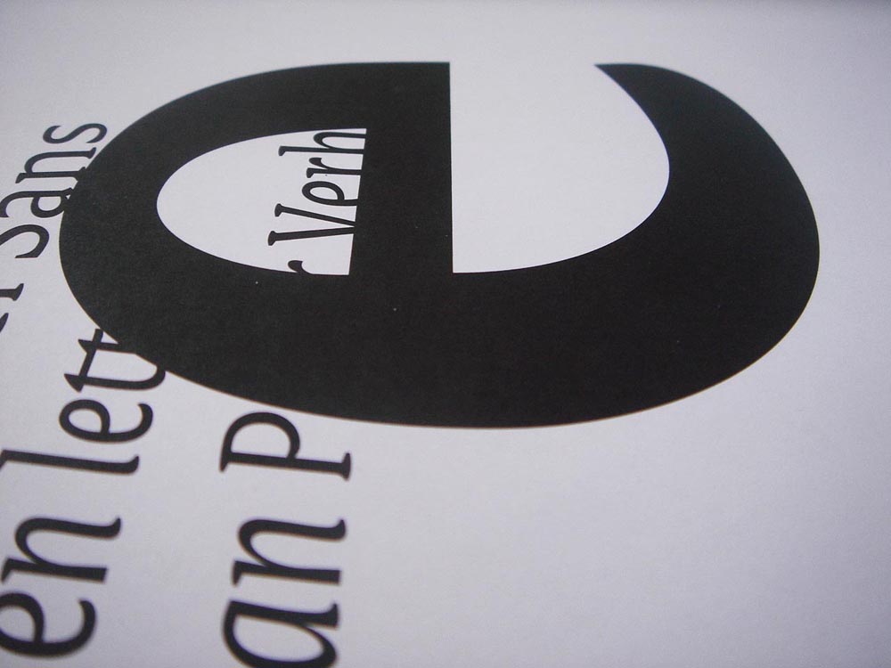
The new type family is called Rijksoverheid [Government], and is based on Verheul’s OurType Versa. The serif has all Versa’s qualities, especially a kind of grain that is the typographic equivalent of breath in music or brushstrokes in a Mondrian. The sans is a new, less flared interpretation of Versa, with a disarming frankness in its open forms and straight rhythm.
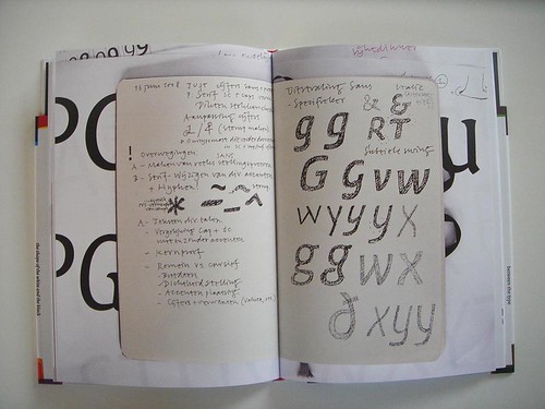
The Versa story is told in Jan Middendorp’s Dutch Type: it started off in 1994 as Nardy, a brushy bold italic display face, gathered itself into Versa and accumulated developments big and small as well as growing several new branches for the design of Dutch Type itself. It was then released as OT Versa and Versa Sans before being used in Studio Dumbar’s pitch for the 1 Logo project, and subsequently developed into Rijksoverheid. There’s a small book about the type by Mathieu Lommen (Letterrijk, published – in Dutch only – by De Buitenkant), with some interesting detail images of the development process and specimens of the character sets. Unfortunately for anyone not designing a project for the Dutch government though, the type is exclusive.

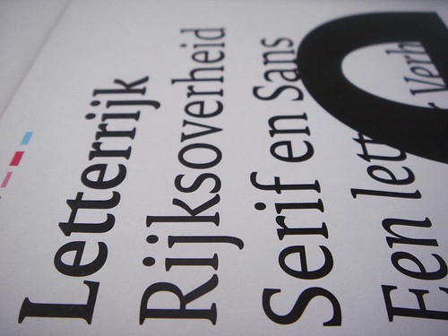
Rijksoverheid does raise a question about what it is in a typeface that makes for a national, or more specifically a Dutch character. This is an enduring question, from what Fournier called ‘le goût Hollandais’ to Gerard Unger’s suggestion, quoted in Letterrijk, that an authentic Dutch character might show ‘clarity, pragmatism and the drive to add a small but personal twist to recalcitrant basic forms’. Rijksoverheid adds two more tentative answers, one in the lovers’ embrace of contrasts in the type – between hand and handle point, rhythmical and monumental, intimate and authoritative – and another in the accumulation of values over time through decades of typography-led public projects.
The new identity is expected to be fully implemented by the beginning of 2011.

