
Wednesday, 12:00pm
24 October 2018
Ending the war on wildlife

Harry Woodgate’s science-driven illustration and design for A People’s Manifesto for Wildlife creates a human connection for its readers
In the long history of manifestos, many are as visually engaging as they are strong in their rhetoric. So when Chris Packham decided to publish A People’s Manifesto For Wildlife, he turned to illustrator and designer Harry Woodgate to help with his vision, writes Nigel Ball.
With the recent publication of the manifesto, together they have managed to marry an uncompromising stance and beautiful imagery in an effort to ‘end the war on wildlife’.
Harry Woodgate first attracted the eye of Chris Packham when the latter was a judge for the 2017 Penguin Random House Student Design Awards and Woodgate won third prize. Later, when Woodgate was told of Packham’s plans for the manifesto by an art director at Penguin, he decided to get in touch with the wildlife campaigner and broadcaster to offer his services.
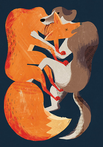
Harry Woodgate’s illustration for animal welfare campaigner Dominic Dyer’s essay ‘Ministry of Wildlife Welfare’.
Top: Opening spread reading ‘Lest We Forget’ in A People’s Manifesto For Wildlife.
Woodgate illustrated and designed A People’s Manifesto For Wildlife, which includes several type-only pages such as this one.
A People’s Manifesto for Wildlife covers a vast array of topics associated with wildlife, from hunting and shooting to urbanism and pet ownership, banding each as a specific ‘Ministry’. Each is written by a different specialist, and each has its own set of proposals for future action. From the outset, Chris Packham was adamant that these must be underpinned by science and be factually correct. In removing much of the emotive and sentimental feelings towards wildlife and conservation that sometimes undermines animal rights groups arguments, it is left to Woodgate’s imagery to help create an empathetic connection to what is being put forward.
The writers include Robert Macfarlane (also one of the publication’s editors) and Guardian columnist George Monbiot. There are also contributions from experts such as wildlife solicitor Carol Day and raptor ecologist and conservationist Dr Ruth Tingay. The list of the manifesto’s twenty contributors is nothing if not diverse. Each ‘minister’s’ rational approach to their proposals – plus the accompanying imagery – helps engage a non-academic or expert audience in what otherwise could have been an unwieldly document.
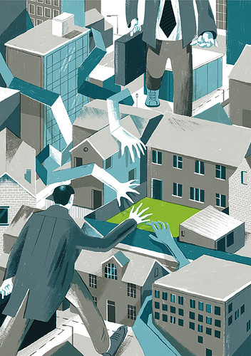
Spread from gardener and author Kate Bradbury’s essay ‘Ministry of Urban Spaces’.
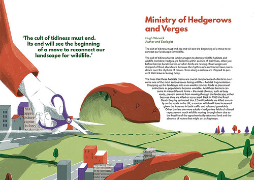
Spread from author and ecologist Hugh Warwick’s essay ‘Ministry of Hedgerows and Verges’.
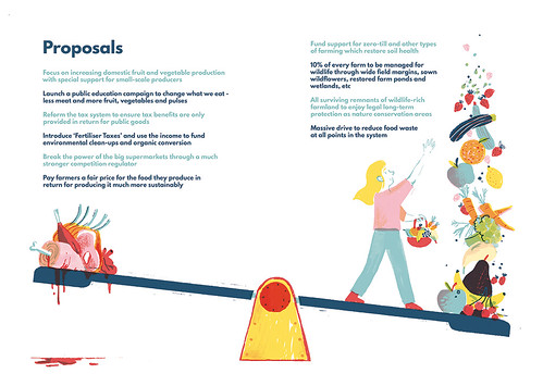
Spread from environmental policy researcher and advocate Miles King’s essay ‘Ministry of Food and Farming’.
Woodgate says: ‘We had some good lengthy phone conversations about what was needed from the illustrations and overall design, as well as about the manifesto as a whole, which was very useful. The main points were that we wanted to create something that was accessible, as opposed to a dry and unwelcoming scientific report that was difficult to read; and also that we wanted something that although being impactful and thought-provoking, kept quite an optimistic tone throughout. The manifesto is really about positive environmentalism – how much better the world can be if we make changes – so most of the illustrations try to reflect this. For the overall design we decided to use a different limited colour palette for each ‘ministry’ of the document, which was then reflected in the type and layout design – this helped distinguish each section while keeping a consistent theme throughout.’ This was an essential aspect of the design to keep people reading until the end of the manifesto, which runs to 57 pages. What is compelling from a design perspective is the way Woodgate has incorporated different illustration styles throughout, without allowing the viewer to think they have stumbled into a different document. From watercolour to collage, rich tones to typographic pieces, and illustrations that work as singular images to those that integrate with the body text, there is a unifying nature to the way he has combined different visual elements.
Although all under the one banner of supporting wildlife, the content of the manifesto is broad, and at times controversial. Available to download alongside the illustrated manifesto is a purely text-based and fully referenced version. Comparing the two is an effective demonstration of the effectiveness of Woodgate’s work is in helping to communicate the authors’ messages. One appears wordy and gives the impression that it could be a chore to read, while the other is a visual delight for the eyes.
Illustration for ‘Ministry of Urban Spaces’.
Chris Packham is also a keen photographer, and a critical one, too, as anyone who has ever watched BBC’s Springwatch Extra and heard his comments on viewer’s photographs will know. He clearly has a strong visual eye. That he trusted Woodgate is further testament to the young illustrator’s skills. Speaking of his process, Woodgate says: ‘Towards the start, we discussed specifics a lot more, going through line sketches, drafts and then final artworks, which helped establish the overall tone of the document. As things moved on however, I did move straight to working on final versions of things – a combination of the sheer scale of work we needed to complete to meet our deadline, and also that Chris and the ministers were quite happy to give me that creative freedom, which was absolutely wonderful, and something I really appreciated.’
Some of Woodgate’s illustrations bear passing references to both Edward Bawden and Eric Ravilious, particularly in relation to his choice of colour palette. Although unintentional on the part of the illustrator, the visual echoes of these distinguished artists – who were also champions of the British countryside – add further authenticity to the manifesto. That this is done in a contemporary manner means that – as with the ministers’ proposals – the visuals do not communicate any suggestion that there was a ‘golden age’ to which we should return to (as is prevalent in so much of populist politics today). As a result, A People’s Manifesto for Wildlife is something that looks to the future and puts forward a powerful voice – in verbal and visual language – for a cause that cannot speak for itself.
Nigel Ball, design educator, graphic designer, photographer, Ipswich
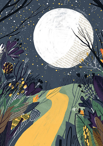
Illustration for ‘Ministry of Young People in Nature’.
All images used with the permission of Harry Woodgate and Chris Packham. A People’s Manifesto for Wildlife is edited by Chris Packham, Patrick Barkham and Robert Macfarlane with additional research by Greta Santagata.
Eye is the world’s most beautiful and collectable graphic design journal, published quarterly for professional designers, students and anyone interested in critical, informed writing about graphic design and visual culture. It is available from all good design bookshops and online at the Eye shop, where you can buy subscriptions and single issues.