
Thursday, 9:01pm
10 March 2011
Entente cordiale

Anette Lenz
Anthony Burrill
Vincent Perrottet
Nicolas Ledoux
Pascal Béjean
Philippe Apeloig
Ray O’Meara
Fanette Mellier
Les Graphiquants
Stefi Orazi
Bob London
natalie ferris
Design education
Graphic design
Posters
Visual culture
A pre-Chaumont RCA show juxtaposes cross-Channel poster art
Posters shout, jostle, and cajole. They blister every surface from bedroom wall to tube-train, from the streets of Manchester to Marseille, writes Natalie Ferris. The exhibition, ‘British Posters / Affiche Françaises’, held briefly at the Royal College of Art from earlier this month, provided a witty moment of reflection.
Below: poster by Les Graphiquants.
Posed as a dialogue between British and French graphic designers, 21 large-scale posters vied for attention across the quiet Lower Gulbenkian Gallery. Yet, did the British have an unfair advantage?
Above: poster by Vincent Perrottet and Anette Lenz.
The ten French posters presented were the selection of the International Poster and Graphic Design Festival of Chaumont 2010, the aim of which, according to the director of the festival, Étienne Hervy, was to ‘… help build the value of these posters in their own right,’ as well as to ‘raise awareness, among the public and the clients themselves’ for the posters’ relevance in contemporary graphic design.
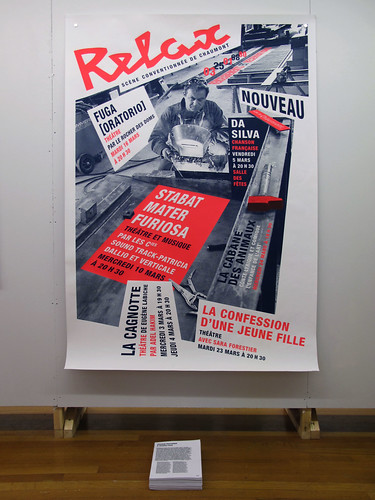
Below left: poster by Pascal Béjean and Nicolas Ledoux. (See article in forthcoming edition of Eye, no. 79.)
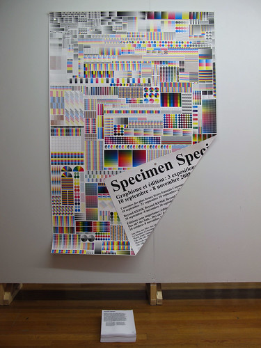
Chosen from a diverse number of largely commercially commissioned projects, the posters vary from the painterly elegance of Philippe Apeloig’s YSL poster for the Petit Palais, to the chromatic ‘printer marks’ of Fanette Mellier’s double-sided poster / book (below).
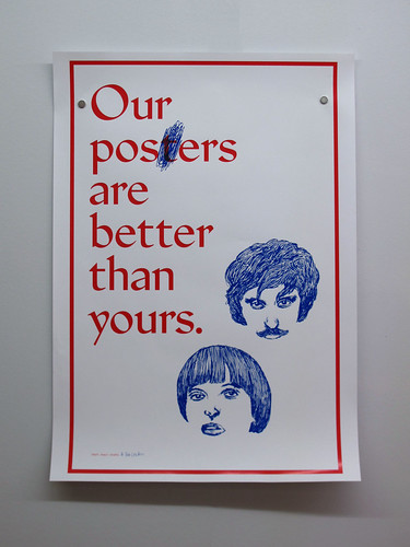
The posters speak for themselves, although some shout louder than others. The eleven British designs are ‘responses’ to the winning French posters. Invited to respond by curator Sophie Demay, the British designers had the freedom to be more direct and irreverently self-conscious. They parody implied British / French cultural divides, such as (below) Stefi Orazi and Bob London’s assertive use of Eric Gill’s Jubilee typeface, or creatively reference the French posters, such as Ray O’Meara’s YSL inspired typeface, Jovial (Duroselle), and Ken Kirton and Louise Naunton Morgan’s ‘hybrid’ reprint of Fanette Mellier’s poster.
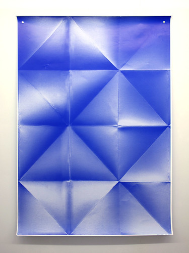
While the French posters herald events or contemplate the status of the contemporary poster, such as within the voluminous folds of Les Graphiquants’ conceptual ‘presences’, the British posters are more cunning, pointed and tongue-in-cheek.
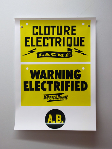
Below: poster by Anthony Burrill.
As a democratising influence, curators (and RCA students) Sophie Demay and Clo’e Floirat ‘tunnelled’ the exhibition, mounting the large posters on to two alleyways of opposing boards, in which the French posters and the English counterpart ‘responses’ are alternated. This plays out like a barricaded streetscape, drawing the posters into witty relationships; glimpsed beside, behind, and out of the corner-of-the-eye.
The exhibition is due to return to Chaumont later this summer, as part of the International Poster and Graphic Design Festival, from the 22 May to 5 June 2011. Perhaps, in what Hervy sees as a ‘continuing dialogue’, the French will have the opportunity to reply …
Natalie Ferris is a student in the ‘Critical Writing in Art and Design’ department of the RCA. Special thanks to David Crowley.
See also ‘Sticks in the mind’, Véronique Vienne’s article about contemporary poster culture in Eye 69.
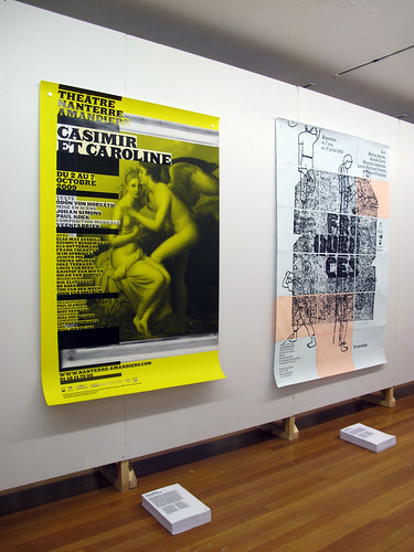
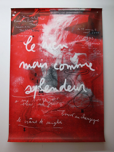
Below: poster by Frédéric Teschner.
Eye is the world’s most beautiful and collectable graphic design journal, published quarterly for professional designers, students and anyone interested in critical, informed writing about graphic design and visual culture. It’s available from all good design bookshops and online at the Eye shop, where you can buy subscriptions, back issues and single copies of the latest issue. For an extensive, if incomplete text-only archive of articles (going back to Eye no. 1 in 1990) visit eyemagazine.com. For a visual sample, see Eye before you buy on Issuu.