
Monday, 10:01am
20 February 2012
From ligatures to Lilos
A handful of memorable logos from John McConnell’s long career
John McConnell, the subject of Eye 81’s Reputations interview, has been quietly leaving his mark on British design for nearly five decades. Here, we show some of the logos and wordmarks he has created for a wide variety of clients.
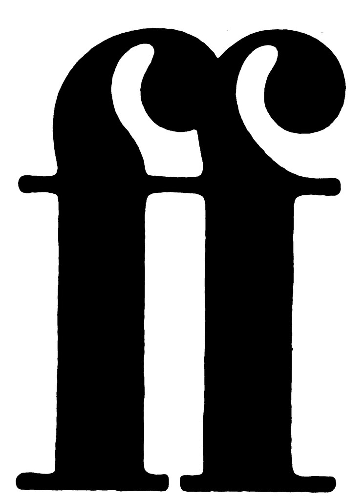
Top: a double-f ligature, 1981, for publishers Faber & Faber. McConnell later became a director of the company, and stayed until 1996.
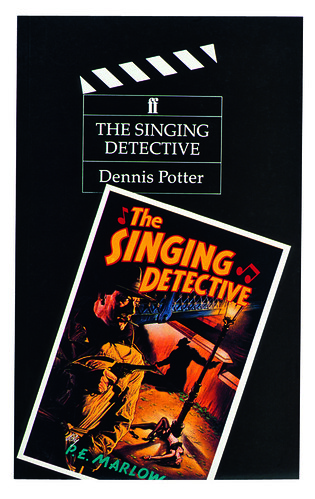
Below: cover for The Singing Detective, 1980s, an example of McConnell’s series design, incorporating a ‘clapperboard’ motif with his Faber panel.
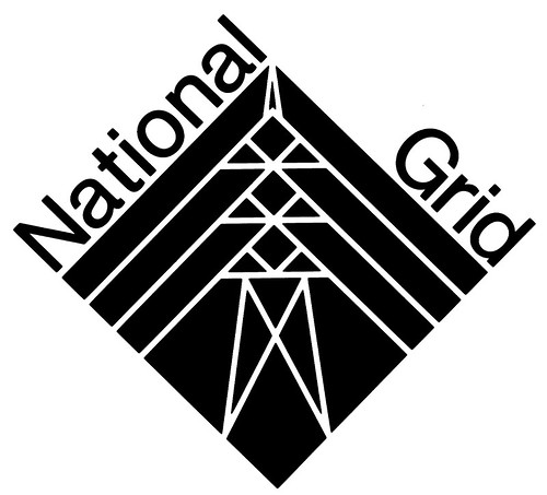
Below: logo for National Grid, 1989, launched 1990.
Below: logo for Unicorn, 2005, the children’s theatre on the banks of the Thames in London.

Below: logo for Japan Festival, 2001 – in McConnell’s description, a ‘classic bit of type and the Japanese flag.’
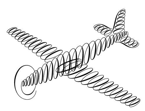
Below: 1987 logo for Fred Tow.
McConnell recalls: ‘He invented an inflatable aeroplane. So I was thinking of the Lilo, that squidgy shape, and I realised that the shape could be made our of eighteenth-century calligraphic handwriting.’
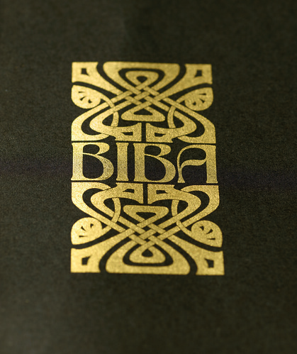
Above: Biba logo, late 1960s. The wordmark was devised from one of the alphabets available at photo-lettering company Face, of which McConnell was a director.
Read the full text of the John McConnell Reputations interview in Eye 81.
John McConnell studio site: mcconnellstudio.com.
Eye is the world’s most beautiful and collectable graphic design journal, published quarterly for professional designers, students and anyone interested in critical, informed writing about graphic design and visual culture. It’s available from all good design bookshops and online at the Eye shop, where you can buy subscriptions, back issues and single copies of the latest issue. Eye 81, has the theme of ‘Designers and clients’; Eye 82 will be on press any moment.