
Friday, 5:00pm
27 September 2019
From stone to screen
Curator Mark Noad explains the thinking behind ‘Rock Paper Pixel’, a new exhibition at the Lettering Arts Centre in Snape

Letter Exchange is an organisation for professionals in the lettering arts – calligraphy, letter cutting, type design and typography – that encourages discussion between these disciplines that can influence new approaches to lettering across different traditions, writes Mark Noad.
When the Lettering Arts Trust approached me to curate this exhibition, I wanted to draw on Letter Exchange’s ambition to present unique, innovative and experimental work, realised with exemplary craft skills, and the opportunity for visitors to interact with them.
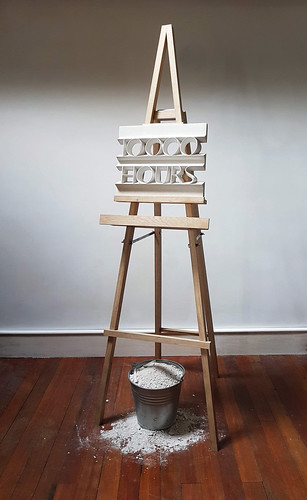
Michelle de Bruin, 10000 Hours.
Top. Julia Vance, Let Me In.
‘Rock Paper Pixel’, the title of this exhibition, can be seen as a shorthand for the development of the history of lettering. Although each of these developments has largely superseded the previous, all are available to lettering artists practising today. In the game Rock Paper Scissors, at any given moment, any of the three choices can be the right one to make. Likewise, depending on the project, the choice of working in stone, on paper or digitally can be the correct one.
The pieces I have assembled for the show demonstrate what can be done with lettering through the application of imagination, design and craftsmanship. Together they show that influence, experimentation and play all have a role in creating innovative, beautiful, thought-provoking works.
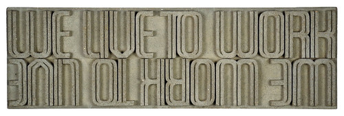
Richard Kindersley, Live to Work (cast concrete).
There are works by Edward Johnston, Eric Gill, Ralph Beyer and Nicolete Gray – all major influences on contemporary lettering. The skill that Richard Kindersley demonstrates by cutting a mould for concrete in polystyrene with a hot wire has a direct lineage from the woodcut lines of Eric Gill. Rosella Garavaglia’s contemporary calligraphy has its roots in Johnston’s teachings.
Nick Benson’s letterforms are inspired by the free style of graffiti tags but are informed and realised by the skilled hand of a master letter-carver. Type designer Jeremy Tankard’s typeface Brucker was prompted by attending the recent Letter Exchange Conference in Cambridge.
Nick Benson, Base64 portrait of Mark Noad.

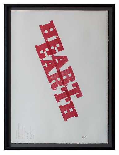
Sutherl&Smith – Kelvyn Laurence Smith / Jim Sutherland, Heart Earth.
Many pieces in ‘Rock Paper Pixel’ were created through a process of experimentation, the artist trying something new, responding to different ideas and materials. This can take them outside the conventions of their established disciplines: lettercutter Robbie Schneider used laser-cut MDF; calligrapher Cherrell Avery worked with wrought iron; sculptors Julia Vance and Michelle de Bruin used lettering to create three-dimensional forms.
The 8000 one-off covers of Eye 94 were the result of advances in digital printing, but it was MuirMcNeil’s willingness to experiment that meant it happened. Andy Altman of Why Not Associates explains the automated process used to cut stone for the Comedy Carpet: ‘The results led to truly beautiful, unexpected typographic arrangements that one would never normally attempt or imagine.’ And there is a playful element to the exhibition. You will be able to arrange the letters of Jim Sutherland’s chessboard-based typeface to create your own messages and patterns; create typographic pictures using Jeremy Tankard’s fonts; and make rubbings of internet acronyms cut into stone by Jo Crossland.
Jo Crossland, Too Long Didn’t Read.

I would like visitors to view ‘Rock Paper Pixel’ as active rather than passive: you can engage with the works on display. As Sacha de Leeuw says about her ‘huggable’ sculpture u, nu: ‘Just like the reader finishes the book, your handling it will finish this piece.’
Come to this exhibition to view the lettering arts in all its many forms. Stay to join in, take part; discuss, debate, disagree; explore, experiment, engage and have fun doing so.
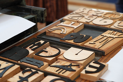
Will Hill and Mark Noad’s custom woodblock alphabet.
Mark Noad, designer, Letter Exchange committee member, London
Eye is the world’s most beautiful and collectable graphic design journal, published quarterly for professional designers, students and anyone interested in critical, informed writing about graphic design and visual culture. It is available from all good design bookshops and online at the Eye shop, where you can buy subscriptions and single issues.