
Thursday, 11:12am
27 January 2011
Going overground
Lulu Pinney on GlobalVision’s friendly tube map for the Piccadilly line
Great moments in information design (continued).
Compared with most other London Tube lines the Piccadilly line is one I actually like travelling on, writes Lulu Pinney.
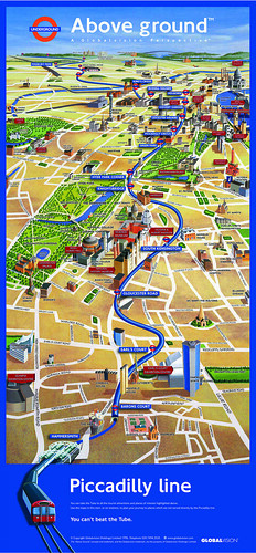
Maybe this is because it has caused me less trauma than others over the years. And it takes me home. However there’s another small detail that adds to my affection of the royal blue line: the tall, thin poster by the door in my carriage (below).
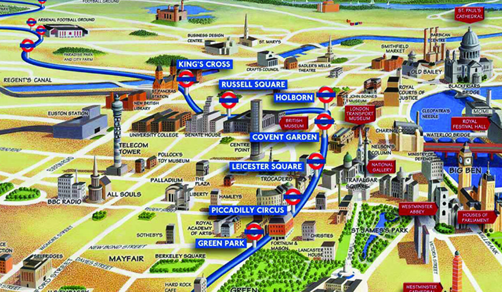
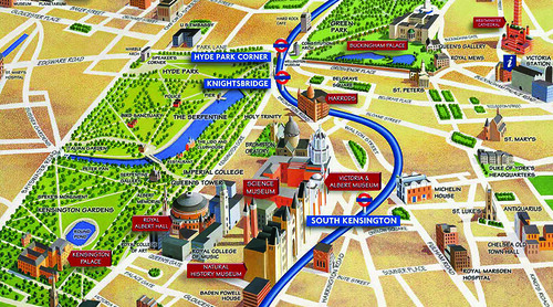
Colourful, friendly and engaging, it shows where the Piccadilly line would run were it at street level. It highlights landmarks and places of interest along the way, firmly locating the Tube stations in the real world, something the official Tube map doesn’t – and can’t – do.
All credit to whoever identified this need and plugged it with an effective solution, directly at the point of need. (The poster is still to be found in every carriage on the Piccadilly line.) This is about as basic a definition of the value of information design as you can get.
The official Tube map – Harry Beck’s geometrical array of coloured dots and lines – is an outstanding specimen of information design, allowing you to plan at a glance a route between any two points in the whole of London. This is a remarkable achievement but inevitably there is a trade-off for simplifying such a big network in this way: it bears little resemblance to real geography (see Maxwell Roberts’ ‘Knots and geography’ on the Eye blog).
Reality is missing from the official Tube map because the reality of London’s geography is messy. It is this problem that the ‘Above ground’ poster addresses beautifully. It shows key information, but not too much; it complements the Tube map that is to be found right above it; and it was specifically designed for the space it sits in by the carriage doors. This is a position that allows it to present itself directly to the people to whom it has only just occurred that they are not sure which stop would be best for where they’re going.
This poster is dated 1996 and the ‘Above Ground’ concept is credited to GlobalVision. I don’t know why similar posters weren’t commissioned for all the other lines. If an argument in their favour were needed, surely the fact that this one is still being used and still helping travellers fourteen years on is a good one.
And over and above ticking the boxes of being clear, useful and relevant, it has the additional bonus of being engaging, elegant and original, which – as a designer – are all things that lift my day.
‘Above ground’: Piccadilly line poster for London Underground (1996).
Created by the in-house design team at LondonTown.com, known then as GlobalVision, art-directed by Steven Potter.
Lulu Pinney is an Infographic Designer at BBC News Online, London
She also has a blog, lulupinney.co.uk.
Eye is the world’s most beautiful and collectable graphic design journal, published quarterly for professional designers, students and anyone interested in critical, informed writing about graphic design and visual culture.
It’s available from all good design bookshops and online at the Eye shop. Eye 78, featuring more ‘great moments in information design’ is out now.