
Wednesday, 10:00am
26 February 2014
Graphic design method acting
When MinaLima took on the Harry Potter franchise, they designed more than graphics – they were designing childhoods
‘The Graphic Art of the Harry Potter Films’ at London’s St Bride Library was a popular talk that brought J. K. Rowling’s fantasy world into the realities of design for posters, maps and publications, writes Joseph Bisat Marshall.
The first of J. K. Rowling’s books in the Harry Potter series, Harry Potter and the Philosopher’s Stone, was published by Bloomsbury in 1997. Four years later, Warner Bros Pictures released the first film in what would become a high-grossing series of feature films.
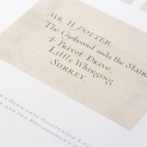
The graphic story began with an acceptance letter – to Hogwarts School of Witchcraft and Wizardry in Harry Potter and the Philosopher’s Stone. For those of us who are part of the ‘Harry Potter generation’, whose growing up paralleled the release of Rowling’s books, this letter invited us into a fantasy world. Designers Miraphora Mina and Eduardo Lima were not just designing graphics, they helped design our childhoods.
Harry Potter’s Hogwarts acceptance letter, Harry Potter and the Philosopher’s Stone, 2001.
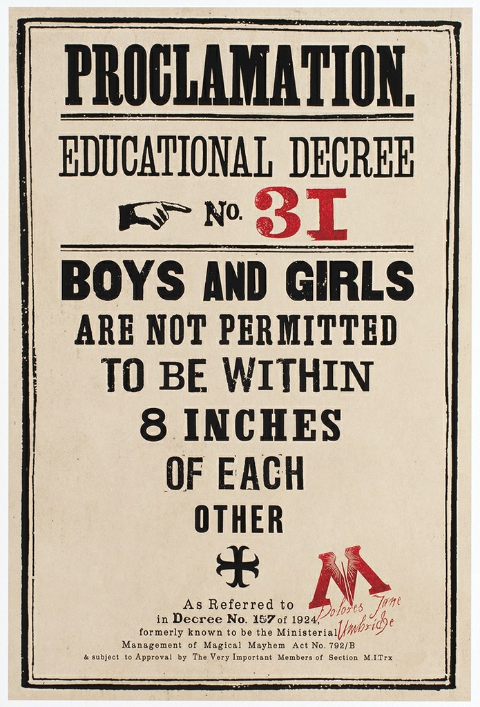
Top: ‘Proclamation No. 31’, Harry Potter and the Order of the Phoenix, 2007.
At St Bride, Mina and Lima began by showing a short film of graphic highlights from their ten-year bond with Harry Potter. They then explained how they established and developed the film series’ graphic style, and created every graphic prop for the film series.
Miraphora Mina studied at Central Saint Martins and the National Film School before starting her career in film production design. In 2002, while working on the second Harry Potter film, Mina met Eduardo Lima, a visual communication graduate from Rio de Janeiro who had spent several years working in the Brazilian film industry before moving to London. They soon formed a design partnership – MinaLima.
‘The Marauder’s Map’, first appearance in Harry Potter and the Prisoner of Azkaban, 2004.
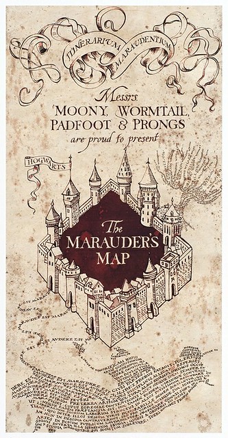
Mina and Lima spoke about four prominent areas of design for the Potter series, much of which was completed on set and alongside other members of the film’s art department (headed by production designer Stuart Craig). The first, ‘The Marauder’s Map’, was designed for the first film and modified a number of times throughout the series. They explained that the map design process was ‘character driven’. As with method acting, Mina and Lima had to inhabit the characters that created the work. They became editors of newspapers, owners of books, managers of magical shops.
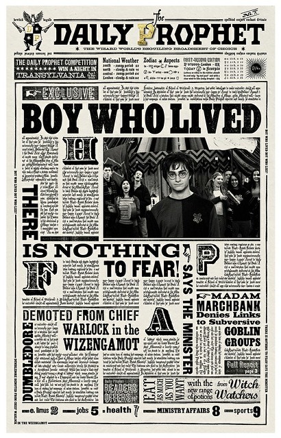
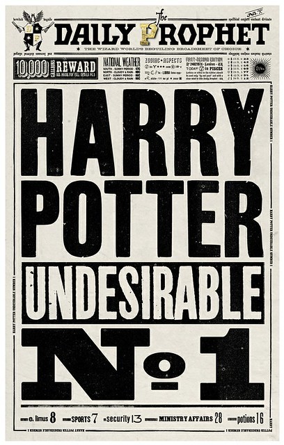
The Daily Prophet, Harry Potter and the Goblet of Fire, 2005.
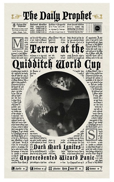
The second area of design work included the wizarding newspaper, The Daily Prophet, which underwent a redesign when (in the story) the Ministry of Magic took over the publication. Mina and Lima developed a holistic visual style for this fantasy world that respected all elements in the film, including architecture, costume and narrative.
The Daily Prophet redesign from Harry Potter and the Goblet of Fire, 2005.
Third, Mina and Lima regarded the large amounts of packaging and in-film promotion needed for ‘Weasleys’ Wizard Wheezes’ as the ‘ultimate gift’. They stocked the four-storey joke shop set with Victorian inspired graphics and lovingly designed products such as ‘Skiving Snackboxes’, ‘Electric Shock Shake’ and ‘Comb-A-Cameleon’.
‘Comb-A-Chameleon’, packaging for Weasleys’ Wizard Wheezes, Harry Potter and the Half-Blood Prince, 2009.
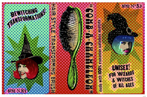
‘Weather in a Bottle’, packaging for Weasleys’ Wizard Wheezes, Harry Potter and the Half-blood Prince, 2009.

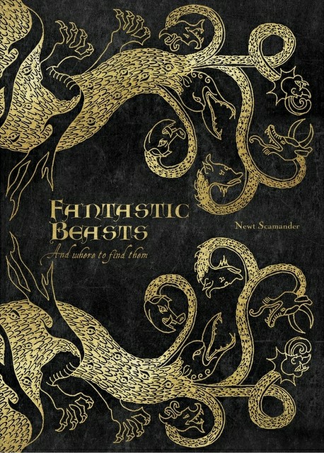
The fourth area of design work was for the many books seen throughout the films. Each one was highly bespoke: designed, produced and aged with the utmost attention to narrative. The content of nearly all of this work was supplied neither in the scripts nor in the literature; it required Mina and Lima to immerse themselves in the graphic world they had created.
Fantastic Beasts and Where to Find Them, first appearance in Harry Potter and the Philosopher’s Stone, 2001.
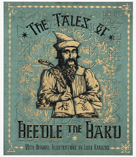
The Life and Lies of Albus Dumbledore was designed as a ‘trashy’, ‘throw-away’ publication on the request of J. K. Rowling. The Tales of Beedle the Bard has beautiful, intricately cut pages that resemble fine lace patterns. Mina and Lima were given free reign to indulge in features rarely allowed by publishers – including transparent pages and gold leaf – each one hand-bound and meticulously aged.
The Tales of Beedle the Bard, first appearance in Harry Potter and the Deathly Hallows: Part 1, 2010.
These books were designed in full and only ever seen in fleeting shots of often just the covers. An expansive collection of old books was kept as reference to age the props accurately. Mina and Lima cheerfully recalled filling the art department’s hallways with coffee-stained pages, singing the praises of Nescafé Gold.
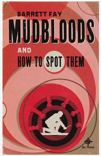
Mudbloods and How to Spot Them, Harry Potter and the Deathly Hallows: Part 1, 2010.
Graphic design for film navigates an odd space between the real world and fantasy. It is fabricated yet the design process remains the same whether the work exists in this world or another. Mina and Lima explained that ‘background objects were never given any less detail or attention than those seen significantly on screen’. The sum of the work creates a totality of experience – although much of the material might never be shown on screen, it is seen by the actors and ‘felt’ by the audience. Mina and Lima continue to design additional material for ‘The Wizarding World of Harry Potter’ in Orlando, Florida. They also run ‘The Printorium’, an online gallery offering limited edition reproductions of artwork from the films.
Joseph Bisat Marshall, designer and design student, Central Saint Martins, London
The Daily Prophet, Harry Potter and the Deathly Hallows: Part 1, 2010. All designs by MinaLima.
Eye is the world’s most beautiful and collectable graphic design journal, published quarterly for professional designers, students and anyone interested in critical, informed writing about graphic design and visual culture. It is available from all good design bookshops and online at the Eye shop, where you can buy subscriptions, back issues and single copies of the latest issue.