
Wednesday, 10:59am
13 March 2019
Hacking Gutenberg
Eye’s Type Tuesday about 21st-Century letterpress featured Double Dagger, The Counter Press and Erik Spiekermann. A splendid time was had by all
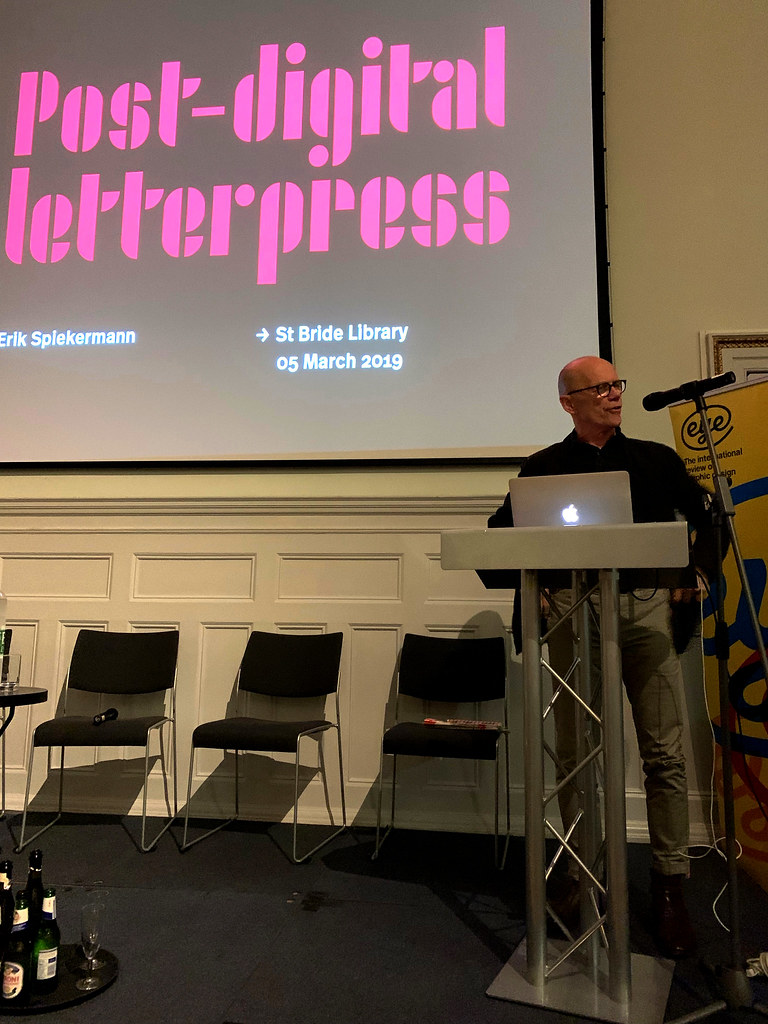
Erik Spiekermann opened his talk at Type Tuesday on 5 March 2019 with some ruminations on the subject of craft: ‘Craft, skill, trade, vocation: The human impulse to make something for its own sake, to do it as well as you can,’ writes John L. Walters.
He followed this with pictures of type, posters, equipment and details from p98a, his spacious and immaculate letterpress studio near Potsdamer Platz in Berlin.
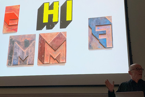
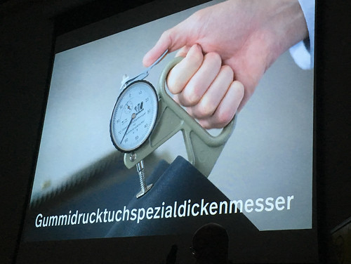
Letterpress printing involved complex, arcane processes; what used to be a commonplace means of communication is now both craft and art. It is celebrated for what makes it different from today’s digital defaults. The way wood and metal type has to be set and printed presents designer, compositor and printer – now often the same person – with limitations that can also be seen as freedoms. ‘Kerning is overrated,’ declared Spiekermann, showing examples of wood type that could only be set closer with a hacksaw.
Right and top. Erik Spiekermann giving his talk ‘Post-Digital Letterpress’ as part of Eye’s quarterly Type Tuesday event ‘Hacking Gutenberg’, 5 March 2019 at St Bride Printing Library.
When a client asked Spiekermann to make the type bigger on a p98a letterpress job, he had to explain that this was not possible. You can only work with what you have in the composing room, which in the example he gave was the 16-cicero wood type Fanfare. Letterpress’s welcome constraints were a theme that recurred throughout the evening, which included short presentations by The Counter Press (David Marshall and Elizabeth Ellis) and the Double Dagger team of Pat Randle and Nick Loaring. When you don’t have a ‘y’ or a sufficient quantity of the letter ‘a’ or ‘N’, you have to improvise.
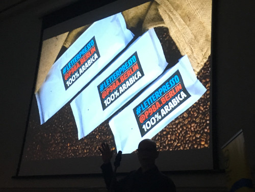
Spiekermann’s back story as a successful designer is reasonably well known (see ‘Six degrees of Erik Spiekermann’ in Eye 74 and ‘Meta’s tectonic man’ in Eye 18), so he focused his talk on 21st-century letterpress printing, pausing only to take a pot-shot at contemporary agencies. Talking about his Letterpresso coffee beans and their packaging, he said: ‘It took about five minutes to decide on the name and the logo. We didn’t need Post-it notes and a branding consultant.’
Erik Spiekermann’s Letterpresso ‘brand’ (2014) using the Block typeface.
Spiekermann is an entertaining speaker, with an amiable bluntness and sense of the absurd that appeals to British audiences. The biggest laughs of the evening were for some long German technical terms.
He showed us the plastic plates used for Change Is Good, the letterpress-printed book (about the early days of the digital revolution) by Wired founder Louis Rossetto. A further selection of recent projects included his Paper journal, a new edition of Wittgenstein’s Tractatus and the enormous newspaper (four pages of ‘Nordic format’, i.e. 88×114cm) that he made for online news service krautreporter.de. Spiekermann’s video of Krautreporter’s printing on the mighty (and oil-thirsty) Johannisberger press reminded the packed hall how physically demanding it is to run a machine of that size.
The post-digital process at p98a turns digital PostScript files into printable photopolymer plates. Photo: Norman Posselt.
He concluded with more meditations on the ‘values of good craftsmanship’, which in Spiekermann’s forthright views go far beyond skilled manual labour, and apply equally to citizen and computer programmer.
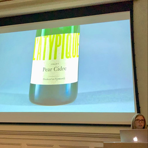
By contrast, The Counter Press’s Marshall and Ellis expressed their passion for print in measured British tones. Their clients include L’Atypique cider and the St Bride Foundation itself. If you become a ‘Friend of St Bride’ (which we strongly recommend), you can carry The Counter Press’s letterpress membership card design in your pocket or bag. They showed pictures of their studio, with its modest proofing presses, in which they make their own newsprint journal. Extra Condensed no. 3 is promised soon.
Elizabeth Ellis of The Counter Press showing their work for L’Atypique.
The making of The Counter Press’s Extra Condensed No.2.
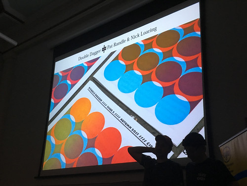
Also about to print their third edition were the guys behind Double Dagger – Nick Loaring and Pat Randle.
Seen at Glastonbury: ‘Let The Good Times Roll’ (2014) by Nick Loaring and Pat Randle, a poster using 24 & 12 line Stephenson Blake wood-type printed using a split-duct technique for the two colours.
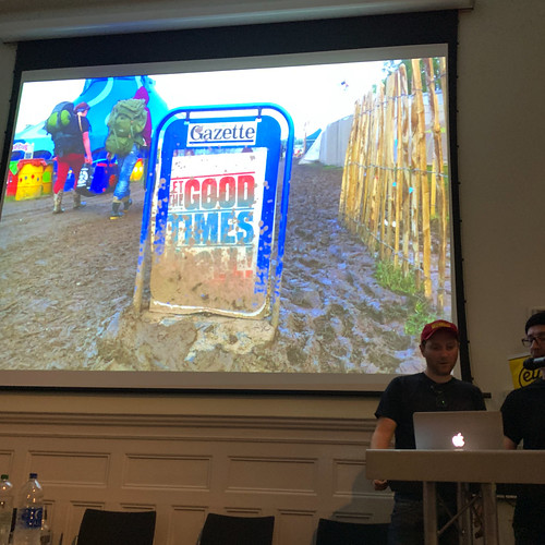
They showed an early collaboration (Glastonbury Free Press) for the Glastonbury Festival using polymer plates that they found highly unsatisfactory (though the resulting papers were welcome in the field toilets). Loaring and Randle relish metal type and Double Dagger is printed at Whittington Press (home of Matrix) in Gloucestershire using the Press’s own Monotype typesetting machines. The journal demonstrates the duo’s devotion to the constraints of letterpress in a liberating, exuberant manner: they’re more like a festival act themselves.
Pat Randle and Nick Loaring with the cover of Double Dagger no. 2.
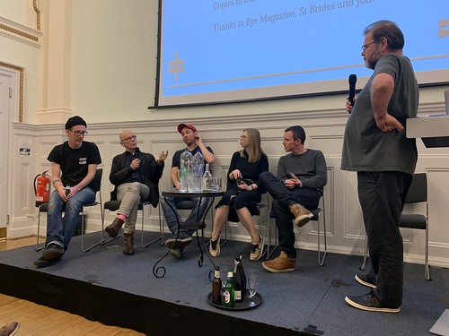
All the speakers returned to the stage to take part in a panel discussion chaired by Eye’s art director Simon Esterson. The resulting chat between speakers – and with the typographically distinguished audience – confirmed the acceptance of a non-purist ‘broad church’ attitude in letterpress that the Double Dagger team had mentioned in their talk. The only moment of disagreement occurred when Randle referred to the German-made Heidelberg as the ‘Rolls Royce of printing machines’. Quick as a flash, Spiekermann retorted: ‘No, they are the Mercedes Benz!’
Panel discussion with (left to right) Nick Loaring, Erik Spiekermann, Pat Randle, Elizabeth Ellis and David Marshall, chaired by Simon Esterson, and closing Eye’s Type Tuesday event at St Bride Printing Library, London, 5 March 2019.
John L. Walters, editor of Eye, London
Eye is the world’s most beautiful and collectable graphic design journal, published quarterly for professional designers, students and anyone interested in critical, informed writing about graphic design and visual culture. It is available from all good design bookshops and online at the Eye shop, where you can buy subscriptions and single issues.