
Monday, 6:18pm
12 January 2009
Hey, good looking!
I braved designer scorn to champion the kings of Californian airbrush
‘Who wants to read a book about airbrush?’ Even one of my artist subjects was giving me shit about the decision to publish a book on 1970s airbrush art, writes Norman Hathaway. This project inspired so many grimaces and disgusted responses that I started to question it myself.
Hadn’t enough time passed for people to let go their prejudices against this oft-maligned illustration trend? Since design and illustration is always scrambling to seem ‘serious’, worthy, or (lately and most regrettably) some sort of conceptual art, airbrush art is the loud, embarrassing uncle in the room.

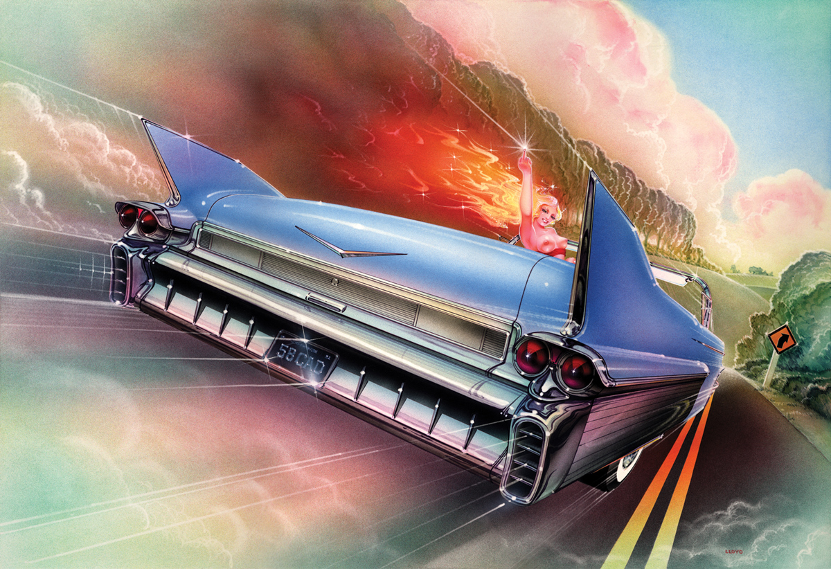
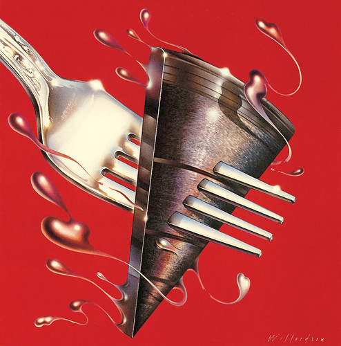
Images by Dave Willardson (above: Keith and Mick, Crawdaddy, 1972 ), Peter Lloyd (top: ‘Caddygirl’, Playboy, 1985) and Peter Palombi (below: ‘Nature By The Pack’, Yasei Jidai, 1976).
Airbrush art was a hugely popular and dominant form in its day, and it is worthy of in-depth study. Nobody seems troubled by super-slick photography from the same time period. The work of Helmut Newton, Moshe Brakha and Guy Bourdin are the photographic equivalents of airbrush art: both forms played with sexuality, polished glamour and humour in similar ways, and the photography is enjoying a revival – without the sour faces.

Academics and design journalists tend to focus on overtly intellectual designers, allowing less conservative, more populist work and practitioners to fade into the ether. Searching for famous airbrush dudes online, I was shocked to find barely any. When Dan Nadel (of PictureBox, who commissioned the book) was teaching at Parsons School of Design, he found that illustration students had shown keen interest when he showed them 1970s airbrush books in class. Maybe so much time had passed that many younger artists were unaware of the work altogether, and would be fascinated by the technical skills required to create such work without a computer.
I opted to focus on the airbrush revival of the 1970s, and limit it to as few artists as possible. I’m tired of the buckshot approach taken by Taschen and others, whereby a category is basically scanned and printed without putting the work in context, or providing insights into how and why the work was created.
Though there were other, equally good practitioners, such as Robert Grossman and Doug Johnson plus the Brits Philip Castle and Michael English, I opted to examine just four Californians: Dave Willardson, Charles White III, Peter Lloyd and Peter Palombi. There’s a compelling mix of chrome, palm trees and sunny optimism found only in the west coast artists.
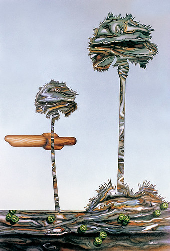
Charles White III (above: ‘Trees and Peas’, 1974), Dave Willardson (below: album cover image for The Section, 1978).
These pictures weren’t beating you over the head with cleverness or conceptualism. Many airbrush illustrations are simply about objects, free of environments or situations included to support a hokey angle or narrative. There's usually no puzzle solve, or plot to follow: perhaps that’s why many are quick to brand the work as empty or frivolous.
But that view applies incorrect criteria to the work. Instead, think of the pictures as the result of a long, hard gaze. All the artists are world-class ‘lookers’. It is as though the airbrush tool itself forced them to view their subjects with obsessive visual analytics – breaking each picture element down to a cellular level of study and then building it back up again, bit by bit, until it becomes an impenetrable part of a larger image.

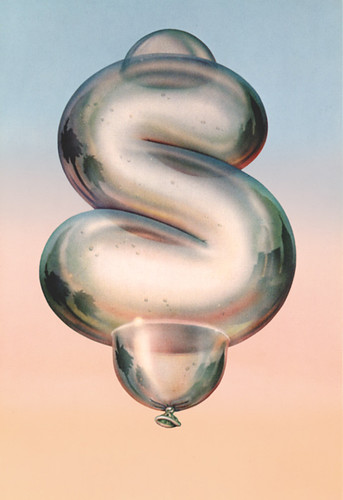
Charles White III (above: ‘Businessman's Lunch’, Yasei Jidai, 1976 and below:
‘Inflation’, magazine cover, 1977).
On the one hand, the work is ultra-tight and seemingly ‘straight’, but it often slyly winks and tugs against the company line. The artists cheerfully created immaculate piss-takes on advertising and illustration vernaculars. And they regularly and blatantly disregarded client briefs, which enabled the work to communicate on two levels at once: they could be obvious fans of Coca-Cola ads, while simultaneously, via a tweak in the image, giving the finger in the anti-establishment manner of the time.
Norman Hathaway’s Overspray: Riding high with the kings of California airbrush art (PictureBox) is out now, and will be reviewed in Eye no. 71 (Spring 09), out in March. Read Hathaway’s blog, overspraybook.blogspot.co.uk.
Eye is the world’s most beautiful and collectable graphic design journal, published quarterly for professional designers, students and anyone interested in critical, informed writing about graphic design and visual culture. It is available from all good design bookshops and online at the Eye shop, where you can buy subscriptions, back issues and single copies of the latest issue.