
Wednesday, 5:53pm
17 February 2010
Knots and geography

A psychologist challenges the Beck gospel of Underground octolinearity
Henry Beck’s iconic map (or diagram) of 1933 tamed the London Underground by showing chaotic meandering routes as straight lines, writes psychologist Maxwell Roberts. By simplifying the appearance of the map, travellers could plan their journeys more easily.
Beck’s early designs had an elegance and balance to them that has never been surpassed . The Underground map was not just easier to use, it was more inviting.
Beck’s enduring rules were that only horizontal and vertical lines and 45 degree diagonals are permitted, along with tightly radiused curves. This is also known as regular octolinearity, and only one of Beck’s published designs departed from it.
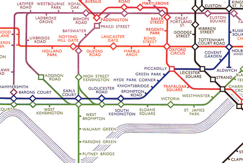
Top: An early (pre-Beck) London Underground map.
Below: One of Beck’s early designs.
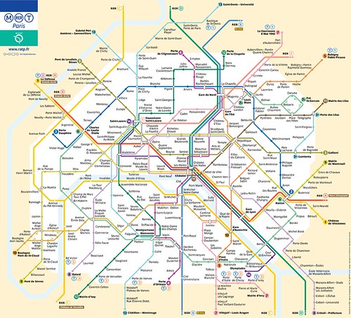
Today, regular octolinearity has almost become a design gold standard. Adopt this, and many assume that the best possible map will result. For example, in Mark Ovenden’s Metro Maps of the World (2005), more than 60 per cent of the major networks conform, and deviations generally accommodate topography. More recently, Ovendon has documented many attempts to force the Paris Metro to fit, and their resulting problems. No graphic designer would work in this rigid rule-driven way with type, so why the bias for maps? How can designers who automatically reach for tradition know whether they really have shown a network in the best possible way?
For more than ten years I have been investigating these issues, designing maps that either follow tradition or cast it aside, often with surprising consequences. These maps are now being tested in studies in which people are asked for subjective assessments and also to plan journeys, so that we can investigate time taken and errors. Some of these designs will be exhibited at South Essex College, Southend-on-Sea from 26 February to 8 March (click here for more details).
For example, using number of corners to measure complexity (we have found that this is directly related to usability) a hexalinear map (horizontal and 60 degree diagonals only) suits London better than octolinearity (below). It needs just six corners for Central London inside the Circle Line. There are fourteen on the current official map, but nine is the minimum without distorting geography too much.

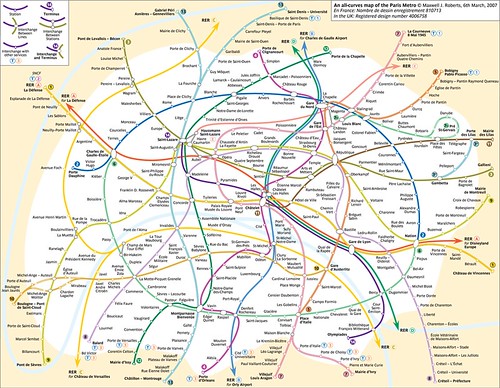
In Paris, the extremely complex Metro tests octolinearity to destruction (above). The almost-knotted trajectories translate into a page of zigzags. Reality has not been simplified: all that has been achieved is changing the shape of the complexity. An all-curves map smoothes away the awkward kinks, revealing the underlying structure of the network (below). In usability tests, this version is 30 per cent faster for planning than the official map.
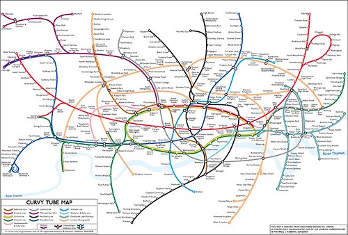
When mapping a network, we must be careful not to fall into the cul-de-sac that Henry Beck-worship leads us down. Even in London, where octolinearity works reasonably well, the soft flowing lines of the all-curves map has quite a following (above), although the lack of geometry offends the Beck purist. Interestingly, our studies show that subjective preferences are not linked to planning performance. Map engagement and map usability are completely separate factors.
Maxwell Roberts is a psychologist at the University of Essex. Further writing can be found at www.tubemapcentral.com.
Underground Maps Unravelled: Explorations in Information Design
26 February > 6 March 2010
Campus Gallery, South Essex College
The flyer for the exhibition can be downloaded here.
Further reading:
Mark Ovenden, Metro Maps of the World (2005). Harrow Weald: Capital Transport
Mark Ovenden, Paris Metro Style in Map and Station Design (2008). Harrow Weald: Capital Transport.
Mark Ovenden, ‘Harry Beck: The Paris Connection’. Creative Review, March 2009.
M.J. Roberts, Underground Maps After Beck (2005). Harrow Weald: Capital Transport.
Eye, the international review of graphic design, is a quarterly journal you can read like a magazine and collect like a book. It’s available from all good design bookshops and at the online Eye shop, where you can order subscriptions, single issues and classic collections of themed back issues.