
Thursday, 1:57pm
20 December 2012
Lay out – speak out

A letterpress conference at Fleet Street’s St Bride Library aimed to focus our attention on content
‘Something to say’, a letterpress conference organised by Catherine Dixon & Rose Gridneff at St Bride Library, aimed to focus attention on what is being said, writes Stephen Barrett. In doing so they made a case for letterpress as both a reminder of our typographic heritage and as a valid means of communication today.
The conference began by reminding us that letterpress is beautiful, tangible, formally exquisite, warm and tactile, holding language in its arms. Ian Gabb’s work illustrated all these points. Yet he said that letterpress ‘is not an end to itself’ – that it should be used to challenge its historical conventions. His position on the periphery of the letterpress community has allowed him to use the process in a way that is richer for its refusal to adhere to tradition.
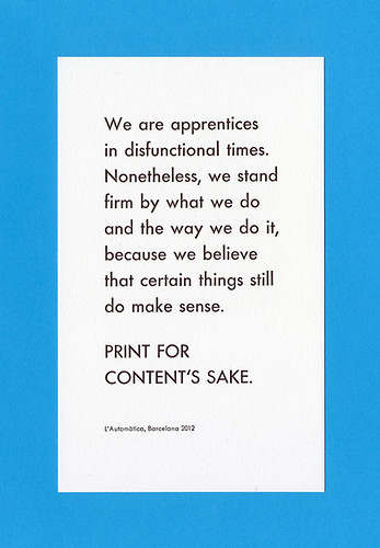
L’Automàtica, ‘Print for content’s sake’, conference souvenir, 2012. Top: Dylan Kendle’s album artwork for 3 by Nouvelle Vague.
Much of the work Anthony Burrill presented (see ‘Over the rainbow’ in Eye 75) focused on a single, simple message. His works become almost like monuments to the printed word, whose simplicity forces us to consider not only the message but also the physicality of language itself – the space that it occupies. The imperfections of woodblock printing are cultivated and celebrated, giving a rough edge to language – they reveal emotion like a faltering voice.
Anthony Burrill, woodblock poster printed at Adams of Rye.

There was a distinct sense that the audience was being asked to consider the work shown in the context of ‘here and now’, even when presented with work from the past – the story of one of the last great ‘jobbing’ letterpress printers, Desmond Jeffery, (see ‘Early adopter’ on the Eye blog) was retold by designer Jono Lewarne and curator Charlotte Hetherington. These artefacts, rather than becoming rarefied, were discussed in relation to what they were being used to say, and why, questioning what their value might be for designers today.
Poster by L’Automàtica.
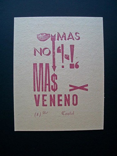
The Catalan collective L’Automàtica delivered a moving presentation that seemed to sum up a situation that could become close to any of us, and for its honesty was perhaps the most captivating of the day. We learned how the economic situation in Spain has meant that designers and artists have to be resourceful and creative with what they have left. By reviving an out-of-business printshop and keeping the printer on to teach them, the group of young artists and designers have been using the press to print messages of social and political activism.
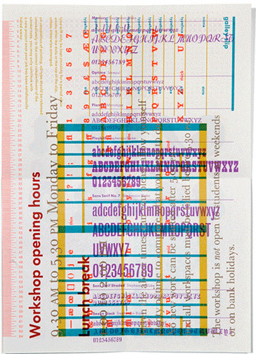
Ian Gabb, Royal College of Art / workshop prospectus , letterpress booklet.
Here, an outdated method of technology has become what it once was: at the heart of the distribution of ideas to bring about change. In a time when there is an apparent loss of confidence in the messages of corporations and governments – letterpress seems to speak in a voice that we can trust.
Dylan Kendle, Nouvelle Vague numerals.
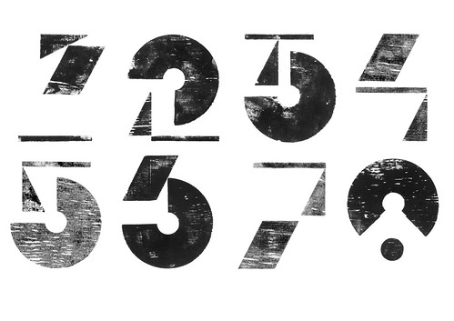
Further purposes for letterpress were presented; ‘6x6’ (see forthcoming article by Alex Cameron) – a collaborative project supported by the University of Brighton and the London College of Communication – has connected six colleges through the use of letterpress as tangible way for students to learn about typography through making. Dylan Kendle of Tomato showed us how he has incorporated letterpress prints into digital animations and film, and how ‘playing’ with process has informed his experiments with digital media.
Peter Nencini, Make Do Type specimen.

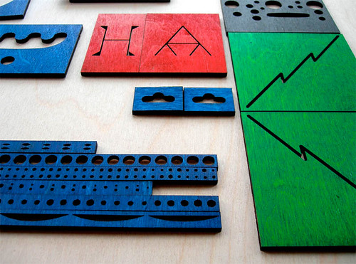
Peter Nencini’s presentation also illustrated how the formal aspects of letterpress can inspire ways of working with other media. How notions such as modularity, constraint, grids, systems and the relationship of ‘tool’ to ‘form’ can influence ways of approaching design, whether the outcome be a typeface or a fabric pattern.
Much of the power of what we saw and heard was due to the variety of speakers selected. Dixon and Gridneff selected speakers most of whom work outside the traditional letterpress community. We learned that it is often those without formal training in traditional letterpress techniques who are offering new and inspiring ways to use it.
Peter Nencini, lasercut woodblocks for Make Do Type.
What was apparent in all the speakers was a desire to make work that has something to say – whether through the content of the message or the processes by which that message is communicated.
Eye is the world’s most beautiful and collectable graphic design journal, published quarterly for professional designers, students and anyone interested in critical, informed writing about graphic design and visual culture. It is available from all good design bookshops and online at the Eye shop, where you can buy subscriptions, back issues and single copies of the latest issue. See Eye 84 at Eye before You Buy on Vimeo.