
Tuesday, 11:20am
29 November 2011
Murder most typographical
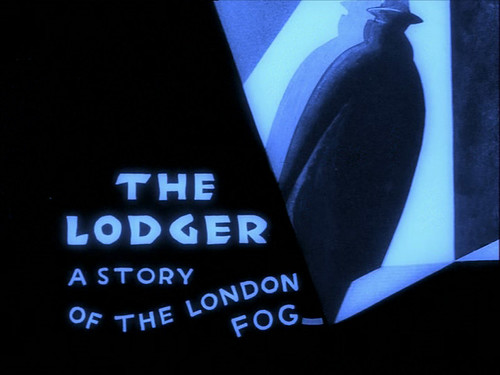
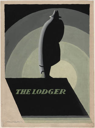
Edward McKnight Kauffer’s titles for Hitchcock’s silent thriller The Lodger
For all the critical attention Edward McKnight Kauffer attracts (including our preview and review of ‘The Poster King’ at the Estorick), there has been little mention of one of his more interesting projects: the collaboration with Alfred Hitchcock on silent thriller The Lodger: A Story of the London Fog (1927), writes Alexander Ecob.
Type, in the form of intertitles, had an important role in silent films. Information on their titlers is, however, patchy – though we do know that Hitchcock started his film career as a title-card designer for what was later to become Paramount Studios, working on movies such as The Call of Youth (1921) and The Princess of New York (1921). Hitchcock’s output as a titler was unremarkable, but it almost certainly contributed to his awareness of the potential of titles as a creative and emotive device.
More importantly, Hitchcock’s early collaborations with director Graham Cutts took him to Munich in the mid-1920s as German Expressionism was coming to a head. The influence of films such as Fritz Lang’s Destiny (1921) and the atmospheric titles from Robert Wiene’s Das Cabinet des Dr Caligari (1920) can be seen in every aspect of The Lodger, titles included.
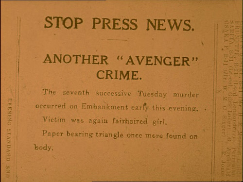
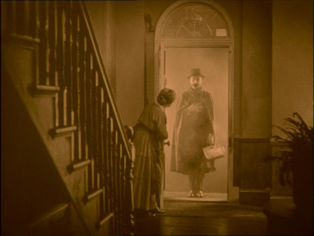
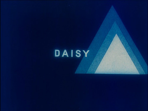
Alongside straight dialogue cards and incidental type (we are shown telegrams, news tickers and later newspaper cuttings, which move the narrative along in an unobtrusive manner), The Lodger uses title cards with implicit meaning. Daisy, the leading lady, is announced by a card bearing only her name and an abstract triangle motif – of the sort the film’s villain leaves on the bodies of his victims – marking her out as a fulcrum before she even appears on screen.
In later cards, the triangles loom ever larger as the killer’s net tightens around her.
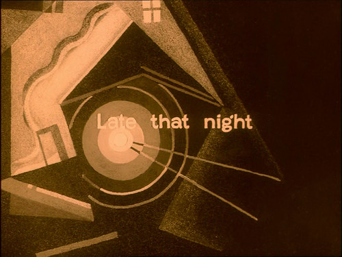
It was on the recommendation of Ivor Montagu, the film-maker and founder of the Film Society, that Kauffer was appointed to title The Lodger. Kauffer created even bolder art titles, imbuing narrative shifts as simple as ‘Late that night’ with a harsh angular insecurity through his abstract representation of the lodger’s house. At once mysterious and dripping with tension, the cards echo Hitchcock’s narrative, enhancing the flow rather than interrupting it.
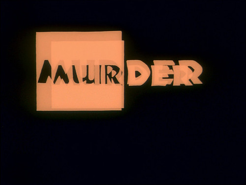
Another link to German design can be seen in The Lodger’s recurring ‘MURDER’ titles, in Rudolf Koch’s Neuland typeface. Koch carved each character directly into the metal, without the aid of drawn guides, which resulted in wildly differing letterforms in different type sizes. Such is the variation, in fact, that it is difficult to tell whether Kauffer actually used Neuland, or hand-lettered similar characters.
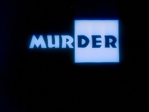
Above: Title from The Lodger, showing Koch’s Neuland typeface, also seen in Kauffer’s earlier designs (below).
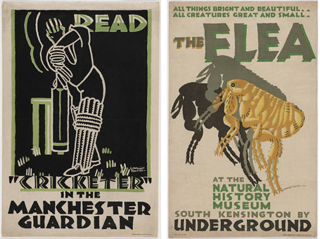
Neuland’s crude boldness saw it appropriated not as a modern blackletter, as Koch perhaps intended, but as an advertising face (later becoming synonymous with the representation of the ‘primitive’ in advertising (see Rob Giampietro’s New Black Face). Kauffer was already familiar with the face, having used it in advertisements for the Manchester Guardian as early as 1923 (the year it was released), book jackets in the mid-1920s, and in a poster for the Natural History Museum in 1926, the year The Lodger was being produced. However, an early piece of Kauffer’s artwork for the film uses a more conventional serif – could it be that Neuland was suggested by Hitchcock himself?
Whoever was responsible for its inclusion, this German advertising blackletter is a great fit for Hitchcock’s British thriller. The clumsy yet elegant violence of the letterforms and their squat, black shapes lend a notion of brutality and a palpable sense of oppression to the film – the wildly flashing ‘MURDER’ titles, imagined in concert with a feverish orchestra, must be one of the most alarmingly atmospheric uses of type in an English film to date.
Despite Kauffer’s interest in cinema (he had designed the logo for the Film Society, of which he was a founder member, for Ivor Montagu, in 1925), The Lodger was his only direct involvement in film production, though he did design an exquisite letterpress poster for Fritz Lang’s Metropolis (1927).
What is so pleasing about The Lodger, widely credited as the first ‘true Hitchcock’ film, is that it brought together two great synthesisers of influence. Kauffer’s art was an impressive amalgam of Modernism, Cubism, Expressionism and the styles of the US, the UK and wider Europe, while Hitchcock’s films pulled together American production techniques, German Expressionism and other European styles – but the work of both remains recognisably and distinctively their own.
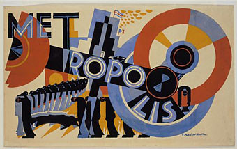
Above: Kauffer’s unused poster for Metropolis. Below: early work for The Lodger.
Eye is the world’s most beautiful and collectable graphic design journal, published quarterly for professional designers, students and anyone interested in critical, informed writing about graphic design and visual culture. It is available from all good design bookshops and online at the Eye shop. The new issue, Eye 81 is on its way to subscribers and bookstores worldwide – see Eye Before You Buy for a visual sample.