
Tuesday, 10:59am
3 November 2015
Noted #71
Peter Biľak
Kristyan Sarkis
Alberto Hernández
Jason Smith
Phil Garnham
Benoît Bodhuin
Henrik Kubel
Scott Williams
A2 / SW / HK
Derek Birdsall
Carvalho Bernau
Simon Esterson
George Ryan
Ben Jones
Terrance Weinzierl
Steve Matteson
Eric Gill
various designers
Philip Sayer
Graphic design
Posters
Type Tuesday
Typography
TPTQ Arabic; Frank; FS Brabo by Fontsmith; Typomad 2015; New Perspectives in Typography; The Eric Gill Series
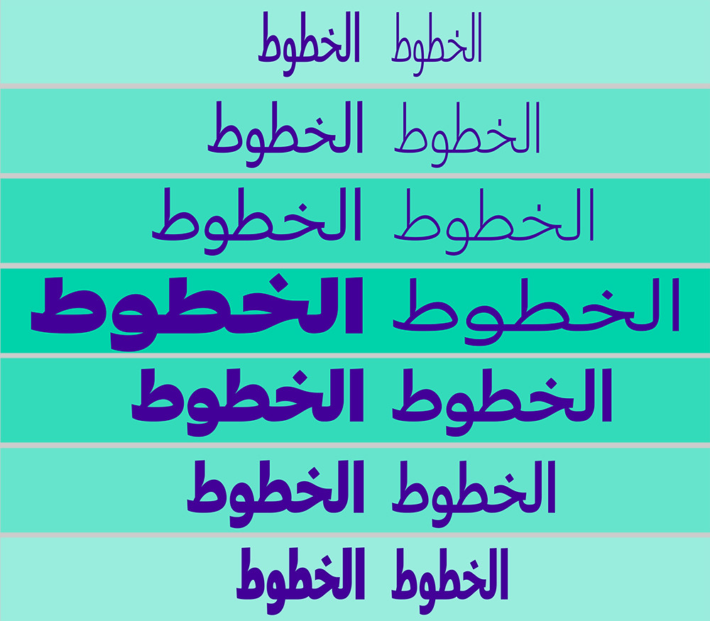
Typotheque’s Peter Biľak has announced the launch of TPTQ Arabic, a new type foundry dedicated to developing original high-quality Arabic typefaces and systems for bi-lingual typography.
The new company is a partnership between Lebanese designer Kristyan Sarkis and Biľak (see ‘Reputations’ in Eye 75). In response to what the founders perceive as the ‘visual uniformity’ of Arabic newspaper typography, TPTQ has released Greta Arabic, a large type family, available in 39 styles, that explores new approaches to Arabic type.
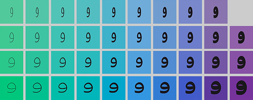
Another inaugural release is New Fedra Arabic, ‘redrawn and remastered’, a collaboration with Iranian designer Bahman Eslami.
Greta Arabic comes in ten weights and four widths.
Top: specimen that demonstrates the versatility of the family.
For more about some of the issues surrounding ‘non-Latin’ type, see the article ‘Beyond Latin’ in Eye 90.
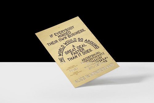
FRANK brass stencil designed by Bunch and Alberto Hernández.
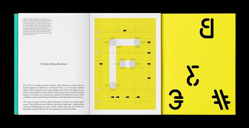
Spread from the sumptuous FRANK specimen with technical specifications.
The new stencil typeface FRANK (designed by Alberto Hernández and Bunch) was recently announced with an unprecedented fanfare from Croatia. FRANK is a sans serif, monolinear display typeface with geometric rounded endings, originally designed as a bespoke font for the rebranding of Cerovski (a print production studio).
The font is available in OpenType and Web Open Font format from Milieu Grotesque. The promotional materials included a metal specimen that doubles as an actual stencil, an elaborate brochure that showed myriad uses of the display fonts and a video (see below). The text pays tribute to stencil authority Eric Kindel (see ‘A tradition with breaks’ in Eye 86).
The making of the brass stencil for stencil typeface FRANK. Design: Bunch and Alberto Hernández.
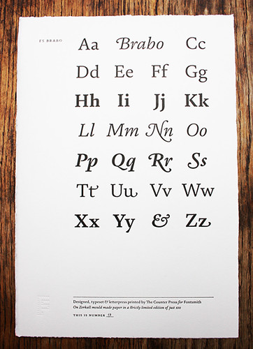
Inspired by the archive at Plantin-Moretus Museum in Antwerp, the Clerkenwell foundry Fontsmith is launching a new serif typeface – FS Brabo. Fontsmith founder Jason Smith (see his ‘Inspiration’ article about Eric Gill in Eye 59) claims that FS Brabo is a typeface ‘that can add poetry to the plainest prose’.
A specimen of the typeface FS Brabo by Fernando Mello, published by Fontsmith.
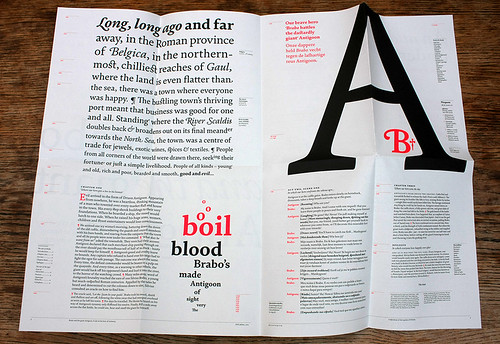
FS Brabo specimen designed and printed by The Counter Press for Fontsmith.
For more about the Plantin-Moretus Museum and its extraordinary contents, see Phil Sayer’s photo essay in the latest issue, Eye 90.
Posters featured on the website for the ‘Type Earthquake’ open call.
Benoît Bodhuin, La Typo exhibition.
‘Type Earthquake’, an open call from Spanish typographic festival Typomad, asks for the boundaries of conventional typographic communication to be broken. Typomad encourages designers who experiment and challenge the traditions of poster design, and the deadine is 15 November 2015 at 11pm (Spanish time).
The guidelines for this annual venture, the only typographic festival in Madrid, include the request that the design ‘breaks the established rules of composition and / or narrative’, that it ‘contributes to debate on current issues’ and that it generates ‘dialogue and debate’. The subsequent Typomad conference takes place on Fri 4 and Sat 5 December 2015 at Centro Cultural Conde Duque.
Darius Ou, Autotypography.
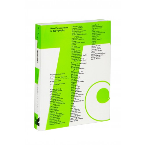
New Perspectives in Typography, (Laurence King, 2015), designed and edited by Scott Williams and Henrik Kubel of A2-Type.
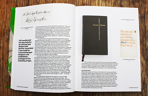
Spread from New Perspectives in Typography with work from ITC (left) and Derek Birdsall / Omnific.
Designed and edited by Scott Williams and Henrik Kubel, New Perspectives in Typography is a collection of work by 100 international designers that demonstrates inspirational uses of type and typography. Williams and Kubel are careful to state that this is by no means a definitive guide, an attempt to define a new movement, or a manifesto. The new book is a showcase of different responses to what applied typography means today.
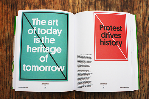
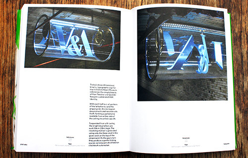
Spreads from New Perspectives in Typography.
De Zaak Nu identity by Atelier Carvalho Bernau, 2010.
V&A digital ‘palindrome’ by Troika, 2010, based on the original identity designed by Alan Fletcher and Quentin Newark at Pentagram.
In the editors’ words: ‘New Perspectives in Typography celebrates the handmade; bespoke and made-to-measure type; customised or bastardised versions of of pre-existing fonts; the use of freely available typefaces in inventive ways; and how technology has impacted on contemporary design.’
The book also includes essays by Paul Shaw, Limited Language, Emily King and Rick Poynor, and captions by Michael Evamy.
Logo for The Eric Gill Series designed by Eye’s Simon Esterson.
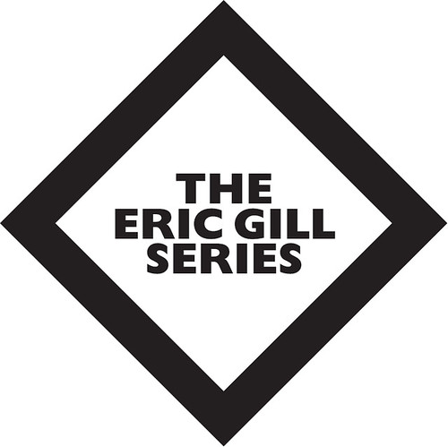
Eye’s Simon Esterson and John Walters have been working with Monotype on ‘The Eric Gill Series’, a new exhibition at The Old Truman Brewery in London that incorporates archive material relevant to Gill’s designs for Joanna and Gill Sans, a digital exhibit designed by Field (see Eye 80) and an interactive ‘fridge magnet’ display using giant glyphs from the series of three extended typeface families – Gill Sans Nova, Joanna Nova and Joanna Sans Nova – based on Gill’s original designs.
On the evening of Friday 6 November 2015, there’s an event, ‘Me and Mr Gill’, with Phil Baines, Penguin’s Claire Mason, Sallie Morris, Joanna Sans Nova designer Terrance Weinzierl and David Pearson, chaired by Walters. Another event on Tuesday 10 November will feature Dan Rhatigan, departing type director of Monotype, David Hitner of StudioSmall, whose work for fashion designer Margaret Howell makes extensive use of Gill Sans. Admission is free for all events, but you have to book via Eventbrite.
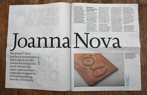
Spread from the new Monotype Newsletter, available at ‘The Eric Gill Series’ exhibition at The Old Truman Brewery.
STOP PRESS – TICKETS FOR ‘ME AND MR GILL’ HAVE ‘SOLD OUT’.
Eye is the world’s most beautiful and collectable graphic design journal, published quarterly for professional designers, students and anyone interested in critical, informed writing about graphic design and visual culture. It is available from all good design bookshops and online at the Eye shop, where you can buy subscriptions and single issues.