
Wednesday, 11:00am
18 October 2017
Noted #84
Tom Gauld
Pat Randle
Nick Loaring
Stanley Donwood
Mark van Wageningen
various designers
Graphic design
Illustration
Typography
Visual culture
Tom Gauld’s literary bake-off, typography with balls, hot-metal Double Dagger 2, the smell of London and The Simoncini Method
Here are a few things that caught our attention in recent weeks.
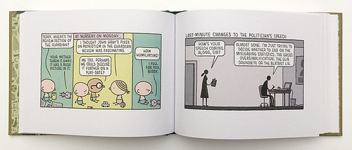
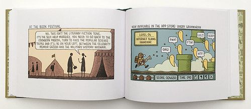
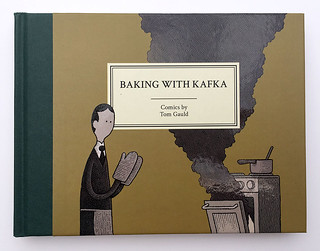
Baking With Kafka is another quietly hilarious collection of Tom Gauld’s Guardian cartoons, with a few thrown in from The New Yorker and The New York Times, so literary themes predominate. Read it to find the truth behind literary awards, (as-yet unused) dystopian road signs and why J. G. Ballard’s children’s picturebooks were not a success. See Tom’s illustration for ‘The programmed designer’ in Eye 94.
Tom Gauld skewers speech-writing and literary festivals (among many other mildly hot topics) in Baking With Kafka (Drawn & Quarterly, £12.99).
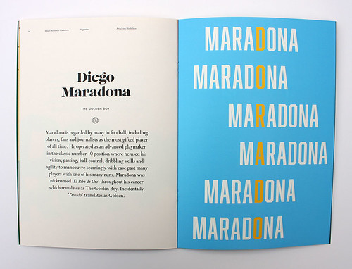
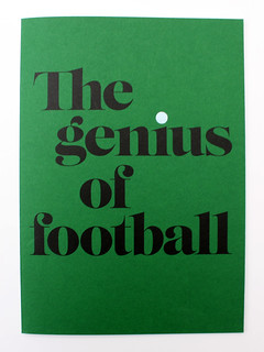
The Genius of Football (Dinkit, £7) is a 28-page publication, conceived and designed by Matt Berry, that uses typography to express the talents of great footballers – including Zinedine Zidane (The Pass Master), Johan Cruyff (The Revolutionary) and Diego Maradona (The Golden Boy).
Spread from The Genius of Football that interprets Maradona’s footballing skill with a mesostic that spells ‘dorado’ (‘golden’ in Spanish).
Cover of The Genius of Football, conceived and designed by Matt Berry, Made by Berry.
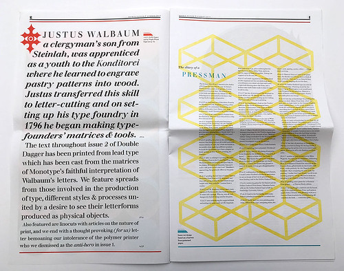
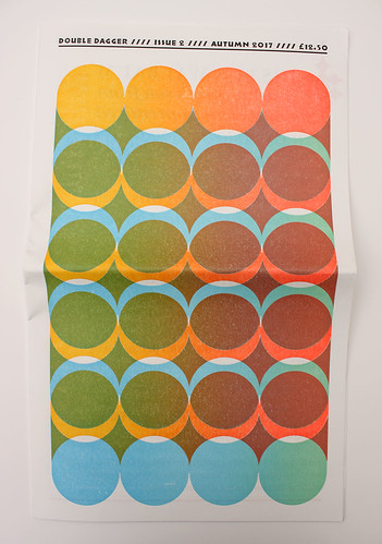
Double Dagger no. 2 (£12.50) is an occasional publication that is edited, produced and published by Pat Randle and Nick Loaring, cast on a Monotype Composition caster using two weights of Walbaum and printed letterpress at The Whittington Press (see ‘Man and machine’ in Eye 84). Contributors include Edwin Pickstone, Mark van Wageningen (see ‘Colour is the new black’ in Eye 94), Stanley Donwood and Kiva Stimac of Popolo Press.
Opening spread from Double Dagger no. 2.
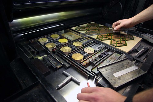
Thomas Mayo’s hexagonal wood type on press for the second issue of Double Dagger, 2017.
Stanley Donwood’s The Contagion of New Troy (2016), which fills the centrefold of Double Dagger no. 2.
Front cover of Double Dagger no. 2.
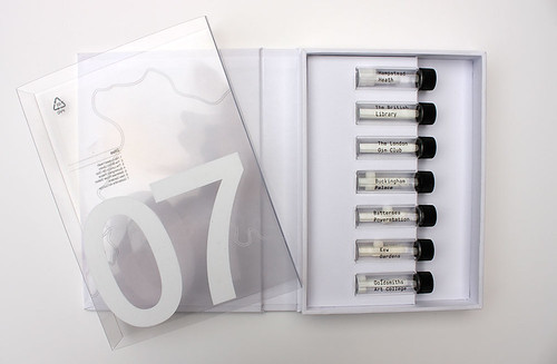
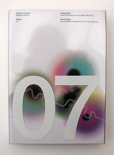
Process | Material sample no. 7 (produced by creative production house Nirvana) is a designerly box of not entirely fragrant fragrances from London. The scents carefully preserved in little sample bottles range from the smell of Goldsmiths Art College to the more delicious London Gin Club.
Nirvana’s ‘London in Seven Scents’, made in collaboration with ‘scentographer’ Amy Radcliffe and International Flavours and Fragrances (IFF).
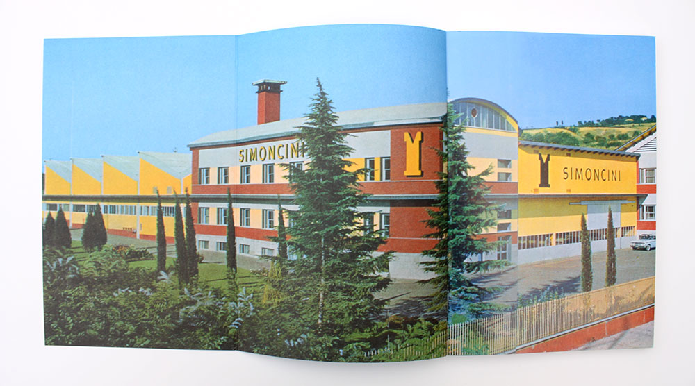
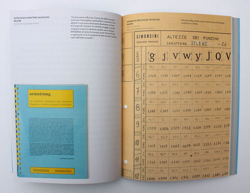
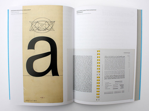
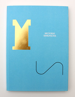
Metodo Simoncini is the catalogue (Ronzani Editore, €25) for the current exhibition ‘The Simoncini Method: In Search of an Aesthetic Whole’ Francesco Simoncini (1912-75) was a businessman and type designer whose company Officine Simoncini manufactured matrices for the Linotype system. He designed the typefaces Delia, Life and Selene, and presided over the production of many more, including Aster, Permanent and Garamond Simoncini.
Spreads and cover from Metodo Simoncini [The Simoncini Method], which accompanies the exhibition of that name in Bologna, Italy, published in Italian and English. The typeface Selene (right) was originally named Armstrong in tribute to the 1969 moon landing. Permanent (below right) was designed by Karlgeorge Hoefer.
Eye is the world’s most beautiful and collectable graphic design journal, published for professional designers, students and anyone interested in critical, informed writing about graphic design and visual culture. It is available from all good design bookshops and online at the Eye shop, where you can buy subscriptions and single issues.