
Friday, 10:49am
2 September 2011
Notes on a betrayal
A brief encounter with Monocle’s luxury stationery range
As a self-confessed stationery geek who gladly pays money every month to receive stationery goods from around the world via radandhungry.com, being asked to review two notebooks from the Monocle stationery range was like an alcoholic being told that Jack Daniels would like to send you a free case of Old No. 7, writes Brendan Dawes.
Monocle: stationery. Just imagining those two words sat neatly next to each other, no doubt in a sophisticated serif typeface, got me excited. If these notebooks were to carry the Monocle badge – a mark that stands for all things expensive and high-end – this was something to look forward to.
But for anyone who obsesses about such things, a new notebook brings with it problems, not least of which is guilt.
I’ve always felt it important to obsess about the tools I use, from the notebooks I jot ideas into and the pencils I use to do that jotting, right down to the pencil sharpener I use (a KUM Long Point). This stuff matters. Roald Dahl would only ever use the Dixon Ticonderoga 1388-2 pencil; animator Chuck Jones swore by the (discontinued) Eberhard & Faber Blackwing 602, a pencil I recently paid £20 for. And yes, I said pencil, not pencils.
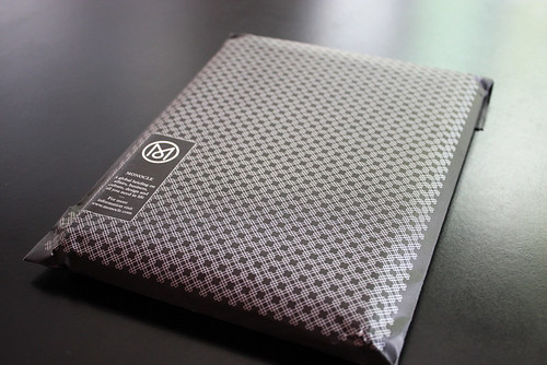
My notebook of choice for many years has been Field Notes. These American-made pocket memo books are beautifully manufactured and equally produced for use. So when I started to peel away the cellophane wrapping from the Monocle stationery, I felt as if I was about to indulge in some illicit yet glamorous affair.
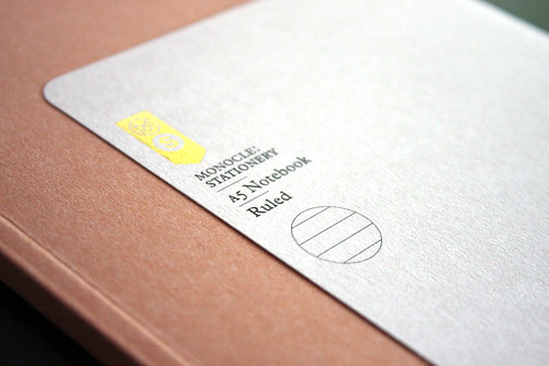
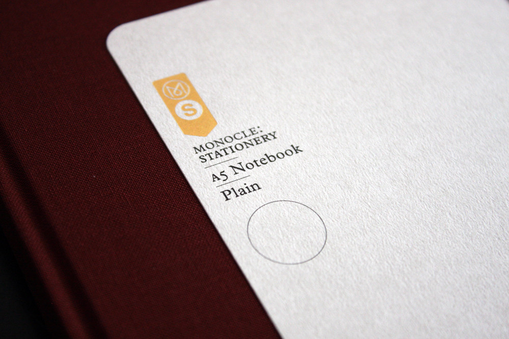
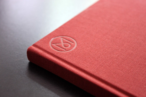
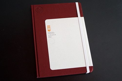
As expected, the Monocle notebooks are indeed beautiful. Both the A5 paperback and the hardback versions come with a slip of card folded around the covers featuring a gold embossed Monocle Stationery mark. On the outside, subtle circle iconography denotes the type of paper contained within (ruled, graph or plain), whilst inside are the details of its making.
To be honest I would have liked more details: what’s the typeface used, what kind of paper stock, what type of ink? These are the things that make Field Notes so special and I think they could equally sit well within these notebooks.
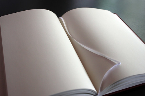
Everything about the Monocle Stationery line is subtle, understated and elegant. Though, and this is probably just a personal thing, these notebooks feel like they expect too much from me, as if the things I’m about to sketch had better be equally beautiful. What I want from my notebooks – these objects that capture my ideas – is to be beautifully made but, more than anything, to be utilitarian in their purpose. I don’t want to like I’m being judged as I haphazardly scribble a little idea.
Choosing a notebook is something that should never be taken lightly; you need to find something that will suit how you’re going to use it. My fleeting affair with the Monocle range was fun but Field Notes are made for me.
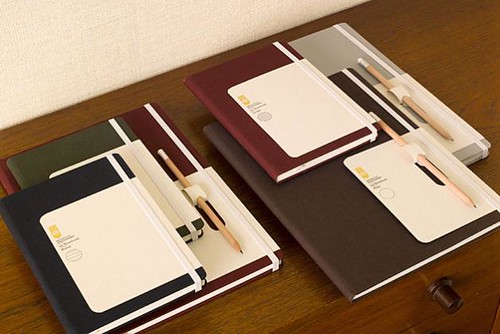
Monocle notebooks from £15 from shop.monocle.com/stationery
Field Notes notebooks fieldnotesbrand.com
Eye is the world’s most beautiful and collectable graphic design journal, published quarterly for professional designers, students and anyone interested in critical, informed writing about graphic design and visual culture. It’s available from all good design bookshops and online at the Eye shop. For a taste of the new issue, see Eye before you buy on Issuu. Eye 80, Summer 2011, is out now.
![]()