
Tuesday, 8:00am
26 April 2016
Offset 2016: day two
Matt Edgar
Angus Hyland
Russell Mills
Jonathan Barnbrook
Graphic design
Reviews
Typography
Visual culture
Angus Hyland, Tado, Russell Mills, Assemble, Piranha Bar, Jonathan Barnbrook and GMunk. Pam Bowman and Matt Edgar continue their coverage of the Dublin conference
The beginning of the Dublin conference’s second day, Saturday 9 April, was filled with adrenalin and expectation, write Pam Bowman and Matt Edgar.
Angus Hyland, Pentagram.
Top: Russell Mills.
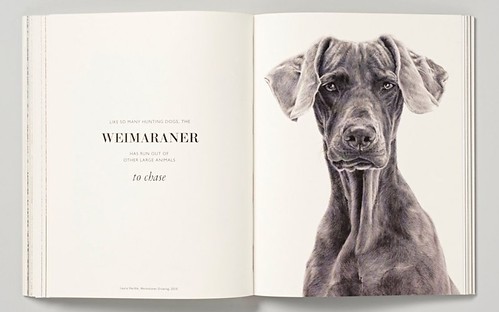
Spread from The Book of the Dog: Dogs in Art
By Angus Hyland and Kendra Wilson (Laurence King, £12.95).
Cover of The Book of the Dog: Dogs in Art.
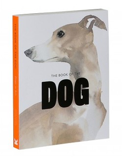
Pentagram’s Angus Hyland presented a body of work loosely themed around ‘Le Style Anglais’. An array of signatures by British Kings and Queens (and Cromwell) provided the prologue to a series of book cover designs for Penguin’s ‘Monarchs’ series. Hyland evoked ‘English craftsmanship’ through a number of projects, including an in-store publication for the luxury fashion brand Mulberry, that Hyland described as, ‘nostalgia and English surrealism punked-up’. A reworking of the identity for the William Morris society, The Book of the Dog for Laurence King and finally a limited-edition publication for the AGI congress completed the narrative.
Tado.
Sheffield duo Tado’s presentation began with this back story: ‘Neither Katie or myself have an entrepreneurial bone in our bodies. We decided to set up by ourselves more out of necessity. We realised that as illustration students who specialised in drawing panda bears with tits, there probably wasn’t much of a job market for doing that full time. So we decided to create our own destiny, create our own jobs and we were ready to take on the world at that point.’
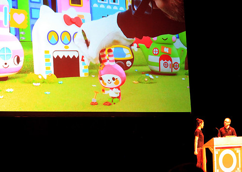
Hello Kitty x Tado, Pomme Party, 2014.
Tado’s work was laced with influences from Oliver Postgate and Peter Firmin (see ‘Storytelling on a shoestring’ on the Eye blog) to Hayao Miyazaki. Recent work for Ikuko Shimizu’s character Hello Kitty, commissioned by Sanrio, saw their work move into stop-frame animation for the first time. Armed with an Animation for Dummies guide, a lasercut set and hand-crafted characters, the couple spent two months crafting the short film to celebrate Hello Kitty’s 40th anniversary. The resulting work was put on show last year in Los Angeles at the Japanese American National Museum.
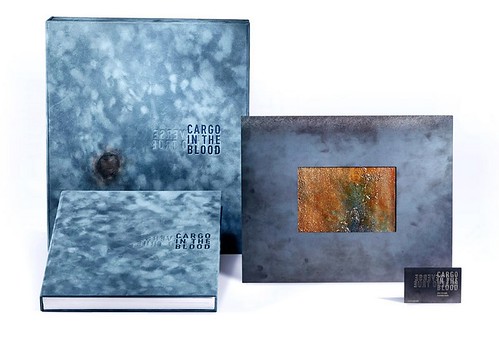
Cargo In The Blood by Russell Mills and Nine Inch Nails.
Russell Mills (see ‘Material and metaphor’ in Eye 05) made connections between the graphic marginalia of Laurence Sterne’s Tristram Shandy, the dada collages of Kurt Schwitters and music: ‘Everything we do is a form of collage.’
Mills showed illustrative work spanning 30 years – including book covers for Ian McEwan, Milan Kundera, Peter Ackroyd and Samuel Beckett – that mixed metaphor and abstraction and captured the tone of the writing. This ability to filter and channel the central themes of an author or artist are most commercially visible in his packaging for Nine Inch Nails. Mills talked through their most recent collaboration Cargo In the Blood, developed off the back of Nine Inch Nails’ 2013 album Hesitation Marks. The project involved setting up a studio in a warehouse in Los Angeles to develop a series of huge canvases that were then cut into 2000 6x4-inch pieces that became part of a limited-edition book.
Assemble.
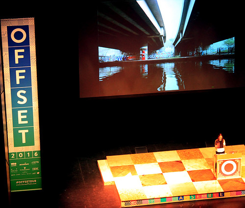
Assemble’s revival of the Granby Four Streets won the London collective the 2015 Turner Prize and founding member Paloma Strelitz represented the collective in Dublin. The Tate declaring the project ‘contemporary art’ was remarkable especially given that the collective includes architects and designers. Strelitz spoke about developing Granby Rock in the Granby workshop, a composite of Toxteth demolition detritus and showed projects such as 2011’s Folly for a Flyover in Hackney Wick and 2013’s Baltic Street Adventure Playground. There were links between Strelitz’s presentation and the work shown by Morag Myerscough the previous day.
Piranha Bar, Offset 2016 main titles.
Piranha Bar had the responsibility of creating this year’s titles for the event and said, ‘when we started talking to Offset about the idea of creating titles for their 2016 conference in Dublin, our heads literally exploded!’ Despite such hazards, it looked like they had a lot of fun.
Jonathan Barnbrook at Offset 2016.
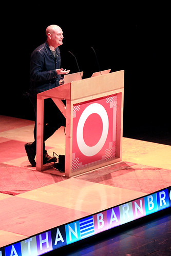
Jonathan Barnbrook bookended his talk with his work for the late David Bowie, most recently, his graphic design for ★ [Blackstar].
‘I didn’t know how ill he was, I went to meet him in New York last June … we listened to the album together, he played it on Skype, he watched me while he played it on Skype! It was a serious relationship, we both knew we had to do something different on every album, but it was a fun one too, I’ve got so many emails from him with “in” jokes and that kind of thing, and he didn’t take himself seriously, that was one of the best things, we could have a joke.’
Vinyl album artwork for David Bowie’s Blackstar, 2016, designed by Jonathan Barnbrook.

Part of a collection of Blackstar artwork elements released by Barnbrook for fans to download and use ‘in the spirit of openness and in remembrance of David [Bowie]’.
Barnbrook also talked through projects ranging from his design of the identity for the occupy London movement, an installation for last year’s Banksy-curated ‘Dismaland’ and his typographic practice.
Barnbrook revealed the macro and micro nature of his process and output, asserting, ‘you can represent utopia in a typeface’, an interesting remark from a designer whose work includes some beautifully dystopian themes. Barnbrook also talked of getting older and said, ‘sometimes it’s better to be kind than right’. There was a softening and tangible sadness at the passing of a personal and professional relationship with Bowie, but the English punk and playful wit persist, as do his social and cultural values.
GMunk.
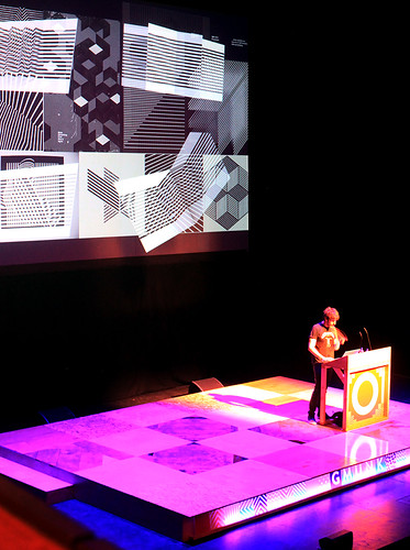
GMunk is a strange one. In the middle of an idiosyncratic presentation that must have included some 900 slides, presented at breakneck speed, was a title sequence designed for the OFFF Cincinnati conference, 2014. Towards the end of the sequence was a 3D typographic model comprised of foot high characters of his nom de plume. The type was illuminated and then covered with what appeared to be a luminous and viscous ejaculate, poured provocatively in pornographic slo-mo. Spunk on the GMunk, if you will.
GMunk, OFFF Cincinnati, 2014.
The result was hilarious and grotesque, reminiscent of the early work and inspiration of Chris Cunningham [see ‘Expert flesh creepers’ in Eye 57). Other influences, such as that of former employer Kyle Cooper (see ‘Every frame counts’ in Eye 66), can be seen in the range of GMunk’s in-camera techniques. Software is obviously important but much of the work is crafted outside the computer, employing LEDs and electronic sequencing devices to create depth of field and spatial complexity. His fascination with moiré, pattern and structure is clear and can be seen in his Instagram collection (@gmunk). Highly collaborative and fuelled by a restless playful drive, the output is prolific. GMunk also wins the prize for the most effective use of animated gifs, in a weekend of presentations that were peppered with them.
See ‘Offset 2016: day one’ on the Eye blog.
Offset director Bren Byrne.
Pam Bowman, Subject Group Leader, Visual Communication, Sheffield Hallam University
Matt Edgar, Course Leader, BA (Hons) Graphic Design, Sheffield Hallam University
Eye is the world’s most beautiful and collectable graphic design journal, published quarterly for professional designers, students and anyone interested in critical, informed writing about graphic design and visual culture. It is available from all good design bookshops and online at the Eye shop, where you can buy subscriptions and single issues.