
Tuesday, 12:21am
22 March 2011
Out of office
A few words about Birmingham’s Type Writing Symposium
It’s not often I take time out of the studio to do some proper thinking and learning but last Wednesday was different, writes Katie Parry. I attended ‘Type Writing’ a one-day symposium organised and curated by Dr Caroline Archer of The Typographic Hub, a Birmingham City University research centre which works to promote the history, theory and practice of typographic design. An event about typography on my doorstep? How could I resist?
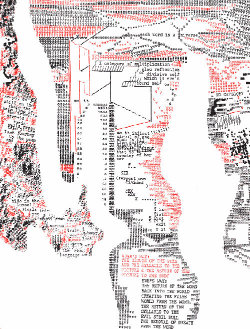
Top: Steven McCarthy (University of Minnesota) explored the work of concrete poet Steve McCaffery, in particular, Carnival.
Thirteen speakers from the UK, Netherlands, Denmark, US and New Zealand explored ‘the link between typographer and the writer of words’, with each person interpreting this theme in a different way, which made for a wildly diverse range of topics and presentation styles. Even breaks between lectures were brimming with typographic treats in the accompanying exhibition.

Above: Detail of Virginia Woolf Triptych by Nicky McNaney and Tracy Allanson-Smith – part of the ‘Type Writing’ exhibition.
With Juliette Kristensen’s ‘Talking Boards, Writing Machines: Ouija boards, index typewriters and the ventriloquism of agency in the fin-de-siecle’, we were lured back to the late nineteenth century to explore the emergence of the ‘index typewriter’ – a beautifully complex machines, operated by using one hand to select a letter with a pointer while the other hand is used to push a lever, pressing type on to the page.
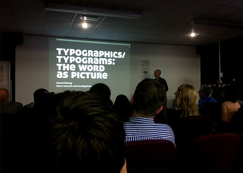
In contrast, Henrik Birkvig (above) from the School of Media and Journalism in Denmark told us of his search to find the correct name for ‘a design in which one or more letters of a word are replaced with a picture, in an attempt to enhance the word’s meaning’. Settling on the definition ‘typogram’ we were drawn into an obsessive yet witty examination of Birkvig’s 192-strong collection, including an analysis of which letters are most often modified (letter ‘O’ was no. 1) and a tally of good vs. bad typogram design.
Effective design is clearly important to Gregg Bernstein, who’s been paying close attention to the things most of us ignore. He’s taken it upon himself to redesign the clickwrap User End License Agreement (UELA) used by iTunes, and discussed how use of clear, considered design can turn overwhelming strings of legalese into elegant, useful and understandable pieces of information design.
Until last Wednesday, I’d forgotten the value taking time to learn new things – unexpected things, unrelated to specific projects, the joy of listening to people enthuse about subjects close to their hearts and the sense of freedom you get from doing something out of the ordinary.
I’d like to thank each of the ‘Type Writing’ speakers for reminding us what ‘inspiration’ means.
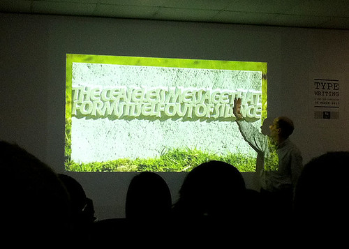
Below: Letter-carver John Neilson discusses his work.
Speaker list: Steven McCarthy (University of Minnesota); Juliette Kristensen (University of Kingston); John Neilson (Letter-carver); Mathieu Lommen (University of Amsterdam); Kathryn Moore (Landscape architect and writer); Alex Lazarou (Designer); Henrik Birkvig (School of Media and Journalism, Denmark); Jessica Glaser (University of Wolverhampton); Ben Waddington (Local historian); Sarah Maxey (Artist and illustrator); Gregg Bernstein (Georgia State University); Rachel Marsden (Artist); Borja Goyarolla (Will Alsop RMJM).
Keep an eye on www.typographichub.org where the ‘Type Writing’ presentations will be uploaded over the coming weeks.
The Typographic Hub, Birmingham Institute of Art & Design, Birmingham City University, Corporation Street, Gosta Green, Birmingham B4 7DX.
Katie Parry is Creative Director of Birmingham-based design agency Supercool, www.supercooldesign.co.uk.
Below: Mathieu Lommen’s presentation included this original Jan Tschichold sketch of his first published typeface Transito (ca. 1929) – part of Amsterdam University Library’s typographic collection.
Eye is the world’s most beautiful and collectable graphic design journal, published quarterly for professional designers, students and anyone interested in critical, informed writing about graphic design and visual culture. It’s available from all good design bookshops and online at the Eye shop, where you can buy subscriptions, back issues and single copies of the latest issue. For an extensive (if so far incomplete), text-only archive of articles (going back to Eye no. 1 in 1990) visit eyemagazine.com. For a visual sample, see Eye before you buy on Issuu.