
Wednesday, 8:00am
6 July 2011
Permutations in colour
Exploring the dramatic possibilities and problems of overprinting
Since 2007, final year BA students in the Department of Typography & Graphic Communication, University of Reading, have been able to select a module called ‘Design and creative print production’, writes Eric Kindel.
The module grew out of a series of articles I wrote for Eye between 2002 and 2006 dealing with features and techniques of design for print (see, for example, ‘Worlds of moiré’ in Eye 52 or ‘Cheap Jack Flash’ in Eye 60).
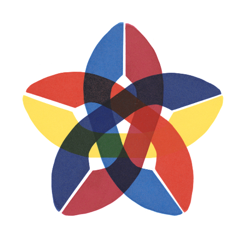
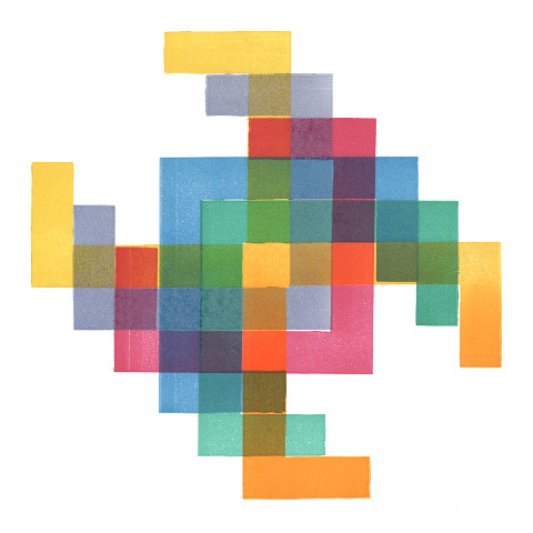
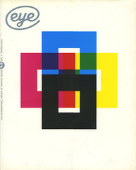
Top: Charan Aujla, 2011
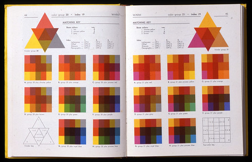
The first article in the series, ‘When 1+1=3’, looked at colour overprinting. It reviewed publications that explained and demonstrated how designers could exploit overprinting to various ends. One book I featured was Donald E. Cooke’s Dramatic color by overprinting (1955/1974). In it, Cooke demonstrated the overprinting permutations of 11 separate colours, in 3- and 4-colour groups. The results required 165 pages to show in full, and were a production tour-de-force.
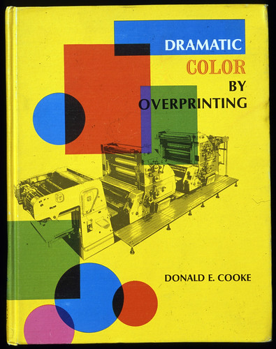
>Above: Dramatic color by overprinting, cover (1955/1974)
Below: Spread with colour configurations
When I came to write one of the briefs for the new module, I returned to Dramatic color by overprinting for inspiration. The brief that was written, ‘Permutations in colour’, asked students to create a configuration of multiple, separate colours, each to be printed consecutively on a letterpress proofing press. The configuration had to show each colour on its own and how it overprinted each of the others. The first time I set the brief, I asked students to use eight Pantone basic colours, straight from the ink tin. This proved a bit too ambitious and I later reduced the number to six, and this year to five.
When students first get started on the brief, they typically devise configurations of considerable complexity, partly the result of visualising with software applications like Illustrator. On reflection, they realise just how difficult these solutions would be to execute, whether in making the print elements, or in achieving accurate colour registration through the sequence of impressions. Such difficulties focus their thinking on how to reduce or mitigate complicating features.
A notion of efficiency comes into play, as students advance toward solutions that are neither more nor less than what the brief asks for. They see that the brief can be solved programmatically, using a single, repeating element. Effective solutions multiply the element into a configuration that is easy to grasp, that shows an good amount of each colour on its own and as it overprints the others, and that allows some latitude in registration so that inaccuracies are not unduly obvious or distracting.
Above: Nicola Shenton, 2008.
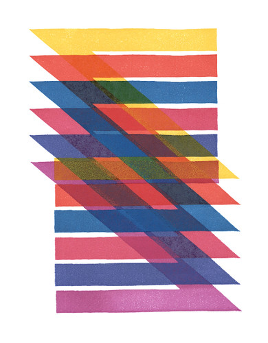
Over the first few years the brief was run, the students nearly all approached the problem through translation, where the print element was repeatedly shifted, or ‘translated’, across the paper in precise increments (i.e. by moving the element across the press bed, or the paper along the gripper, or both). A typical print element was one created by setting two pieces of type-high spacing material into an L-shape; it neatly solved the problem and produced good results. Students soon developed variations on the theme, some of which required cutting the print element from lino instead.
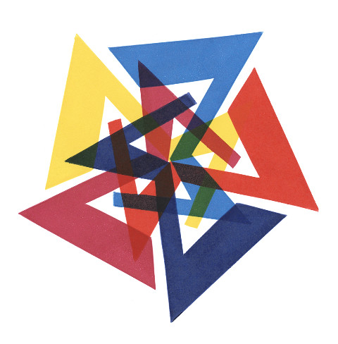
Above: Joe Thompson, 2009.
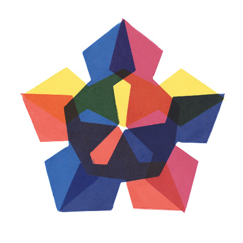
One year a student realised that the brief could also be solved through rotation. Here the print element was simply turned incrementally through equal segments of a circle that were the same in number as the number of colours being printed. While in both instances, translation and rotation, the overprinting requirement was satisfied, the rotation generated an intriguing composite design as well.

Above: Marcus Murphy, 2008.
This year, I was much encouraged by excellent work done by all the students on the module. Despite it contributing only a small fraction to their overall degree result, they attacked the brief with real enthusiasm, perhaps another sign of the continued fascination print holds for students. Among them, rotation was the preferred approach. And while some addressed the details of the brief more fully than others, they all made work that I never tire of contemplating.
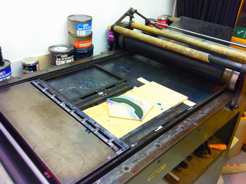
Above: Proofing press with print element (Aujla, see top), 2011.
Below: Tom Derrett, 2011.

Above: Rebecca Kirby, 2011.
Below: George Bevan, 2011.
You can read Eric Kindel’s original article ‘When 1+1=3’ in Eye 43, still available as a back issue.
Below: CMYK colour overprinting demonstration, created for Eye magazine by then creative director Nick Bell (UNA London), 2002.
Eye is the world’s most beautiful and collectable graphic design journal, published quarterly for professional designers, students and anyone interested in critical, informed writing about graphic design and visual culture. It’s available from all good design bookshops and online at the Eye shop. For a taste of the latest issue, see Eye before you buy on Issuu. Eye 80 will be out later this month.