
Sunday, 5:22pm
20 May 2012
Photo finish

Bike app brings black, cream & red-blooded photo-reportage to the iPad
Following the trend toward towards beautifully designed and illustrated publications for cyclists (see ‘Two wheels good’, my article in Eye 77) comes The Collarbone, a ‘pro-peleton photo-reportage’ journal for the iPad, writes John Ridpath.
Developed by brand and design studio Scheybeler+company, The Collarbone is a collaboration between designer Luke Scheybeler, co-founder of the cycling clothing brand Rapha, and photographer Camille Mcmillan, photographer and writer for The Times and former editor at large at Rouleur.
Top: Women’s world cup cyclocross Koksijde, Belgium. Photograph by Camille McMillan.
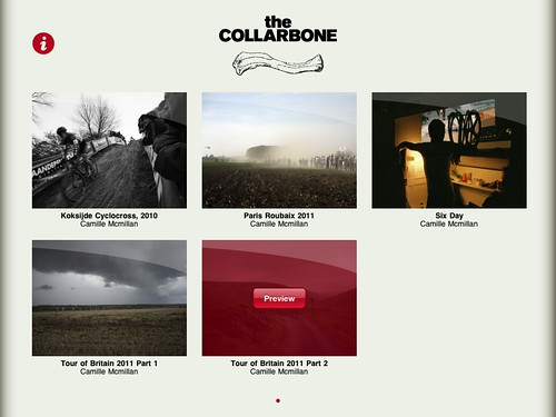
For Scheybeler, The Collarbone is less a magazine and more a ‘cross between a photo journal and a sticker book’. That is echoed in the interface, which has been deliberately designed with the look and feel of a Panini sticker book, emphasising missing content from the main page. ‘We hoped people would want to fill the gaps,’ says Scheybeler.
John Ridpath: Where does the appetite for this kind of cycling publication come from?
Luke Scheybeler: Well, the whole sport has become more sophisticated and design-aware. We were trying to shake up the industry with Rapha and Rouleur, and, certainly from a design and storytelling perspective, we’ve made a huge mark.
Other brands contributed enormously to this, too. Things like the Tweed Run are helping to bring foster participation and inclusiveness as well as a sense of style to city riding.
The Skoda commercial from last year’s Tour, it totally nailed the chaos and messiness of road racing … it’s a brilliant piece of film-making.
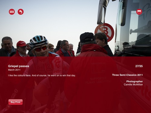
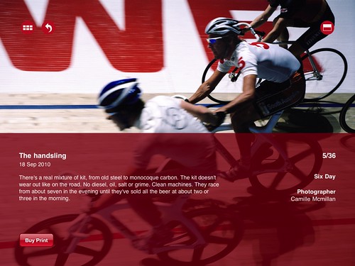
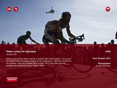
Road racing has more visceral raw material than the shiny, sterile, floodlit, corporate worlds that most sports now inhabit. Cycling is imperfect and messy. It’s raced on open roads. Riders dodge parked cars, dogs and broken glass. The backdrop is raw and wild, the High Alps, or Flanders, or the Massif Central. Contrast this with the synthetic commerciality of carbon and lycra, and you have all the ingredients for amazing imagery.
JR: For Andrew Diprose (of The Ride), the aesthetics of cycling are a big part of the experience. How do you feel about the link between the craft of bicycles and the craft of design?
LS: Of course there are parallels. Bikes are simultaneously engineered machines and cultural stylistic statements. When we launched Rapha, cycling was still very geeky, the clothing was unappealing and the pro scene was very one-dimensional. So we plundered the sport’s history for inspiration.
A lot of the type I did at Rapha was inspired by post-war commercial graphics, the sort of stuff you’d get on a jersey. The Rapha logotype, the condensed sans-serif, it’s all quite comfortable and nostalgic, but also had an established premium feel.
JR: In terms of design, what was the route to the finished product?
LS: The longest process was coming up with the name. We took it from about 1000 ridiculous possibilities to about ten realistic options and then sat on it for about two months. When we came back to the list I was convinced that The Collarbone was right.
It sounded like it was a brand already, but no one had used it in cycling, which was very surprising. It’s obviously relevant to the sport – in an insider’s kind of a way – you have to know that it’s the bone that cyclists always break.
We didn’t hang around exploring too many different design routes. In terms of the identity, we used very heavy Akzidenz Super, contrasted with a delicate sort of medical textbook illustration. Fragility with weight, solidity and lightness.
If you’re first to market, pick red, it’s the strongest colour – that’s what Al Ries said, right? Red, black and cream. Bone and blood. It’s a little dark.
The Collarbone iPad app is available, free, from the iTunes App Store.
Eye is the world’s most beautiful and collectable graphic design journal, published quarterly for professional designers, students and anyone interested in critical, informed writing about graphic design and visual culture. It’s available from all good design bookshops and online at the Eye shop, where you can buy subscriptions and single issues. Eye 82 is out now – you can browse a visual sampler at Eye before you buy on Issuu.