
Tuesday, 3:45pm
7 July 2009
Photo realism
Penguin use Magnum archive stock to make reportage desirable
Publishers these days are all a-jitter at the prospect of a digital future, writes Robert Hanks, when people will download their books rather than buying old-fashioned paper. They’re probably overreacting – it will be hard for digital readers to compete with something as cheap, sturdy and easy to use as a paperback – but Penguin has been showing the right way to react to the supposed crisis: make the physical object much more desirable.
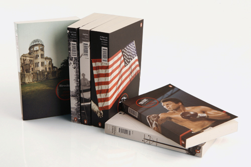
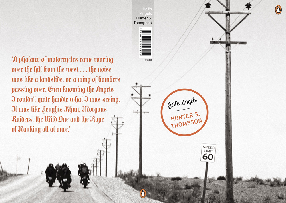
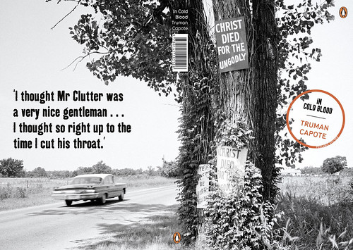
Their latest initiative is Penguin Magnums, a series of six classic or nearly classic works of reportage, with classic-looking photojournalism covers from the Magnum archives - though the boast is that none of the images has been published before. They are striking to look at, individually and as a set, though the front of Hunter S. Thompson’s Hell’s Angels (top, photo by Dennis Stock) and Truman Capote’s In Cold Blood (below, photo by Inge Morath) are a bit too similar – black and white studies of desolate, anonymous American landscapes.
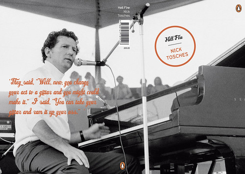
What’s most striking is that the front is quite deliberately only half the story, or less: the image wraps right around the book and in several cases it’s only the back cover that makes sense of it. Andrew Chaikin’s account of the Apollo missions, A Man on the Moon, features a looming stars and stripes against a perfectly black background: you have to turn it over to see the spacesuited astronaut holding the flagpole and saluting (this isn’t, by the way, an actual moonshot, but was taken by Rene Burri at a dismantled space installation - possibly the very one where the moon landings were faked). The front of Nick Tosches’ Hellfire (below) shows part of a piano and a microphone stand: you have to turn it over to find out that the pianist, and Tosches’ subject, is Jerry Lee Lewis.
In a couple of cases the turn doesn’t finish the story but it does add a dimension: the front of the Capote is dominate by a tree covered with posters announcing ‘Christ died for the ungodly’ and ‘Ye must be born again’; the back reveals what’s happening beyond the tree, a sleek Fifties saloon car speeding down the highway - a fabulous contrast between narrow American dogmatism and wide American freedom.
It looks, then, as if this really is the book as a complete object, designed to be seen in the round. There are other nice touches: on the back is a debossed block of text, each book in a different font; on the front, the title is printed on a removable sticker, so that you can clear the image completely. But – a big but – the bar-code is printed at the top of the spine, so that when these sit on your shelves (as opposed to being strewn artistically around your living room to impress guests) they look distinctly ugly; couldn’t they have put it somewhere less conspicuous - even at the bottom of the spine? And when you open them, it is clear the books have been photostatted from older editions - the typefaces are distressingly uncoordinated. A book to be seen not in the round, then, or even from inside; but stick to the front and back and they’re gorgeous.
See ‘Artwork and play’, Robert Hanks’s article about Brian Knight’s ‘Airfix art’ in Eye 72, ‘Advertisers in the dock. Again’ for the Eye blog, and his own blog, Zoo in the head.
See details of the The Penguin Magnum Collection on the Penguin website.
NB: The Penguin Magnums are contenders for the book cover category of Just Add Stock, Eye’s new awards for the use of stock photography. But only if they enter before 31 July 09. Follow the awards on Twitter.
Eye is the world’s most beautiful and collectable graphic design journal, published quarterly for professional designers, students and anyone interested in critical, informed writing about graphic design and visual culture. It is available from all good design bookshops and online at the Eye shop, where you can buy subscriptions and single issues.