
Monday, 9:00am
11 April 2011
Power of the ruling pen
David Gentleman’s graphic poster campaign for Stop the War
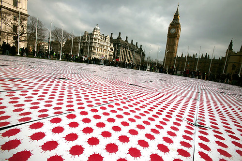
Placards have always been a powerful visual medium for demonstration and protest. A team from Goldsmiths, University of London, asked anti-cuts demonstrators at the recent London march to donate theirs for preservation in the Museum of London’s collections (see the group’s Facebook page for images and more information).
For Eye 78’s Reputations article, editor John L. Walters interviewed designer-illustrator David Gentleman. His graphic work for the ‘Stop the War’ campaign is possibly his most widely known work from recent years – and, as Gentleman told Eye in conversation, ‘it was also a surprise for people who associated me with rather staid spheres!’
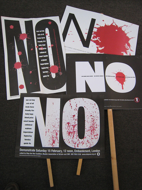
Top: Placards and posters from various marches. The lower one was flyposted to announce the first march in Feb 2003. ‘It would have been the final placard,’ says Gentleman, ‘but for technical reasons the printer would have had to leave a white border round it, so it was changed to black type on white and made in upright format in case it rained – the horizontal one would have flopped about.’
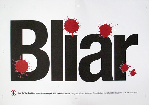
Below: The ‘Bliar’ anagram was Gentleman’s idea. ‘It took me a while to dare to use it,’ he says, ‘because Blair was still prime minister at the time, and I thought: “is this really a good career move?”’
The job came about through his book A Special Relationship, made around 25 years ago. His wife Sue Gentleman remembers the controversy that work caused: ‘The Evening Standard or someone published a headline “No longer a gentleman”!’ As Gentleman explains, the Iraq war reawakened his political drive:
‘I’d inherited my Dad’s automatic leftiness but I’ve never committed like the people I’ve met in Stop the War, whose lives seem wholly dedicated to the cause. At the back of A Special Relationship there are people carrying “NO” placards. When it began to look as if the war in Iraq was imminent, I made a simple “NO” and stuck it over press photos of people on a march, so that it looked very legible.’
‘I sent it to CND a week before the march saying would you like to use this? Not surprisingly, I never heard anything back! After another march, six months later, I saw Tony Benn and asked him who should I send such an idea to, and he told me about the Stop the War Coalition. They got the designs printed fantastically quickly. They used East End Offset, which had been Private Eye’s printer. Phil Whaite, an excellent freelance typographer / designer, helped me with the computer side.’
Below: Posters and banners for Stop the War Coalition, 2003-present. ‘The blood splat was made with red watercolour dripped from a ruling pen held at shoulder height on to good, hand-made watercolour paper,’ says Gentleman.

See full text of Reputations interview with David Gentleman in Eye 78.
See also ‘Fixed compass’, about Gentleman’s identity for British Steel on the Eye blog.
Eye is the world’s most beautiful and collectable graphic design journal, published quarterly for professional designers, students and anyone interested in critical, informed writing about graphic design and visual culture. It’s available from all good design bookshops and online at the Eye shop. For a taste of no. 78, see Eye before you buy on Issuu. Eye 79, Spring 2011, is out now.