
Tuesday, 4:12pm
11 October 2011
Red top
The Independent gets a ‘friendly’ facelift for its quarter century
The Independent’s fourth redesign in three years greeted readers of the UK daily this morning. Abandoning last year’s more subdued style, the tabloid newspaper, first published just over 25 years ago as a broadsheet, now makes more use of colour and bold type, writes Alexander Ecob.
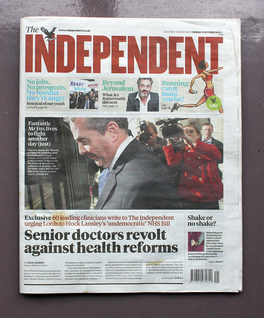
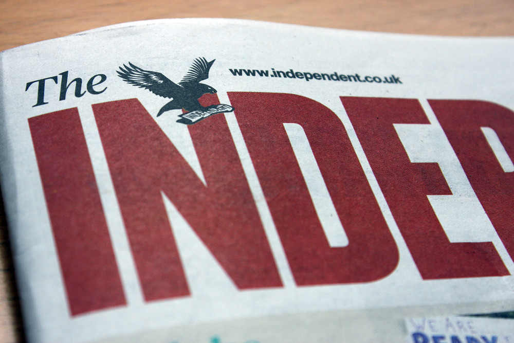
Above and top: Cover of the new redesigned issue (11 October 2011) showing new masthead.
Most jarring may be the switch to a bold condensed sans masthead. Editor Chris Blackhurst has said: ‘The masthead is bolder – still the Independent, complete with eagle, but now more striking and harder to miss …’ On Twitter, commenters have already likened it a Russian newspaper or the Socialist Worker.
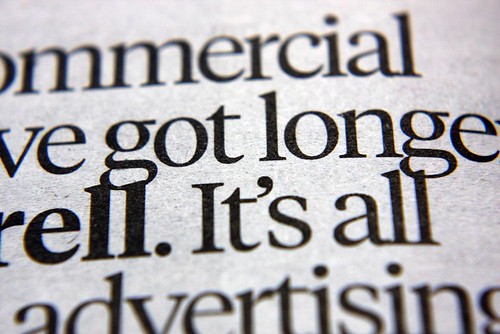
Blackhurst also says that ‘The body typeface and headline fonts we use have been made more readable’. The serif face is Tiempos (designed by Kris Sowersby, see Reputations in Eye 79) while the masthead and additional sans type is set in ‘Knockout’ by Hoefler & Frere-Jones.
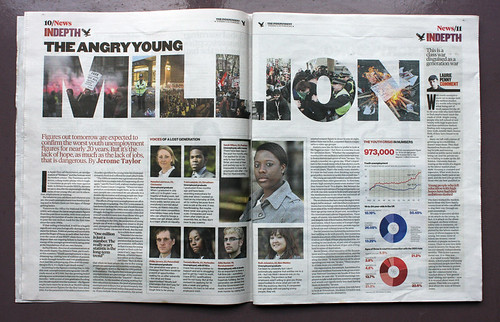
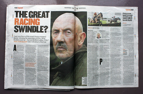
Elsewhere, the newspaper hops between a dense news layout with bold headings and thick rules – a device which could be deemed to give the paper a retro feel – and a more magazine-like approach, with large, occasionally illustrated headings.
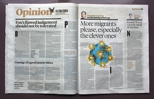
Above and below: spreads from today’s Independent.
Blackhurst concludes his letter saying: ‘The result, I hope, is a modern, confident, dynamic, sharper paper – one that remains exactly true to its original values but is now a friendlier, less daunting read.’ The extended use of colour and informal layout may make the newspaper more accessible, but I’m curious about the characterisation of endless condensed black uppercase sans as ‘friendly’.
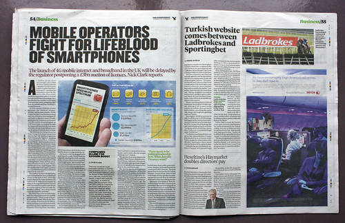
Above and below: The Independent’s ‘friendly’ new look.
The redesign has yet to extend to the Indie’s website.
Reaction to the redesign has been mixed, but Stephen Fry is positive, as is Independent writer Sam Wallace, who Tweeted: ‘I like it. I’m a red-top tabloid journalist.’
Read ‘Too gaudy for words’, Rick Poynor’s Critique about one of the Independent’s earlier redesigns (October 2008).
Eye is the world’s most beautiful and collectable graphic design journal, published quarterly for professional designers, students and anyone interested in critical, informed writing about graphic design and visual culture. It’s available from all good design bookshops and online at the Eye shop. For a taste of the new issue, see Eye before you buy on Issuu. Eye 80, Summer 2011, is out now. Eye 81 will be on press soon.