
Wednesday, 8:31am
9 February 2011
Seven-colour marathon
On press at Pureprint with Simon Esterson; printing the Eye 78 cover
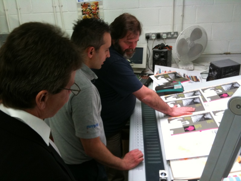
A few weeks ago I went down to Uckfield, to see Eye 78 on press at Pureprint (below, the printers formerly known as Beacon Press), where we have printed Eye since the magazine became independent in April 2008, writes Eye editor John L. Walters.
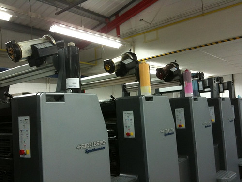
Art director Simon Esterson signs off each section of every issue, and the minders who run Pureprint’s Heidelbergs are unfailingly helpful and cheerful, making small but crucial adjustments to colour balance, ink flow, cylinder pressure and so on.
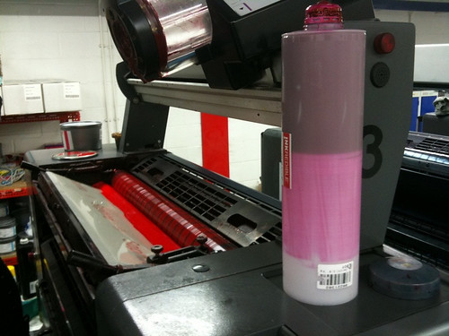
Eye uses several different paper stocks, so the parameters and priorities can change from section to section. Eye 78, however, presented the team with a couple of new challenges. This was the first time that colour images were to be printed on the yellow Solar stock. And it was the first time Eye had featured a seven-colour cover.

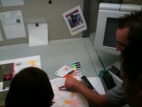
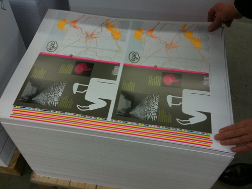
That’s the standard CMYK plus three special inks, two of them fluorescent (below).
The extra colours are there for editorial reasons. The cover is a detail of one of Joost Grootens’ beautiful maps, using the same colours specified when the original Atlas Of The New Dutch Water Line was printed by Lecturis in Holland. When I interviewed Joost for ‘Paper planet’, my Eye 78 feature about his work, he explained that he used ‘bright, almost shouting colours’ to show the defence systems of his water-dominated homeland.
In his new monograph I swear I use no art at all, he explains that ‘when studying a map in detail you want to be able to distinguish colour, not wade through a meaningless mush of halftones.’
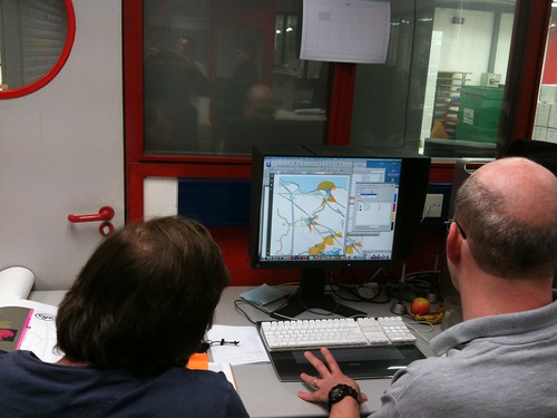
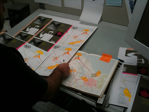
So it seemed both logical and necessary to show some of Joost’s work as close to his intentions as possible. Simon and art editor Jay Prynne used a detail of the original Illustrator file for the cover, removed the type, and specified the same colours for the Eye cover. However this was difficult to proof in the normal way: Eye’s digital proofs can’t really replicate the effect of the fluorescent colours.
Down at Pureprint, Simon and the minder inspected the first sheets from the machine and we compared them to the original book.
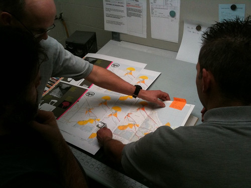
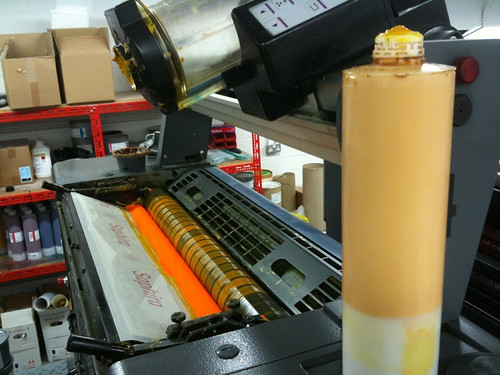
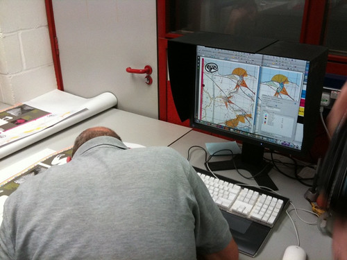
The ink colours were correct, but the density of the halftone screens was not. There was a problem in interpreting the original Illustrator file, so Pureprint’s repro team went to work adjusting the file (below) and remaking the fluorescent printing plates.
New plates arrived and the new sheets matched the original book.
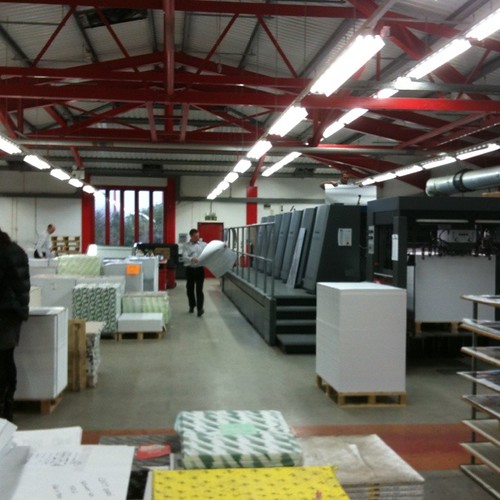
After a few final adjustments, the Heidelberg swung into noisy action.
There’s always something very moving and thrilling about seeing the fruits of your labours come off the press as physical objects, shining, colourful sheets of paper.
Simon stayed late that night and returned the following afternoon for an eighteen hour session passing all the remaining sections. I texted him late at night to ask how printing colour on the Solar had worked out. His reply was typically minimal: ‘Very alternative press ca. 1965.’
Now all those piles of paper have been cut, trimmed and bound, and are going all over the world as copies of Eye 78. And I don’t think we’ve ever had such a warm and immediately positive response to an issue as we’ve had to this one: it seems to have delighted old friends and supporters and drawn in lots of new ones, too.
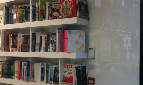
Below: Eye on display in the window of Artwords Bookshop 69 Rivington St., London EC2.
Eye magazine is published quarterly for professional designers and graphic design students. It’s available from all good design/art bookstores and online at the Eye shop, where you can buy subscriptions (for one, two or three years) and single copies with free shipping. For more about 78, see Eye before you buy on Issuu or the contents page.