
Tuesday, 11:45am
1 October 2013
Seymour and Milton
Seymour Chwast
Milton Glaser
Push Pin
Design history
Graphic design
Illustration
Posters
A poster show at Kemistry Gallery celebrates two founders of New York’s Push Pin studio
A current exhibition at the small Kemistry gallery in Shoreditch features posters by Seymour Chwast and Milton Glaser, two of the founders of New York’s celebrated Push Pin studio. We asked Kemistry founder Graham McCallum about his love for their work.
Eye: When and where did you first come across the work of Push Pin?
Graham McCallum: In those pre-Google days, the main source for discovering new work in the 1960s were the magazines Graphis and the German Gerbrauchsgrafik.
I’m pretty sure that’s where I would first have seen Push Pin’s work. Later, Milton and Seymour came to give a talk in London and they both seemed so cool. I remember Milton telling the audience that the secret to longevity in design was the Buddhist concept of continuously holding oneself in bud, but never actually flowering. That stayed with me.
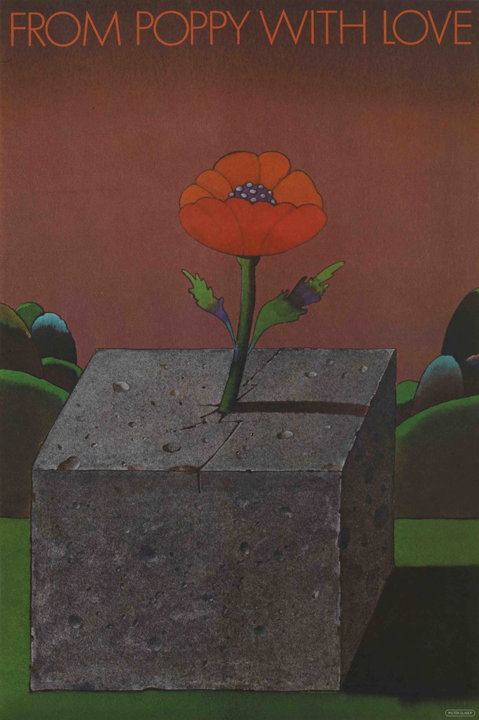
I was working in the BBC design department at the time and assistant to Hilary Hayton. She subscribed to the bi-monthly Push Pin magazine which used to arrive by post from New York. Later she gave me the whole set which are now on display in our exhibition at Kemistry Gallery. I also bought Milton’s poster From Poppy With Love from Habitat who had started selling posters and prints. That hung on my wall for many years alongside Peter Blake’s Babe Rainbow.
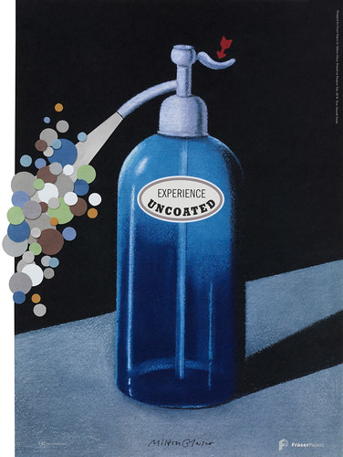
Milton Glaser, Experience Uncoated, 1999.
Top: Milton Glaser, From Poppy With Love, 1968.
Eye: How did it differ from other design and illustration of that time?
GMcC: There was a definite Push Pin style that was instantly recognisable. It was a bit like Lennon and McCartney, it was always a Beatles song regardless of which one had written it. It was the same with Milton and Seymour – their work was always Push Pin regardless of the author. The work seemed very American and there simply wasn’t anything like it going on that I can recall in the UK. That’s why they made such an impact.
Seymour Chwast, Muzeum Plakatu W Wilanowie, 2000

Eye: How influential were they in the 1960s and 70s?
GMcC: They were influential but their work was still generally unknown in the UK back then. It had to be sought out. One piece that did have a world influence is of course the ubiquitous, ‘I heart NY’ although most people who rip it off wouldn’t know its origins. The typeface Baby Teeth was also much used. Milton had designed it around a single ‘E’ he had seen in an advertisement for a tailor in Mexico City. The Bob Dylan poster, the one with the silhouette face and rainbow hair, also became available and set the style for pop musicians being seen as graphic icons.
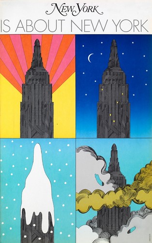
Milton Glaser, New York Magazine cover, 1967
Eye: What did people think of them? Were they controversial?
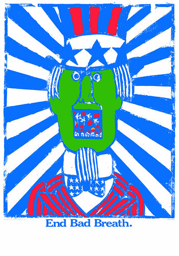
GMcC: Their work always had a liberal core but was hardly controversial. There are some anti-war posters but their work wasn’t targeted at government, more of the ‘Give Peace a Chance’ school of thought. We can all agree that war is a bad thing. I suppose the most controversial poster was Seymour’s Uncle Sam’ with a mouth full of bombs and the slogan. ‘End Bad Breath.’ I’m sure this hung on a thousand student walls alongside the Che Guevara posters. I think Seymour was aways the more political of the two.
Seymour Chwast, End Bad Breath, 1967
Eye: Was what they did relevant to your work at the BBC and elsewhere?
GMcC: Their work had a definite influence on me. Any young designer mops up the work of people they aspire to be. In those days with no internet, it wasn’t so easy, so Push Pin magazine was always a great source of ideas. There were others. Heinz Edelmann in Twen Magazine, Günther Kieser, Neil Fujita and Alan Fletcher were all influences … and still are.
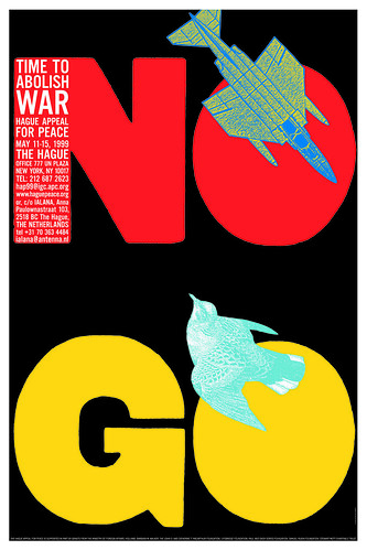
Seymour Chwast, No Go, 1999
Eye: Is the Push Pin approach / style / attitude still relevant?
GMcC: Yes. The most popular exhibitions we put on at Kemistry Gallery are the ones that feature designers from the past. Saul Bass, Lou Dorfsmann, Ken Garland and Alan Flecher among others, always draw huge interest – especially from young people. We get lots of student visits from universities, schools and colleges and it’s a joy to see them sitting cross-legged on the floor with their sketchbooks out, or taking photographs for future reference. The latest show promises to be one of our most successful, which is a tribute to the power of Milton and Seymour’s work, and the enduring quality of their talent.
‘The Seymour & Milton Posters Show’ continues at Kemistry Gallery, 43 Charlotte Road, Shoreditch, London EC2A 3PD until 16 Nov 2013. Open 10-6pm, admission free.
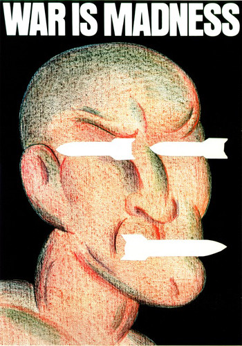
Seymour Chwast, War is Madness.
Eye is the world’s most beautiful and collectable graphic design journal, published quarterly for professional designers, students and anyone interested in critical, informed writing about graphic design and visual culture. It is available from all good design bookshops and online at the Eye shop, where you can buy subscriptions, back issues and single copies of the latest issue.