
Wednesday, 1:30pm
8 June 2011
Specimaniac

In praise of type specimens, old and new, with Veer’s Joe Newton
‘The business of ... lettering has now, under the spur of commercial competition, got altogether out of hand and gone mad’ – Eric Gill, 1930. That statement seems more true now than ever, writes Joe Newton.
There has been a resurgence of passion for typography in the last half dozen years, and a corresponding explosion of typefaces along with it. It is estimated that well over 100,000 typefaces are now available – and that’s just counting Latin-based languages. So how do you choose what to use? Until you load a font on your machine, how much can you really know about it?
Type foundries have long had an answer to this problem: the type specimen.
It is generally thought that the first specimen was created by Erhard Ratdolt in 1486; one of the best known was created by William Caslon in 1734 to showcase his foundry’s wares (top, image from Taschen’s A Visual History of Typefaces and Graphic Styles, see Gerry Leonidas’s review in Eye 77). These early specimens showed the literal point sizes and weights available and played a key role in the first renaissance of type design, fuelling the large-scale commercial expansion of type foundries by allowing printers to make informed decisions about what would have been extremely expensive products.
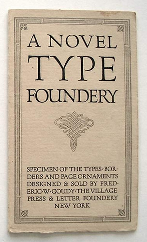
Type specimens flourished in the Victorian era, when the ‘artistic printing’ movement saw printers and type foundries trying to outdo each other with lavish ornament and colour. The trend continued through Art Nouveau / Arts & Crafts / Jugendstil, with designers such as William Morris seeking to infuse the ‘artistic’ into every aspect of design. And type designers such as Frederick Goudy (above) and Bruce Rogers brought a sense of decorative expression to their specimen work.
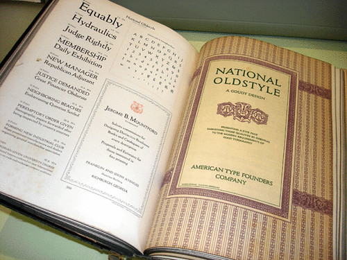
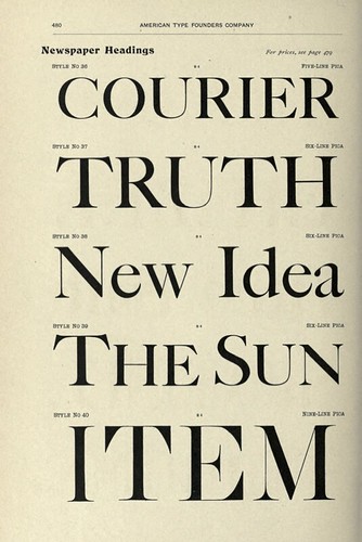
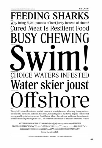
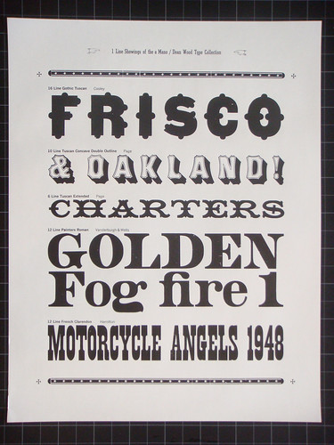
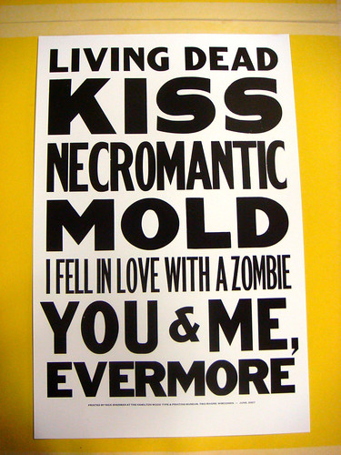
Traditional specimens, like those in the classic American Type Founder catalogues of the early 1900s (1923 and 1912 above), consisted of multiple pages per font family. Primarily words are chosen because they look exceptional in a particular font, but the best specimens take it a step further. David Berlow’s simple but classic specimens for Font Bureau (below) have helped revitalise the traditional form of the American Type Founders books of the 1920s . They evoke a simple poetry by playing gently on the idea of type in use, where the text seems to invoke the spirit of the face, creating a haiku of sorts (as Font Bureau’s Nick Sherman put it.)
Above and below: Type specimens by Nick Sherman (for more, see Flickr collection here)
My favourite modern example of old-school specimen wizardry is the beautiful booklet created by Nick Shinn for his Modern Suite super-family (above). The 160-page book obsessively documents every possible detail.
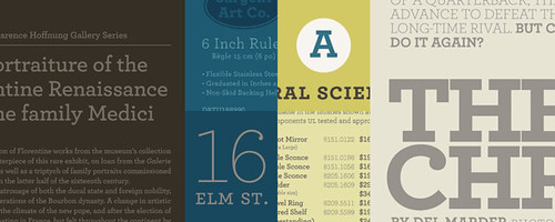
The best way to understand what fonts work for a given project is to see examples in use. The recently launched Fonts in Use website does just that. Many foundries demonstrate the same idea by making their own samples look as authentic as possible: Hoefler & Frere-Jones Foundry is particularly adept at this (below).
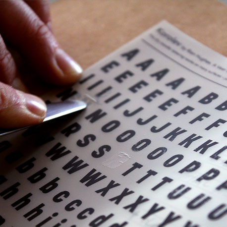
And finally, Veer (where I oversee the type collections) has a history of using type throughout all aspects of the business. We created old-school Letraset-style rub-downs to showcase our typefaces (above), and I’ve started adding colour to my specimens, pushing them closer to the way they might appear in the ‘real world’ (below).

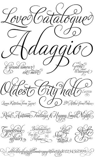
The specimen’s ability to highlight the best features of a font is especially valuable when dealing with complex OpenType fonts. A good one will pull out features buried deep in the glyph palette – consider the work of Alejandro Paul (below), whose elaborate scripts can swell to 1500 characters or more.
Joe Newton is Head of Type Collections at Veer.
See also ‘Deep in the archives’ in Eye 75 by Christian Schwartz and Paul Barnes.
Tell us about your favourite type specimens: from next month we’ll be publishing a regular ‘specimen of the week’.
Eye is the world’s most beautiful and collectable graphic design journal, published quarterly for professional designers, students and anyone interested in critical, informed writing about graphic design and visual culture. It’s available from all good design bookshops and online at the Eye shop. For a taste of no. 79, see Eye before you buy on Issuu. Eye 79, Spring 2011, is out now.