
Thursday, 11:00am
24 April 2014
The promise of information
Density Design
Santiago Ortiz
Marek Kultys
Petra Černe Oven
Barbara Predan
Frog Design
Roberta Tassi
Chiara Diana
Yosune Chamizo Alberro
Rob Waller
Stefania Passera
Ken Garland
David Gibson
Sue Walker
Andrew Boag
Isabel Meirelles
Design education
Graphic design
Information design
Reviews
The Information Design Conference 2014 brings together thriving information design communities from around the world. Mark Barratt reports.
This year’s Information Design Conference, held at RIBA in London on 7 and 8 April, was a bigger deal than the first, held 30 years ago at a fairly isolated campus near Milton Keynes. I was at both, writes Mark Barratt.
At first glance not much has changed. Both lasted two days and covered similar themes. This year’s were visualising information, design for health, storytelling, design crossing boundaries, signs and wayfinding, and ‘misc’. In 1984 there was more about typographic detail, lots more about presenting information on computers and, oddly, nothing at all about signs and wayfinding.
But back then, only one of the fifteen sessions was from a non-UK-based presenter. This year the 40+ presenters arrived from thriving information design communities in Spain, Mexico, Canada, Italy, India, Austria, Finland, Slovenia, the Netherlands, the US, Taiwan, Poland, Sweden and Norway. It is a larger, wider community.
There’s also more to look at. Information Design set out to change the world and in 1984 it was mostly selling a promise. Today it is delivering.
From Italy, Density Design’s ‘Raw’ Web application provides tools to help designers tell visual stories using large sets of raw data. And ‘visual data scientist’ Santiago Ortiz is exploring the potential of data visualisation to discover meaning from computer-stored data, entirely free from the malign promise of the ‘infographics’ movement.
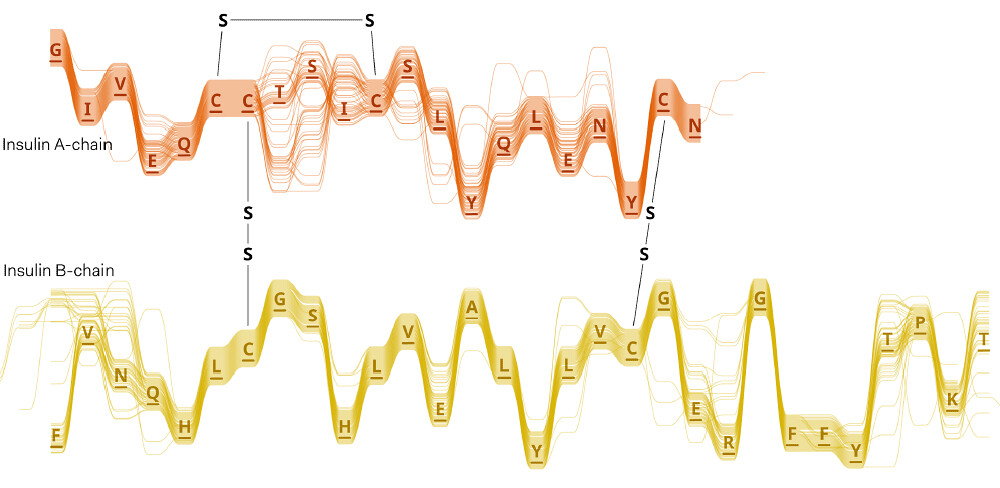
The stories can be powerful without being simple. At Science Practice, Marek Kultys and his colleagues have been developing tools to look at the way that protein structure and amino acid sequence can relate to the function of the protein, by comparing many proteins which, for example, have a similar function. The ‘sequence bundle’ diagrams they have developed help find functional patterns which can be used in making new drugs, among other things.
Character connections within an episode of Lost, intuitionanalytics.com/other/lostalgic/ .
Top: sequence bundles and sulphur bridges in insulin A and B from human and 53 other versions. Courtesy Science Practice, London.
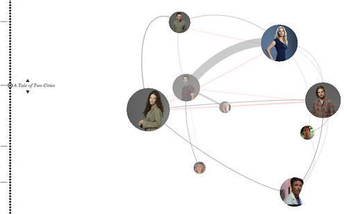
Santiago Ortiz’s work on visualising network interactions is properly bleeding-edge, exploring new kinds of visual story which can help reveal patterns in otherwise-opaque data – one example he showed was the scripts of the TV series Lost, showing that behind the seemingly-chaotic story lines and characters were – reassuringly – a lot of tangled links and story arcs.
This was reassuring because the threat from accomplished information design is the convincing lie, or the persuasive misunderstanding – a point emphasised in Michael Blastland’s keynote, ‘The Design of Evidence’. Blastland is a journalist involved in exploring statistics for a general audience. He believes designers need to know much more about the statistics that they present and focused on data that seems to tell one story but on a closer examination, tells another – or no clear story at all. (Blastland used a number of visual games from the Understanding Uncertainty website to illustrate useful ways of showing risk and uncertainty in statistical presentations.)
The need for designers to understand the context of their work and audiences appeared again and again in conference presentations. It is not a way of working that graphic designers, or graphic design education, have been good at, and perhaps goes towards explaining the fragmentation of the discipline into UX design, service design, co-design, interaction design and so on, as designers in specific fields understand that they cannot do their jobs without understanding both the users and the makers of the tools they help shape. From Slovenia, Petra Černe Oven and Barbara Predan showed how they are uniting information and service design through publications and education practice.
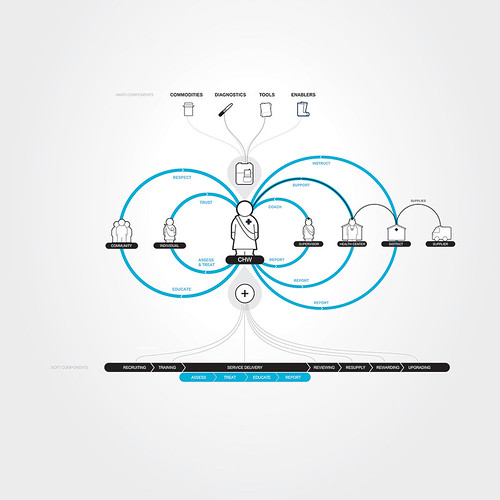
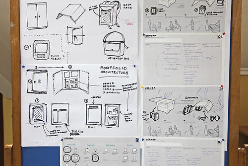
Frog Design’s Roberta Tassi and Chiara Diana walked through the development of a health worker’s ‘backpack’ of graphic tools and packages that will only work if it coordinates the work of multiple governments, NGOs, logistics chains and drug companies to deliver a single coherent set of tools for health workers and their clients in poor countries.
Users, logistics, tools and processes: the Backpack Plus needs to satisfy all of them. Picture courtesy Frog Design.
Sketching the future: a Backpack Plus for community health workers in Africa. Picture courtesy Frog Design.
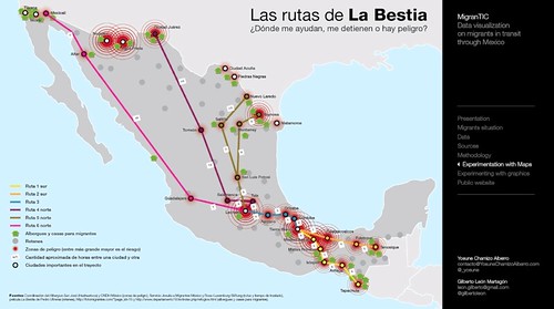
Meanwhile in Mexico, Yosune Chamizo Alberro and the MigranTIC project have been digging through obscure databases to uncover the critical information they hold – on the routes and risks taken by migrants who pour into Mexico from the south, seeking economic salvation or continue onward to the US. Robbery, rape and murder are common and the project is developing displays to help Mexico realise and tackle the problems created.
The MigranTIC project data visualisation shows migrants in transit through Mexico. Courtesy Yosune Chamizo Alberro and Gilberto Leon Martagón, Universidad Autónoma Metropolitana, Mexico.
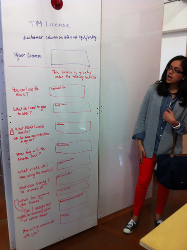
Rob Waller, of London’s Simplification Centre (and a speaker at the first IDC in 1984) and Stefania Passera, based at Aalto University School of Science in Espoo, Finland, didn’t call it ‘co-design’ but both demonstrated it in their presentations. Waller gave a punchy five-minute talk with insights into his ‘Simple actions’ design workshops which tackle ‘orphaned’ design objects such as ‘No parking’ signs. Passera presented reports from her ‘Legal design jams’, which bring together lawyers and designers to understand and unpack documents such as terms and conditions.
Unpacking licence terms at a ‘Legal Design Jam’. Picture courtesy Stefania Passera.
What sets information design apart from other design disciplines, aside from a commitment to what Two Twelve’s David Gibson listed as ‘hierarchy, logic, clarity, context’, is a belief in a kind of metadesigner, an ‘architect’ if you will, who will coordinate and transform information on behalf of the user. The ‘transformer’ was one subject of the first information design conference, so it was nice to hear Sue Walker from the University of Reading looking at how the Isotype folk, who coined the term, developed children’s information books in the 1940s and 50s.
And there was more, on signs and wayfinding, on user-interfaces, on nutrition labelling, dementia care, communicating the impact of climate change, how to escape a tsunami, Ken Garland riffing on the iconography of sixth-century mosaics in Ravenna, Italy. Even a couple of attempts, from Andrew Boag and Isabel Meirelles, on ‘what is this thing and how do we assess it?’ – which were both interesting, though neither was entirely convincing.
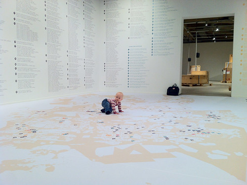
There was even a suggestion that information design has attained the status of art, in a brief, light-hearted look at an exhibit in Espoo mapping the Museum of Modern Art’s collection of work distributed throughout the community. The guide has become a work in itself.
The information design becomes art: guide to the distributed collection of the Espoo Museum of Modern Art at the museum. Courtesy Stefania Passera.
Mark Barratt, information designer, principal, Text Matters
Eye is the world’s most beautiful and collectable graphic design journal, published quarterly for professional designers, students and anyone interested in critical, informed writing about graphic design and visual culture. It is available from all good design bookshops and online at the Eye shop, where you can buy subscriptions and single issues.