
Thursday, 9:20am
29 October 2009
The seventh Python
George Hardie
Erik Kessels
john l. walters
Design history
Graphic design
Illustration
Music design
Photography
Visual culture
Storm Thorgerson’s iconic album art at Integrated2009
To designers of a certain vintage, Storm Thorgerson, one of the founders (with Aubrey Powell) of Hipgnosis, is a star, the prog Peter Saville. Yet he’s off many people’s graphic design radar, writes John L. Walters. Which might be the way he likes it, since he claims to know nothing about typography and disdains illustration.
Thorgerson’s image-making, nearly always for music clients, is based around photography, and the creation of grandiose, retina-searing images that become indelibly associated with particular albums and bands, however tenuous or obscure their representation of that music.
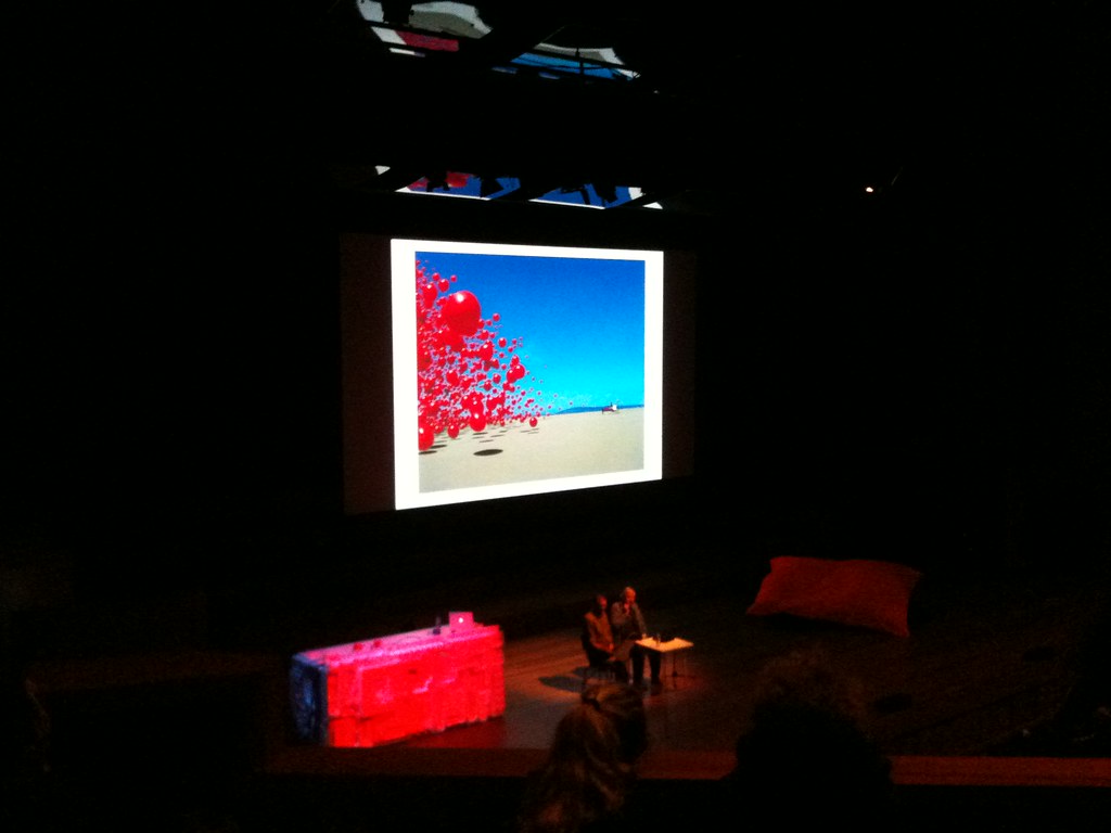
Though recently plagued by ill health (stroke, cancer, hernia), Thorgerson was on fine form for his presentation at last week’s Integrated2009 in Antwerp. Under a projection of his image for the Cranberries’ Wake Up And Smell The Coffee (above and below) he talked about the way his version of graphic design required lots of collaborators: photographers, illustrators, carpenters, sheep-wranglers, etc. ‘You need other people. If it goes wrong, I blame them. If it goes well, I take all the credit.’
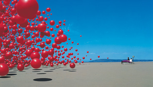
To demonstrate his methods, he asked us to take part in what might become a typical Thorgerson image – a photograph of the entire, 1000-strong audience covering their faces in mock horror. He gestured with his one good hand at the Cranberries picture overhead. ‘This picture is a real event … I can only do what I can see.’ He explained that the image was made using hundreds of red gym balls, dropped from a tower erected on an English beach. The first run of this real-life, real time event was so extraordinary, he said, that the photographer forgot to open the shutter.
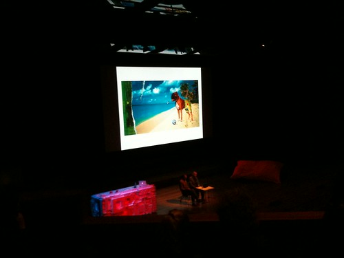
Thorgerson, in conversation with Integrated organiser Hugo Puttaert went on to show a whole sequence of vivid images for acts such as The Mars Volta, Audioslave, Ian Dury (above) Led Zeppelin (below), Peter Gabriel (bottom) 10cc and Pink Floyd, the band with whom he’s most closely associated. Thorgerson, still turns out limited edition prints and books based on their back catalogue.
Some of the images he showed had specific meanings, such as his ‘critique of women’ (above) or 10cc’s Are You Normal? – the defining sheep-on-couch-on-Hawaii-beach shot. But often, Thorgerson claimed no knowledge of what his images meant.
They made him laugh, he said. Albums like XTC’s typewriter font Go2, (celebrated in Dot Dot Dot) or Almighty’s Do You Understand? Or the six different highly elaborate covers for Led Zep’s In Through The Out Door, which they inserted in brown paper bags. ‘We thought it was funny,’ he said. His anarchic yet bossy manner makes him sound like the seventh member of Monty Python.

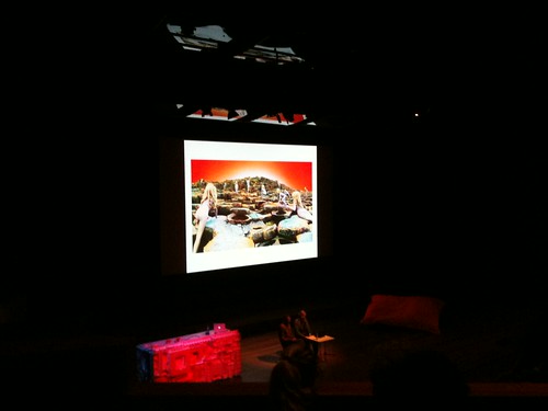
Half the audience were students, born long after CDs began to kill off rock album art, and few of them knew Thorgerson’s name. Yet they knew the Pink Floyd covers. Dark Side of the Moon, Wish You Were Here (with its burning businessman, and George Hardie lettering and artwork) and the receding infinity of Ummagumma (above) have acquired iconic status.
Atom Heart Mother, he said, was ‘much more successful than I ever dreamed. This cow seemed wholly irrelevant, and the record company MD swore at me: “What’s a cow got to do with Pink Floyd?” I was always surprised the band chose this, as it was the silliest idea. They didn’t care about representing their music. It looks as if the cow doesn’t care either.’
This wasn’t the last cow (or Python-like moment) of the day. A few hours later Erik Kessels made an unwitting cross-reference to this with his Useful Photography, and a short film about the difficulties of photographing a cow (an enterprise requiring half a dozen harassed Dutchmen and a car stereo). But by then, Thorgerson was on the Eurostar back to Blighty.

Eye is the world’s most beautiful and collectable graphic design journal, published quarterly for professional designers, students and anyone interested in critical, informed writing about graphic design and visual culture. It is available from all good design bookshops and online at the Eye shop, where you can buy subscriptions, back issues and single copies of the latest issue. You can also browse visual samples of recent issues at Eye before You Buy.