
Wednesday, 10:57am
1 June 2011
The timelessness of craft
Book design
Design education
Design history
Graphic design
Magazines
Typography
Visual culture
Karel Martens and OASE on show at the Narrows in Melbourne
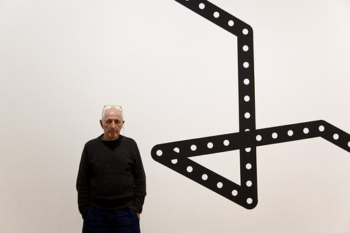
As founder of Werkplaats Typografie, the two-year masters programme at ArtEZ Institute of the Arts, and designer of the Dutch architectural journal OASE, Karel Martens is one of the most influential and well respected graphic designers of the past few decades, writes John Warwicker.
He has achieved this status by quietly and diligently crafting a particular and highly individual course.
His influential book Printed matter / Drukwerk has just been updated and published by Hyphen Press. This new edition and the recent exhibition at Monash University (6-21 April) unequivocally demonstrates his position as one of Europe’s masters and chief interrogators of the Modernist spirit and practice.
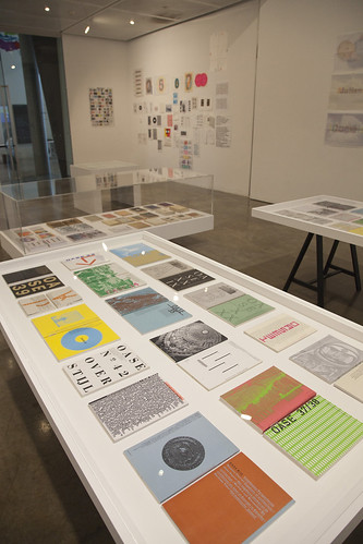
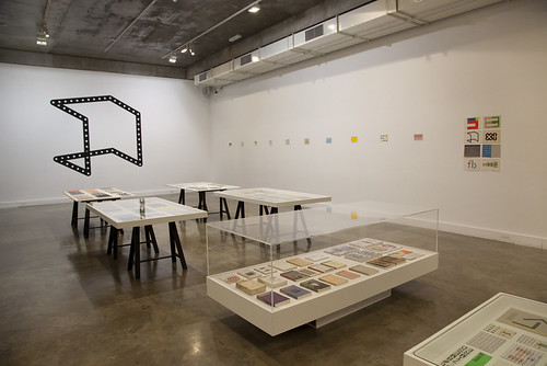
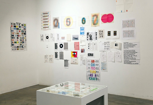
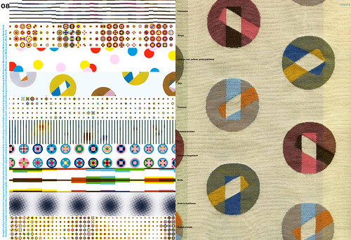
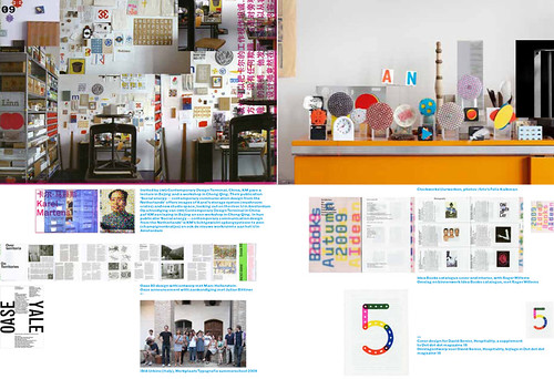
Although the exhibition was modest in size, Martens’ restless sprit of experimentation shone through; from the numerous issues of OASE, to book covers that he has designed over the past 50 years and other ‘experimental’ graphic works. Unlike the majority of work that one sees in graphic exhibitions, where the eye skims across the surface, Martens’ work draws you in to reveal the complexity of construction and the intelligent placing of both colour and form.
OASE should not be regarded as a collection of single issues but as a larger work unfolding over time. It is in this context that this modestly proportioned journal achieves its rightful place in the canon of late 20th- / early 21st-century graphic design.
The essence of any great work, regardless of medium or scale, is in the logic or strategy of its own internal rules and how well that work is crafted within its conceptual and linguistic boundaries. The mark of a great artist is predicated on how this procedure is applied and how it educates the both artist and audience over a period of time.
The conversation between work and artist provokes, informs and reshapes one and the other. Time will quite literally ‘tell’ (its journey). The consistency of purpose, the search for an internal truth. Over time and in time, creates a body of work that is timeless, in every sense of the word. Looking at the work on display it was hard to place it in any chronological order or indeed guess at an approximate date of its creation.
As with the paintings of Giorgio Morandi, it is the economy of means and a continuous questioning of every element within both the field, in Martens’ case the page, and the field itself which produces work of such depth and resonance that revisitation re-educates our eyes, our head and our heart. Teaching tests what one is thinking and continually refines the articulation of purpose and practice. In educating others, one educates oneself. Martens is a prime example of this.
The quality of his decision-making means that his work, like Morandi’s, transcends its modest scale. Its resonance lies within the well considered inflections between colour, form and texture. I use the word ‘inflections’ deliberately, as the subtlety of his decisions, especially his use of colour, would be normally associated with painting rather than graphic design. Within such a singular, deliberate focus Martens has created a ‘music’ that is all his own and that is an achievement worth celebrating.
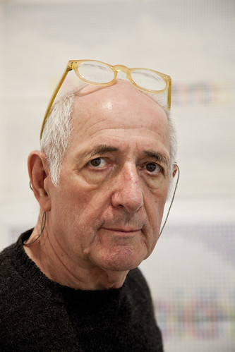
A lunchtime conversation with Martens was empowering and illuminating. It was a reminder and an example of the necessity of being true to one’s self, something that few attain with such a degree of unwavering quality over five years – let alone 50.
Photographs: Tobias Titz, tobiastitz.de.
Special mention must be made to curator Warren Taylor for organising yet another important exhibition here in Melbourne. See thenarrows.org and, for a feature based on a Les Mason exhibition he organised, read ‘The food, the type, the art director and his client’ in the current issue of Eye, no. 79.
John Warwicker is a founding member of the Tomato collective.
See also: ‘Let the object speak’, an article about Martens by Robin Kinross in Eye 11.
And David Crowley’s review of Printed matter / Drukwerk in Eye 44.
6-21 April 2011
Karel Martens / OASE: The timelessness of craft
Curated by Warren Taylor
Art & Design Faculty Gallery
Monash University, Caulfield, Melbourne, Australia.
Eye is the world’s most beautiful and collectable graphic design journal, published quarterly for professional designers, students and anyone interested in critical, informed writing about graphic design and visual culture. It’s available from all good design bookshops and online at the Eye shop. For a taste of no. 79, see Eye before you buy on Issuu. Eye 79, Spring 2011, is out now.