
Thursday, 6:46am
26 May 2011
The Word on the street
OMG: R2’s typographic gallery wall in Lisbon was a scriptural Knockout
There was a time when most art was made for the glory of God, when the Church made the best (and the best-funded) client writes Andrew Robertson in Eye 70. Nowadays, art is a secular rival to religion, competing with places of worship for devotees, and erecting great cathedrals like the Guggenheims and the Tates.
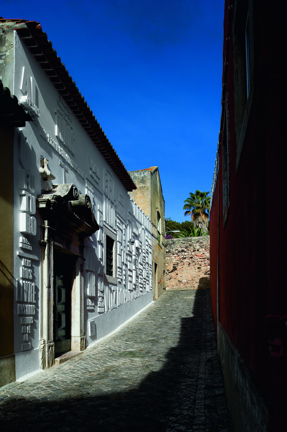
The Ermida Nossa Senhora da Conceição, in the Belém area of Lisbon, is a small chapel repurposed as a gallery that shows work by contemporary Portuguese artists. Belém is 6km west of the capital’s centre, and contains several historical monuments and important museums. To publicise the new space, and make friends with the graphic design community as well as art lovers, the chapel’s owner, Dr Eduardo Fernandes, approached R2, a design practice based in Porto, and asked them to make a graphic intervention in Travessa do Marta Pinto, the alleyway by the chapel.
R2’s principals are Lizá Defossez Ramalho and Artur Rebelo, who founded the practice in 1995 while studying in the Fine Arts faculty at Porto University. Their previous projects include elegant, content-driven poster campaigns for film, dance and art festivals, as well as identity, exhibition and book design for cultural clients.
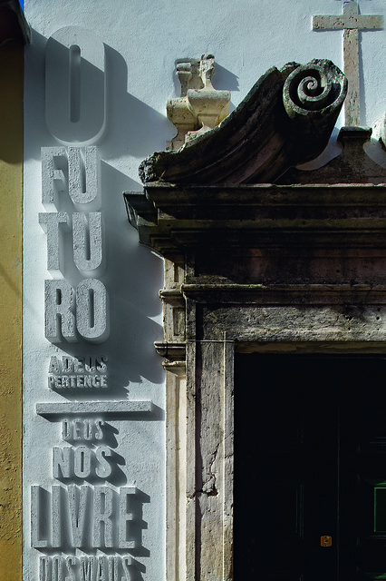
For the Lisbon alleyway, the designers, fascinated by the venue’s eighteenth-century origins, decided to bring God back into the conversation, making use of everyday expressions that include the name of the deity. Among the most resonant examples were: ‘Deus escreve certo por linhas tortas (God writes straight on tortuous lines)’; ‘Deus é bom e o diabo não é mau (God is good and the devil isn’t bad either)’. The expression ‘Deus nos livre dos maus vizinhos ao pé da porta (God save us from bad neighbours at the doorstep)’ is displayed to the left of the door of the chapel, while ‘Deus quando fecha a porta abre a janela (When God closes a door, he always opens a window)’ is by the window.

They also included shorter expressions such as ‘ai meu Deus (oh my God)’, ‘Minha nossa senhora (Holy Mary)’, ‘por amor de Deus (for the love of God)’, ‘Deus te guie (May God guide you)’ and ‘Deus te acompanhe (God be with you)’.
R2 set these expressions in Hoefler & Frere-Jones’s Knockout. First used in the 1990s for Sports Illustrated, Knockout – which is based on the wooden type used for American boxing posters – has grown into a popular multi-weight family (from Flyweight to Sumo – see ‘Forensic types’ in Eye 54). After designing the composition in InDesign, they cut the letters from MDF and fastened them to the wall using glue and screws, finishing off with sand paint to complete the white-on-white setting.
The devil (or God) is in the detail, however: R2 played with the scale of the 3D type to bring out different rhythms and shades of meaning within each familiar phrase. The designers’ intention is that, as the text is read by passers-by, ‘little by little, it will be progressively discovered’. In this small way, until the installation is removed in February 2009, they may make a divine intervention, a numinous spark in the dead language of commonplace clichés.
‘The Word on the street’ by Andrew Robertson was originally published in Eye 70, Winter 2008.
See also r2design.pt/r2design and H&F-J’s typography.com.
Eye is the world’s most beautiful and collectable graphic design journal, published quarterly for professional designers, students and anyone interested in critical, informed writing about graphic design and visual culture. It’s available from all good design bookshops and online at the Eye shop, where you can buy subscriptions, back issues and single copies of the latest issue. For a visual sample, see Eye before you buy on Issuu. You can also find us on EyeFacebook.