
Friday, 7:00am
20 December 2013
Type on the tongue
Simon Esterson
Jay Prynne
Sarah Snaith
Janet South
John L. Walters
Sarah Hyndman
Food design
Typography
Visual culture
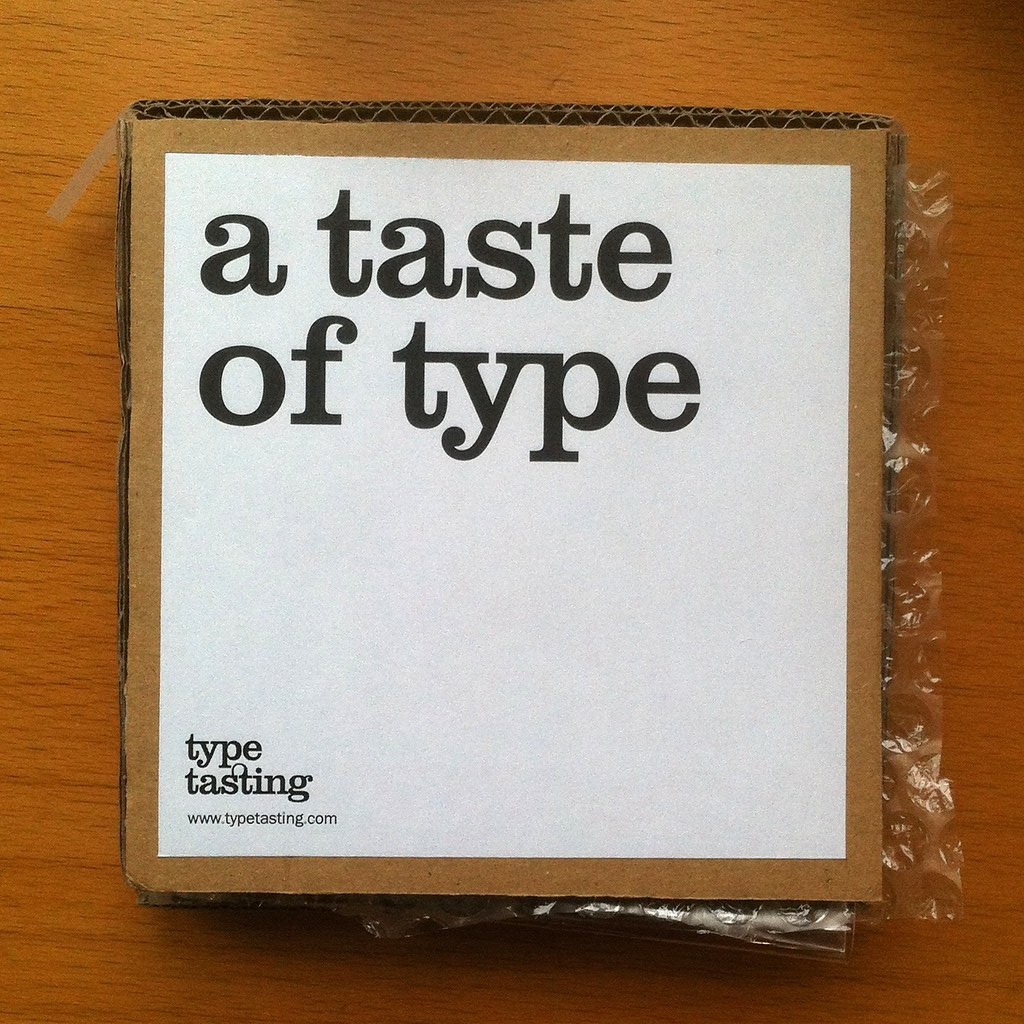
Eye’s panel checks out the taste of Helvetica, Impact and Comic Sans (as cooked up by Sarah Hyndman)
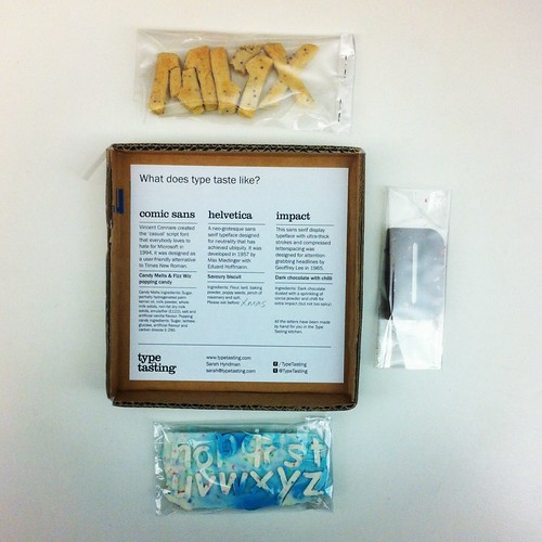
Designer Sarah Hyndman is known for her Type Tasting workshops – popular events at Pick Me Up and London Design Festival this year. For Hyndman’s latest project, A Taste of Type, she has reversed the approach by asking, ‘what does type taste like?’
The resulting edible letters, still in the prototype phase, boxed and mailed to a few associates, have been taste-tested and reviewed by Eye staff in our Shoreditch office: Jay Prynne (art editor), Janet South (editorial administrator), Simon Esterson (art director), John L. Walters (editor) and Sarah Snaith (editorial assistant). You can read about Hyndman’s intentions and recipes in her article ‘What does typography taste like?’
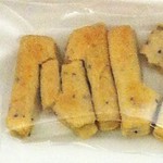
Helvetica: savoury biscuit
Taste
JP: Lovely. Would have been nice with cheese.
JS: Traditional, a bit ‘lardy’ and underseasoned.
SE: Sharp, like the font.
JLW: Delicious, savoury biscuit, not bland.
SS: Bland and unobtrusive.
Texture
JP: Good.
JS: Short.
SE: Granular.
JLW: Good texture for dips or with cheese.
SS: Crumbly, a bit like a plain version of a cheese straw.
Letterspacing
JP: Only one letter survived unbroken so hard to tell. Letterforms good though. Slightly ‘puffed up’, making Helvetica seem more friendly.
SE: Tight.
JLW: A bit ‘decon’ after a journey by mail.
Suitability
JP: Perfect. Helvetica is too serious to be sweet.
JS: Practical and safe with no surprises.
SE: Savoury and minimal.
JLW: Tastes more like Akzidenz Grotesk.
SS: Very suitable but not so enjoyable.
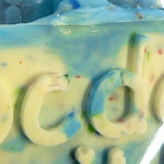
Comic Sans: Candy Melts and Fizz Wiz popping candy
Taste
JP: Lovely, very smooth, nice colouring, very jaunty, good for Comic Sans
JS: Very sweet, annoying chewy bits, ersatz.
SE: Sweet with undertones of guilty pleasure.
JLW: Too sweet.
SS: Sweet and brightly coloured with blue and red.
Texture
JP: Great, smooth.
JS: Chewy.
SE: Smooth.
JLW: Gritty yet cloying – had to rinse my mouth out.
SS: Smooth and creamy with popping bursts of Fizz Wiz.
Letterspacing
JP: Poor … ‘p’ and ‘q’ off the baseline is distressing
SE: Loose.
JLW: Deliberately amateur.
Suitability
JP: Perfect. Comic Sans should be sweet and sickly with sprinkles and pops and bangs.
JS: It tastes funny.
SE: Small doses only.
JLW: Comic Sans deserves better.
SS: There is nothing hateful about eating Comic Sans, however the popping sensation was comic-al.
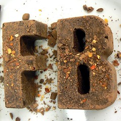
Impact: dark chocolate with chilli
Taste
JP: My favourite, very swish, I enjoyed the ‘kick’.
JS: Full, chocolate flavour with chilli afterburn.
SE: A perfect combination of bitter and sweet.
JLW: Delicious. Chilli gives it a kick.
SS: The richness of the dark chocolate and the spicy hit of the chilli makes an impression on the tastebuds.
Texture
JP: Great, top with chocolate.
JS: Crumbly.
SE: Smooth.
JLW: More-ish – would have appreciated a few more letters.
SS: Firm with crisp, dried chilli flakes throughout.
Suitability
JP: Great, Impact should be dark with a kick.
JS: Good name for a dramatic flavour.
SE: Delivers a powerful condensed aftertaste.
JLW: Like a Central American letterpress poster. Loud.
SS: Quite Mexican, but the typeface has little relationship to the country. Good in small quantities.
Type tasting kit at the Eye offices in Hoxton Square.
Eye is the world’s most beautiful and collectable graphic design journal, published quarterly for professional designers, students and anyone interested in critical, informed writing about graphic design and visual culture. It is available from all good design bookshops and online at the Eye shop, where you can buy subscriptions and single issues.