
Tuesday, 11:31am
26 September 2017
Type safari in Andalucía
Stephen ONeill, aka TypeChap, relishes the beauty of peeling and fractured letterforms in signs on Andalucian streets
Andalucía, the largest region in southern Spain, has severe weather. And over time, it has helped to create typography in beautiful disrepair, writes Stephen ONeill.
Temperatures can hit 50 degrees celsius, occasionally followed by a month’s rainfall in just one day. These extreme conditions take their toll on buildings and signage, and with the economy struggling in this part of the world, funds to carry out repairs are in short supply.
These crumbling walls and distressed signs are something of an eyesore to locals but to a visitor in search of interesting examples of vernacular typography, they look quite stunning.
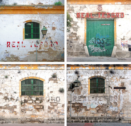
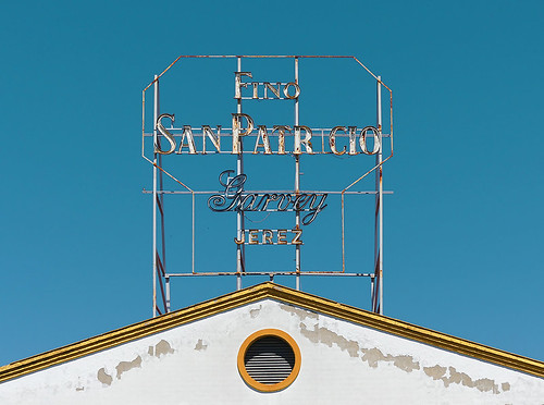
The signage for the derelict Real Tesoro bodega in Jerez vanishing bit by bit, day by day.
All photographs taken by the author.
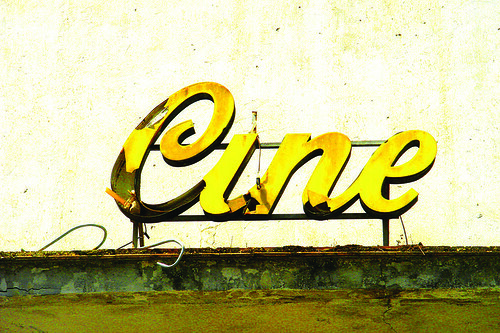
Shattered letters for an old cinema in Jerez – like many signs, this is sadly no longer there and departed to type heaven.
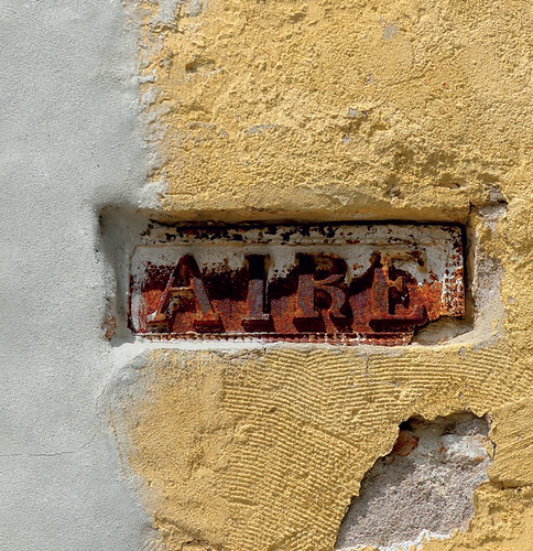
Many old buildings, such as bodegas for the sherry industry, lie derelict with letters merging into the paintwork on exterior walls – plaster and letters cracking and crumbling together. These surfaces look interesting enough on their own, but with the addition of fractured letterforms, they turn into typographic frescoes. And when the glaring sun shines on these walls, every wonderful imperfection is shown in pin-sharp detail.
In some cases, signwriters have repainted letters over and over, changing them slightly each time. Apparently they were originally created using Letraset catalogues as a reference but original typefaces have mutated over time due to the surfaces they appear on changing, then being tweaked (often incorrectly) every few years – the original typeface is merely a starting point for an accidental ever-changing collage of plaster, paint and letters.
In many cases, pressure-formed plastic has been used for cursive text though pieces are often shattered and broken from the signs, showing the structure behind the letters and literally exposing the nuts and bolts.
Crumbly neon signage illuminated by the harsh Andalucian sun.
The word ‘cerillas’ means matchsticks but to a non-Spanish speaker this just looks like a fantastic bit of condensed type with a bold underline on a lurid, rusting red metal box.

There are a fair few broken neon signs as well that look quite striking in daylight – an odd wonky ascender or a missing letter with a garish painted background. Some are exposed to the elements for years on end, on rusty scaffolding, falling to pieces bit by bit.
Another factor that may make these signs so intriguing is perhaps because these are in a foreign language, allowing the letterforms to become more prominent than their meaning.
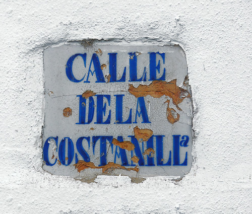
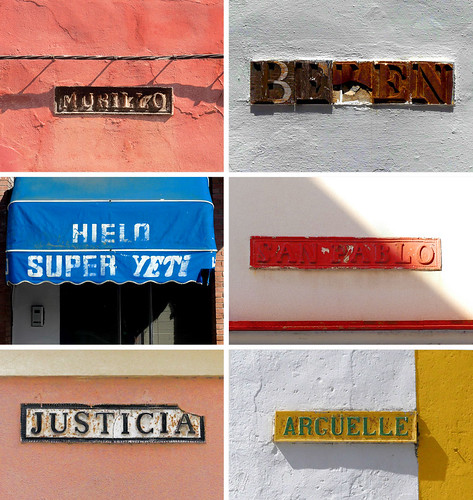
Many street signs follow a similar typographic design but the addition of colour or the mix of new and old letter tiles means there is the potential for surprise with every corner you turn. Occasionally pre-Franco era hand-painted street signs survive with irregular and charming lettering.
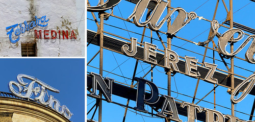
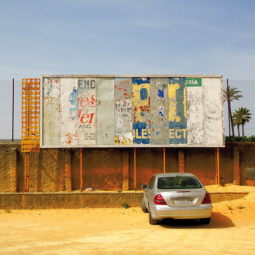
Accidental collage of letters on a distressed billboard in Jerez.
Some pre-Franco era hand painted street signs survive with irregular and charming lettering.
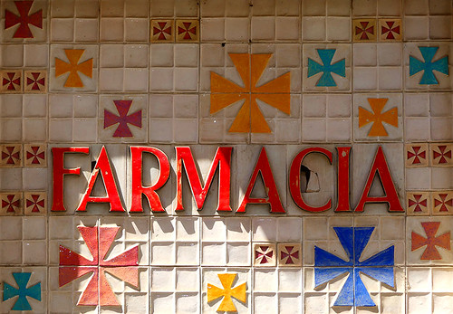
In smaller towns, many chain stores have moved their businesses to shopping centres on the outskirts of town, so town centres can resemble shop-front museums. The local chemists are particularly ornate and also exist as a ‘tertulia’, a social place where people meet up and exchange gossip.
So if you plan a visit to the Alhambra in Granada, Seville Cathedral or the Feria in Jerez, keep your eyes peeled for the backstreets of Andalucía for a seemingly endless supply of typographic surprises.
Signs in the back streets of Jerez.
Haphazard paint and plasterwork accidentally create interesting textural collages with old signs.
Seville’s most beautiful pharmacy.
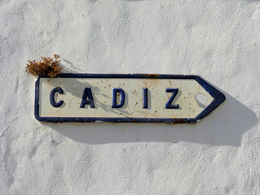
Rusting metal signage for a bodega on the outskirts of Jerez.
Stephen ONeill aka TypeChap, designer, art director, London
Eye is the world’s most beautiful and collectable graphic design journal, published quarterly for professional designers, students and anyone interested in critical, informed writing about graphic design and visual culture. It is available from all good design bookshops and online at the Eye shop, where you can buy subscriptions and single issues.