
Tuesday, 10:00am
11 October 2011
Type Tuesday: Neon skeletons
A pop-up showroom explores the possibilities of a new typeface
Commercial Type is an award-winning type foundry with typefaces used around the world. Their latest venture is Thieves Like Us, a collaboration between Commercial Type and designer and artist Dino Sanchez.
Taking the form of a pop-up showroom, it will exhibit ‘Marian’ – a new typeface by Paul Barnes that reduces classic models of serif type design to their basic skeletal forms – exploring the possibilities offered by these single stroke forms in a variety of media. Marian is a collection of revivals – nine serif faces from the sixteenth to nineteenth century have been treated in the same fashion. Together they represent a concept: to recreate the past for the present (see also ‘Deep in the archives’ in Eye 75 and in recent Type Tuesdays on the Eye blog for the thoughts of Barnes and Schwartz on historic type specimens).
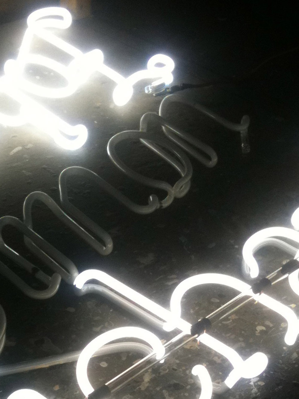
Top: A sneak preview of some of the neon type which will feature in the showroom.
Above: A look at some of the neon pieces being manufactured.
Dino Sanchez, a New York City based artist and designer with a background in industrial design, said to Eye: ‘The show is centered around the typeface Marian and expresses it in a variety of forms. A large part of the show is made up of neon lighting, one for each face in the collection. We decided on neon lighting as it paralleled the flow of the strokes with the flow of gas through the tubular forms.
‘Another piece that will be on display will be a 12ft wide text set in Marian made entirely out of brad nails. It speaks to the idea of stripping down and recreating, a theme that permeates through both the concept of the typeface along with the overall exhibition. Each of the pieces is not expressed simply through print, but through a recreation that takes the particular form of media and its constraints into account.’
Pop-up showroom
29 Kenmare St (at Elizabeth St.)
New York
Noon-8pm daily
Opening reception
Thursday 13 October, 7-10pm.
Read about Marian in the Reputations interview with Commercial Type’s Barnes and Schwartz Eye 82.
Eye is the world’s most beautiful and collectable graphic design journal, published quarterly for professional designers, students and anyone interested in critical, informed writing about graphic design and visual culture. It’s available from all good design bookshops and online at the Eye shop. For a taste of the new issue, see Eye before you buy on Issuu. Eye 80, Summer 2011, is out now. Eye 81 will be on press soon.