
Tuesday, 6:55am
1 May 2012
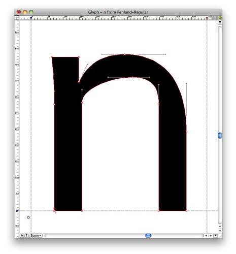
Type Tuesday: Text, pixel, pen and fen
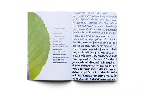
Tankard’s new type family Fenland questions the ‘calligraphic metaphor’
The launch party for Jeremy Tankard’s new type family Fenland, at London’s Kemistry Gallery, was packed to capacity with gallery regulars and friends and colleagues of the designer, writes Alex Cameron.
While busy private views in London galleries are not that unusual, what set this one apart was the atmosphere and the excited buzz of guests poking, pointing and poring over the results of Tankard’s labour.
The exhibition matter offered more than oversized specimen sheets, and there was a welcome lack of patronising posters suggesting how to use Fenland. The exhibition panels assumed that the viewer was interested, capable and engaged.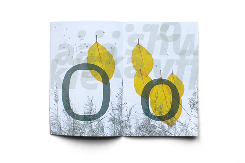
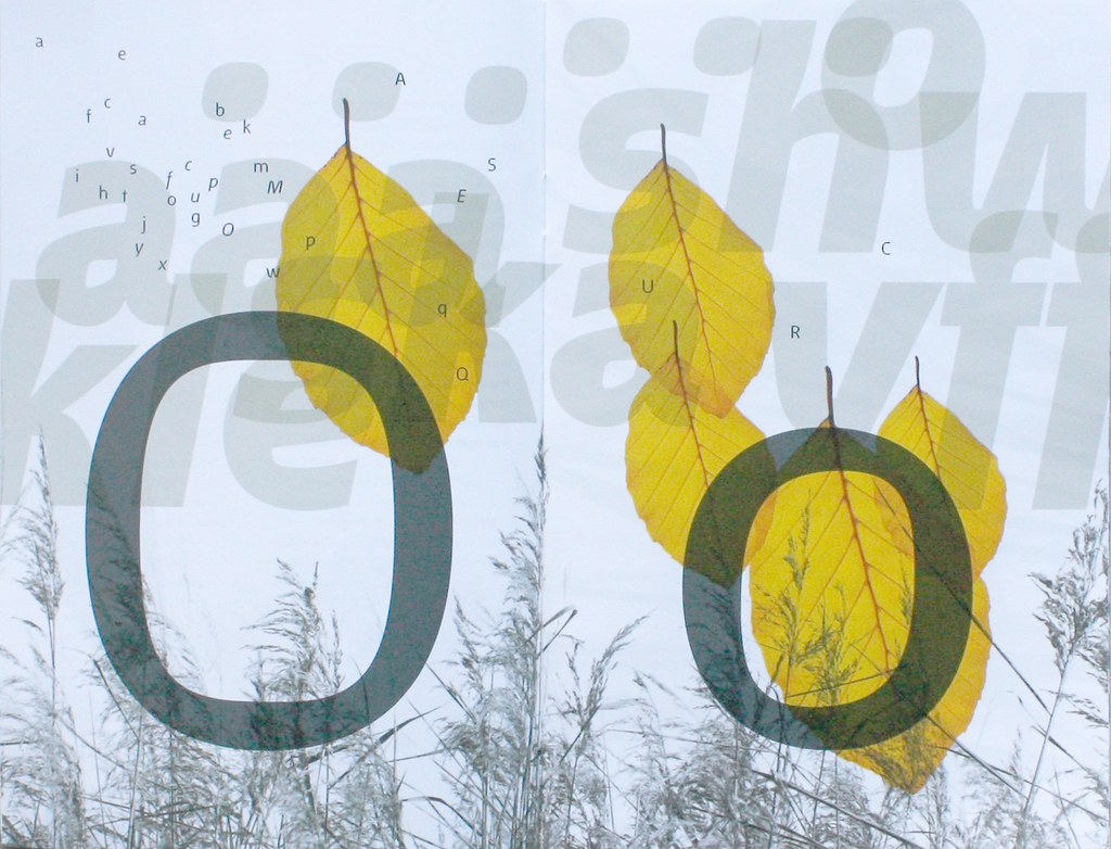
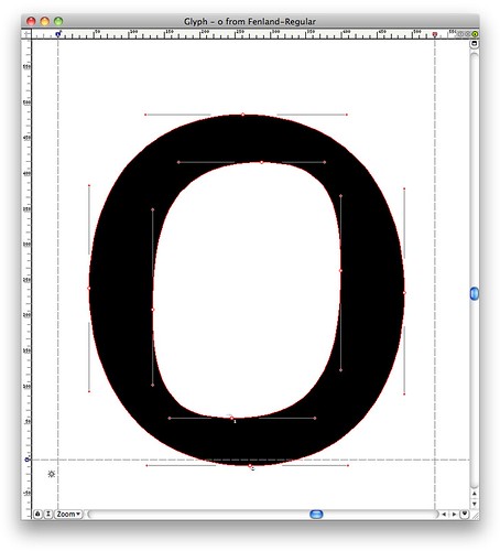
The success of the launch was partly due to good curatorial thinking, but more because the idea behind Fenland is also a critique of mainstream contemporary type design. The target in Tankard’s sights is the prevalence of the calligraphic metaphor: ‘We read printed text. We read shapes described by pixels. So what purpose does the pen have in their construction?’ he asks.
In the weeks following the launch, considered reactions continued on type forums online. While there was overall praise for Tankard, Fenland had its share of detractors. Some questioned the legitimacy of Tankard’s rejection of the calligraphic metaphor as the only approach to type design, while others asked, ‘what’s the big deal?’ in response to his final letterforms. Both views are too one-sided. A more fruitful line of enquiry is to be found in conjoining both questions of idea and form. Tankard met this head-on through Fenland.

Behind Fenland’s beautiful shapes lie anger and disappointment with much of contemporary type design, with its backward-looking type revivals, soft rounded sans and calligraphic rhetoric.
‘Fenland began as a way to find new shapes that didn’t rely on the usual method of structure,’ Tankard writes. ‘The constraints of what makes a text typeface work are still the same; these could include rhythm, pattern, texture and balance. As long as this is respected then how can a shape be constructed in a fresh way?’
Asking such questions should be integral to the design process, but the market seems to tell another story. Fenland, in this respect, is something of an antidote. Tankard says, ‘a fundamental question … deserves more than a cosmetic answer’.

For an insight into Tankard’s design process and early sketches of Fenland, see Birth of a Typeface. More information at Tankard’s own website, typography.net.
Eye is the world’s most beautiful and collectable graphic design journal, published quarterly for professional designers, students and anyone interested in critical, informed writing about graphic design and visual culture. It’s available from all good design bookshops and online at the Eye shop, where you can buy subscriptions and single issues. Eye 82 is out now – you can browse a visual sampler at Eye before you buy on Issuu.