
Tuesday, 1:25pm
28 June 2011
Type Tuesday
How lettering is made for public display: hand-cutting in stone
Andrew Haslam looks at the production of display lettering, and, in this instalment, hand-cutting in stone by Fergus Wessels. Drawing letters for stone-cutting requires great skill, and techniques vary between cutters: some use a soft, chisel-pointed pencil that enables them to draw both sides of the letter with a single stroke, while others bind together two pencils, creating a double keyline with a single movement (a letter-cutter relies on kinetic memory as much as eye).
Each letter will have its own individual width but both the widths and the inter-character spaces have to be considered in combination. The guiding principle in drawing the letters is the search for consistency of letter pattern, evenness of line weight and spacing, uniformity of stress – and logical word breaks.
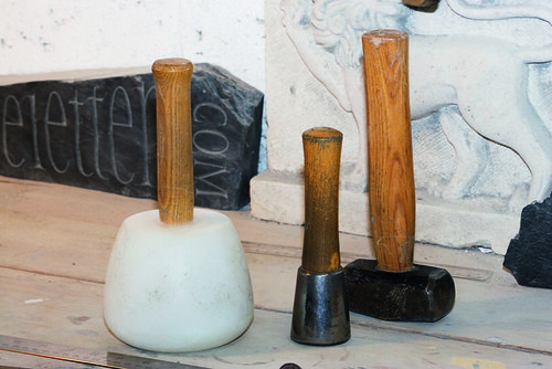
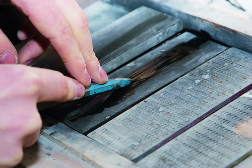
1. Stone-cutting mallets vary in size but have short hickory shafts: cutters work with a succession of short blows. The large nylon-headed round (left) is used for heavy work with a wide chisel, where stone needs to be removed quickly. The small metal mallet (centre) is used for details. The block mallet is reserved for heavy work with a broad chisel and for splitting stone.
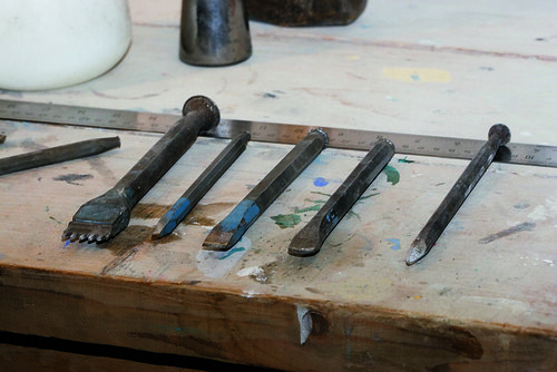
2. Cold chisels are made in many sizes, and the cutting edge is often tipped with tungsten. The large chisel with several points (left) is called a claw. The tip of a chisel may be flat (third from left), rounded (fourth from left), or pointed (right) to create a stippled effect on the stone’s surface.
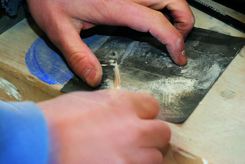
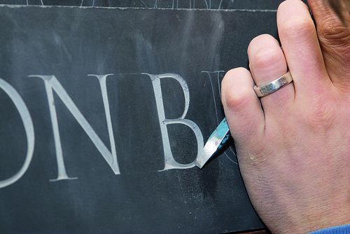
3. The cutter draws the shape of the letter on the stone, using a white Chinagraph pencil for dark stones (such as Welsh slate) and a black graphite pencil for pale stone such as limestone or marble. Sharpening the pencil on emery paper creates a long fine point.
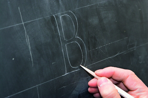
4. Some stone-cutters design directly onto the stone, drawing and redrawing until they are happy with the layout and form of the letters. For capital letters, a parallel cap and base line are drawn across the stone with a ruler; the cap height is usually estimated, rarely measured.
5. Once the letters have been drawn and approved by the client, the fine chisel is sharpened for the first cut.
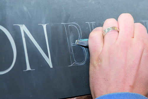
6. The centre of the ‘v’ cut is incised halfway between the keylines, using a fine chisel with a fifteen-degree cutting edge. This ‘undrawn’ line is chased into the stone from a serif point with a succession of tiny blows from the mallet. Some cutters work one letter at a time; others prefer to chase in all the ‘v’ cuts before moving on to the next stage.
7. The cutter works from just inside the keylines toward the ‘v’ cut centre line, ‘chopping’ away stone to create the letterform. The ‘v’ cut gradually deepens as it is worked from both inner and outer edge of the letter. The cutter must hold the chisel at a consistent angle to the stone to ensure an even depth. Many stone-cutters can recognise one another’s work by the depth of the letters.
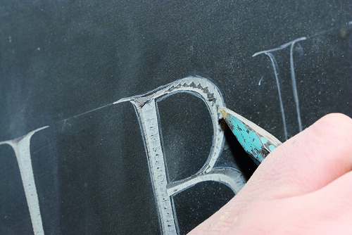
8. Once the central ‘v’ cut is fully established, the cutter concentrates on refining the edge of the letter. The angle of the ‘v’ is retained and tiny taps are used to ‘hack back’ the cut to the drawn edge of the letter. This is a delicate procedure. Softer stone such as slate and limestone is more easily worked than hard stone – like marble or granite – which has an irregular crystal structure.
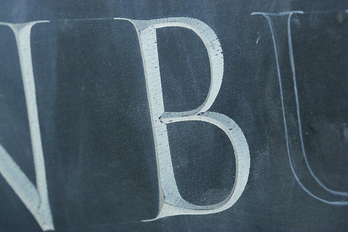
9. Using a very fine chisel the letter-cutter refines the thickness of the stroke – taking it back to the pencil drawing and ensuring the cut angle is consistent.
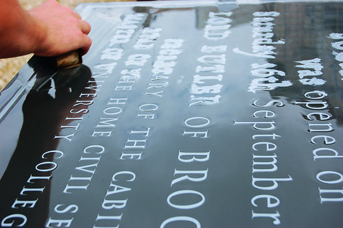
10. On dark stones such as slate, the carved letter is initially far lighter in colour than the stone. However if the stone is used outside, the contrast begins to fade. To compensate for this loss of clarity some cutters paint the ‘v’ cut pale grey to match the cut slate. This preserves its legibility after the stone has been exposed to wind and rain.
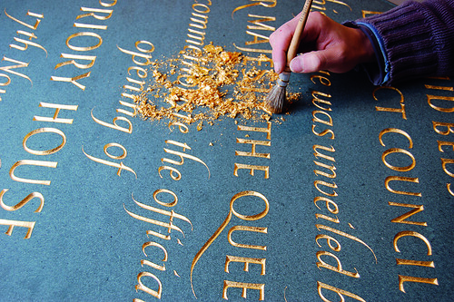
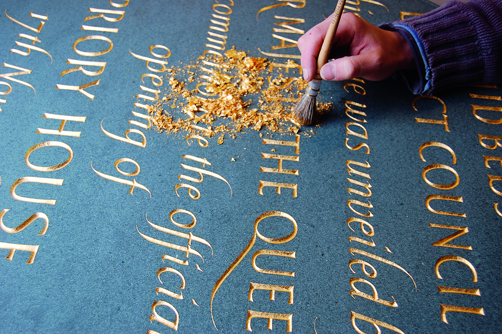
11. The cutter brushes gold leaf into the incised letterforms with a sable brush.
Type Tuesday is our weekly column on typography and type design, featuring a mixture of brand new articles and material from the extensive Eye archive. For more Type Tuesday articles, click here.

Physical Display by Andrew Haslam was originally published in Eye 67, Spring 2008.
Eye is the world’s most beautiful and collectable graphic design journal, published quarterly for professional designers, students and anyone interested in critical, informed writing about graphic design and visual culture. It’s available from all good design bookshops and online at the Eye shop, where you can buy subscriptions, back issues and single copies of the latest issue. The latest issue is Eye 79, a type special.