
Tuesday, 9:00am
26 April 2011
Type Tuesday
Electrifying the alphabet. Wim Crouwel’s experiments in letterforms
The rapid advances in data-processing that revolutionised office work from the mid-1960s onwards – and later invaded everyday life – created special challenges for type designers. With electronic typewriters and microcomputers came the need for electronic fonts, both to translate data into electrical signals understandable by machines, and to transmit information between humans and machines via electronic displays writes Sarah Owens in Eye 62.
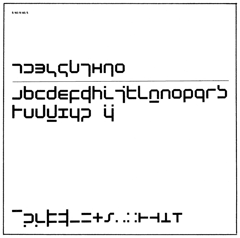
Designer Wim Crouwel put forward the experimental New Alphabet (1967), consisting of radically simplified letterforms, with unusual ideas about case sensitivity and orthography. This proposal was to be seen only as an initial step towards further research made necessary by the increasing quantity of printed material. ‘We need to move on to a completely different form of letter,’ he explained. ‘The typeface that is to emerge will be determined by contemporary man, who knows the computer and also how to live with it.’
Top: Specimen, New Alphabet designed by Wim Crouwel, 1967.
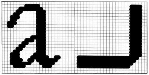
Above: Spread from Steendrukkerij de Jong’s Quadrant Print, demonstrating the Crouwel CRT alphabet and comparing a scanned Garamond ‘a’ with a scanned ‘a’ from the New Alphabet.
Basing his letterforms on the concept of computer memory as an assembly of cells, corresponding to the composition of organisms and structure of society, Crouwel conceived new communication symbols, purposely placing them in stark contrast to digitised, screen-adapted typefaces, of which he strongly disapproved. Aware that the readability of his alphabet might be questioned, he was nevertheless certain that in time, people could familiarise themselves enough to be able to read his letterforms comfortably.
Radical proposals such as Crouwel’s alphabet could be seen as a continuation of the ideas and concepts of Modernism; Crouwel believed that typography and type should correspond to the contemporary demands of ‘an age of science’, rather than those of history.
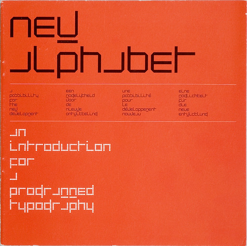
Above: New Alphabet, 1967, published in the twentieth edition of Pieter Brattinga’s Kwadraadbladen series (Quadrat Prints).
Despite these early notions of a ‘machine aesthetic’, the 1960s and 70s saw several designers protesting against the supposedly ‘dehumanising’ and thoroughly ‘indecipherable’ mechanistic alphabets. Dutch designer Piet Schreuders (see Reputations, Eye 32), for example, complained that Crouwel’s New Alphabet was impossible to read, that it required subtitles to be understood, and that it was carried out in the ‘so-called Martian style’.
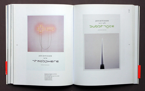
In the following decades, as character recognition technology improved to enable the recognition of most print typefaces and even handwriting, the ethical discussions surrounding electronic typefaces eventually died down. Nowadays, these engineered and experimental machine typefaces are no longer considered shocking or revolutionary; since their original function has lost its relevance, they remain odd vestiges of an age of electronic innovation. Subsequently, the work of designers such as Peter Saville, who resurrected Crouwel’s New Alphabet for the cover of the Joy Division album Substance, clearly ascribes significant formal and stylistic importance to electronic typefaces.
Above: To see New Alphabet in the flesh, visit 'Wim Crouwel, a graphic odyssey' at the Design Museum. Image by Luke Hayes courtesy of the Design Museum.
Wim Crouwel a Graphic Odyssey
30 March – 03 July
Design Museum
28 Shad Thames
London SE1 2YD
Type Tuesday is our new weekly column on typography and type design, featuring a mixture of brand new articles and material from the extensive Eye archive. For more Type Tuesday articles, click here.
Read ‘Electrifying the alphabet’ by Sarah Owens in Eye 62, Winter 2006.
See also: ‘Modern Method’, Kery William Purcell’s interview with Wim Crouwel in Eye 79, Spring 2011 and ‘Crouwel at 80 20 100’ on the Eye blog
Eye is the world’s most beautiful and collectable graphic design journal, published quarterly for professional designers, students and anyone interested in critical, informed writing about graphic design and visual culture. It’s available from all good design bookshops and online at the Eye shop, where you can buy subscriptions, back issues and single copies of the latest issue. The latest issue is Eye 79, a type special.