
Tuesday, 8:14am
30 August 2011
Type Tuesday
Lust and likeability #5: Stormtype’s ‘over-the-top’, ‘edible’ Jannon
More words about type in this critique of Jannon by Jan Middendorp, Petra Černe Oven, Deborah Littlejohn and Mark Thomson.
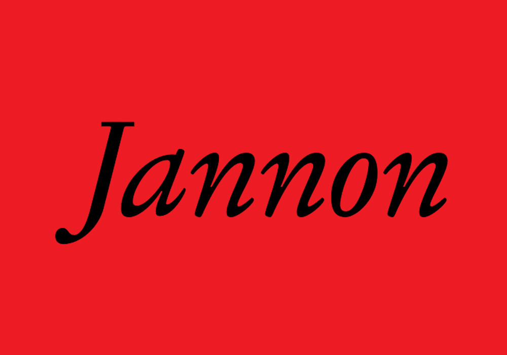
Jannon. František Štorm, Stormtype
As early as 1925, Beatrice Warde (writing as Paul Beaujon) pointed out that several types used as models for Garamond revivals were in fact cut by an artist who worked some 70 years later, Jean Jannon. It took a maverick designer from Prague to finally issue a digital revival under that later master’s name.
Mark Thomson
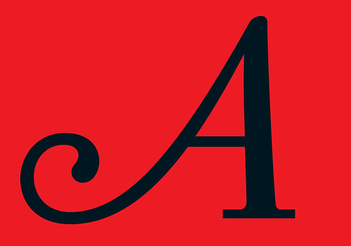
The curiosities of contrast in the roman and the angles in the italic give this type a lively feeling. It is interesting to compare it with Adobe Garamond – it is almost the polar opposite. Where Adobe Garamond is smooth, suave almost, this Jannon is nervy, slightly hyperactive. The consequence is that Adobe Garamond pops up everywhere, whereas I think Jannon has more specific uses. It really looks as though it has to be printed on the right kind of paper – uncoated and not white.
Petra Černe Oven
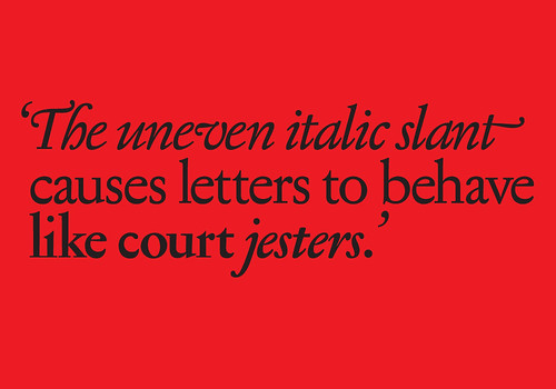
Most people’s reaction to Stormtype’s Jannon is that it is ‘over the top’, but in my part of the world we like exaggeration. Strong, late-Baroque elements seem almost too rich, and the uneven italic slant causes letters to behave like court jesters. I worry what OpenType’s multiple possibilities might do to this rich and diverse typeface – it certainly must be handled with great feeling for wonderful, well thought out details, alternates and ornaments. I would use it for a very special project.
Deborah Littlejohn
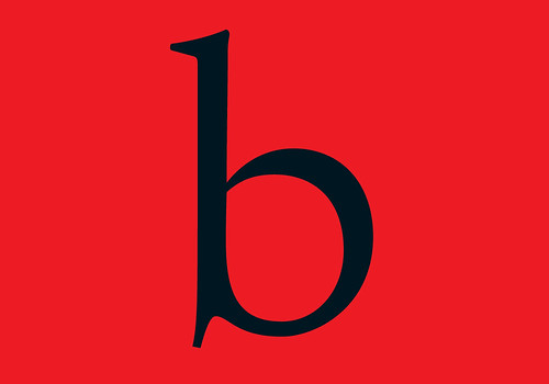
Five males ranked the more reserved Jannon number one, tying with Verlag, and six placed it in the number two spot. Jannon is almost as delicate as Odile – and it is just as elegant – but Odile was placed fourth among male respondents. Jannon must be the ‘man’s man’s feminine font’: one male respondent called it ‘gorgeous’ while another described it as ‘edible’. Twelve slotted it in the top third, making Jannon the number one font overall among male respondents. Jannon did not fare so well with the ladies, who ranked it sixth overall with five of them putting it in the bottom tier. No other typeface on the list rivals Jannon’s textural beauty and rhythm – especially when set in big bookish blocks of text.
Jan Middendorp
Among an avalanche of revivals and ‘re-interpretations’, Štorm’s stand out for their brilliance, liveliness and sensitivity. Jannon is part of a series of historically inspired seriffed faces to which his outrageous Biblon and Serapion also belong. Jannon is on the more serious side of the spectrum. Its ‘Modern’ variety, in which proportions have been adopted to today’s reading habits, is one of the finest (and least boring) Garamond-type text faces to have hit the virtual shelves lately.
See ‘Storm: Living history’ by Petra Černe Oven in Eye 50.
Visit Stormtype.com to see a wide range of typefaces. You can buy Jannon here.
Type Tuesday is our new weekly column on typography and type design, featuring a mixture of brand new articles and material from the extensive Eye archive. For more Type Tuesday articles, click here.
Lust and likeability was originally published in Eye 67, Spring 2008.
Eye is the world’s most beautiful and collectable graphic design journal, published quarterly for professional designers, students and anyone interested in critical, informed writing about graphic design and visual culture. It’s available from all good design bookshops and online at the Eye shop, where you can buy subscriptions, back issues and single copies of the latest issue. The latest issue is Eye 80.