
Tuesday, 10:00am
6 September 2011
Type Tuesday
A2-Type’s new typeface is inspired by Antwerp’s archives
A2/SW/HK, the practice founded by Scott Williams and Henrik Kubel, has nearly always created bespoke typefaces for its projects, writes Alexander Ecob. But Williams and Kubel usually took pains to state that they were not a type foundry.
However in 2009, after more than a decade of crafting type for clients, A2/SW/HK launched A2-Type to release and distribute their type. Since then, the foundry has regularly released new fonts, and the latest creation – scheduled for release this Autumn (2011) – is Henrik Kubel’s Antwerp.
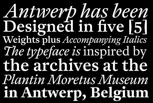
Above: Antwerp by A2-Type.
Kubel has worked on a number of collaborative projects, from the digitisation of New Rail Alphabet, completed in collaboration with original designer Margaret Calvert (see ‘Britain’s Signature’, Eye 71), to display type based on Indian floor painting in collaboration with former student Geetika Alok.
However, Antwerp – a sixteenth-century typeface with contemporary proportions – is all down to Kubel’s passion.
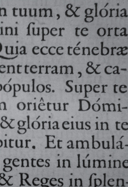
Above: One of the archive pieces which inspired Kubel in designing Antwerp.
‘The design is a free-spirited amalgamation and interpretation of the all-inspiring archives of type on display in the Museum Plantin-Moretus in the Belgian city of Antwerp,’ says Kubel. ‘My passion for fifteenth and sixteenth century typefaces might shine through in Antwerp … it’s how I design letters, and it’s also a direct translation of the way I draw type by hand.’
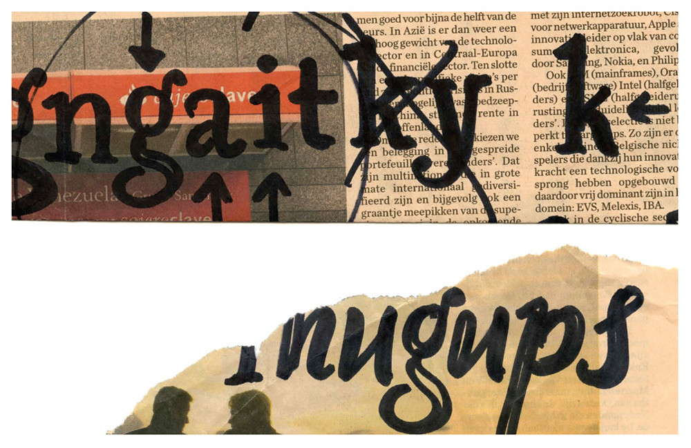
Below and top: Some of Kubel’s early development sketches for Antwerp.
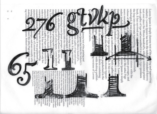
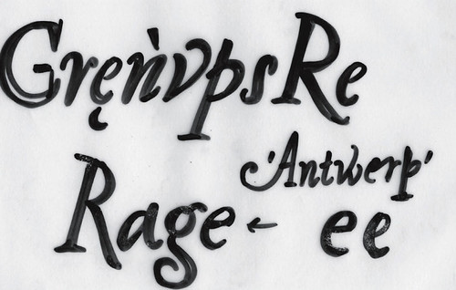
‘The importance and focus on detail in the individual glyphs is something I have spent a long time crafting. Large punctuation, slightly inclined stems, oldstyle serifs and pronounced inktraps. Antwerp is in essence the culmination of all my scribbles, thoughts and research done over a period of many years.’
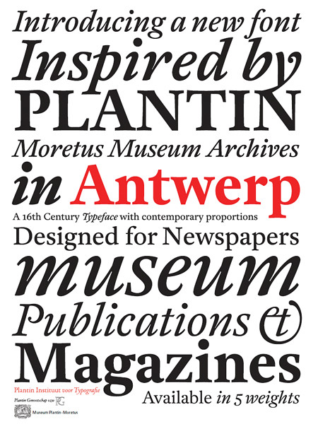
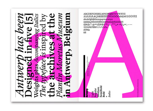
Antwerp was designed by Henrik Kubel as part of his studies at the Expert Type Design Class at the Plantin Institute of Typography. It is an OpenType font and features many number styles, including old style figures (non-aligning numerals), plus a large set of ligatures and fractions. The typeface is available in five weights with 19° Italic styles as a companion. Antwerp supports extended Latin A language settings (Eastern European).
See also: A2’s type design’, Eye 67.
Type Tuesday is our weekly column on typography and type design, featuring a mixture of brand new articles and material from the extensive Eye archive. For more Type Tuesday articles, click here.
Eye is the world’s most beautiful and collectable graphic design journal, published quarterly for professional designers, students and anyone interested in critical, informed writing about graphic design and visual culture. It’s available from all good design bookshops and online at the Eye shop. For a taste of the new issue, see Eye before you buy on Issuu. Eye 80, Summer 2011, is out now.