
Tuesday, 9:00am
27 September 2011
Type Tuesday

Back with a flourish #5. Christian Schwartz on swaggering swashes
In this final extract from ‘Back with a flourish’ from Eye 62, Christian Schwartz examines some further examples of typographic embellishment.
From a Figgins fatface to a ‘bizarre case of typographic transvestism’.
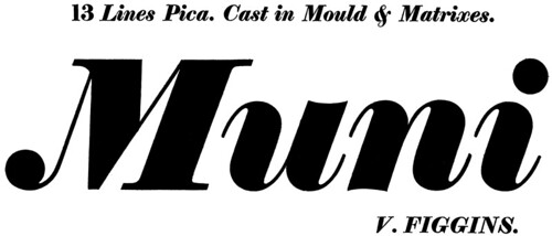
Above: Vincent Figgins, Thirteen Lines Pica Fatface Italic (ca. 1815), shown in Specimen of Printing Types by Vincent Figgins, Letter-founder, London, 1815.
As display type got bigger, louder, and heavier in the nineteenth century, Figgins and many of his contemporaries added a limited set of swash characters to their Modern italics – generally just ‘A’, ‘J’, ‘K’, ‘M’, ‘N’, ‘T’, ‘V’, ‘W’ and ‘Y’. These give the type character without drawing an undue amount of attention to it. The ball terminals connect the forms to the lowercase (almost like the biforms popularised in the 1960s, such as Bradbury Thompson’s Alphabet 26, but not as literal), and make the caps look fresh and contemporary, even today.
In the 1920s and 1930s, American Type Founders rediscovered Renaissance-era swashes while reviving classic typefaces such as Garamond and reworking them for American tastes. They went overboard, just like Photo-Lettering, Inc would 40 years later. Some of these sets of swashes, such as ATF Garamond, were tastefully done. Others, like the ones they added to ATF Baskerville, were ludicrous. Perhaps this was a response to demand from the American market, or it may have been a way to sell additions to popular typefaces to unsuspecting printers. In any case, many of the ATF swash caps are suspiciously similar to each other.
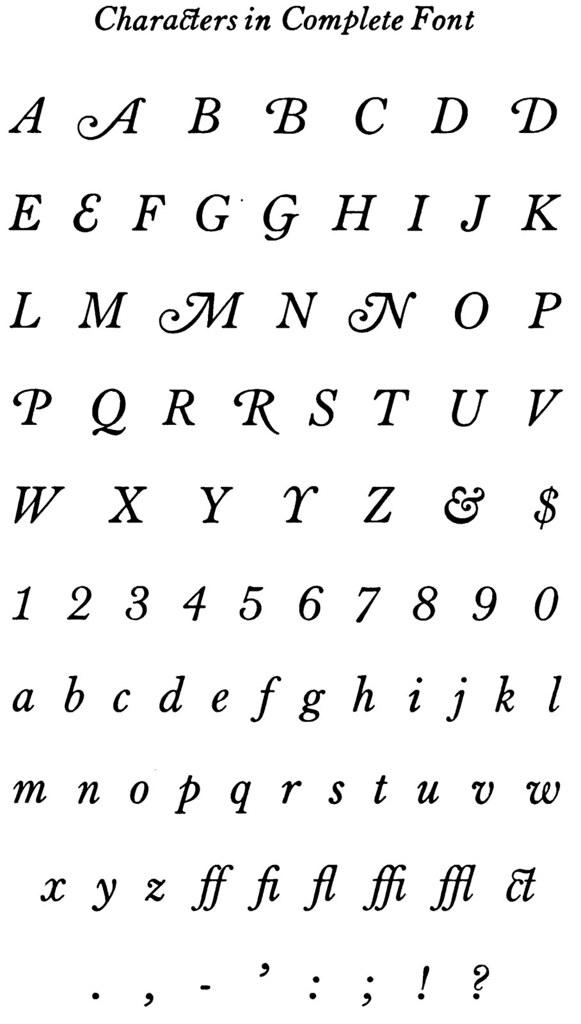
Above: Morris Fuller Benton, atf Baskerville Italic; Specimen Book & Catalogue 1923, American Type Founders, Jersey City, NJ, 1923.
In a bizarre case of typographic transvestism, swash caps for Cloister (below), based on Venetian Oldstyles from the fifteenth century, and Baskerville, based on British Transitional faces from the eighteenth century, are almost identical in underlying structure, which appear to have been borrowed from ATF Caslon No. 410.
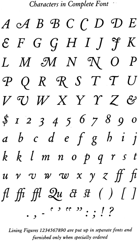
Above: Morris Fuller Benton, Cloister Italic; Specimen Book & Catalogue 1923, American Type Founders, Jersey City, NJ, 1923.
This overheated style reached its most humorous point in the early 1940s. After Futura’s popularity exploded in the US, the major foundries raced to produce clones in varying degrees of faithfulness. Ludlow’s Tempo was fairly accurate in its romans, but the italics worked hard – maybe too hard – to differentiate themselves from their source and the other clones.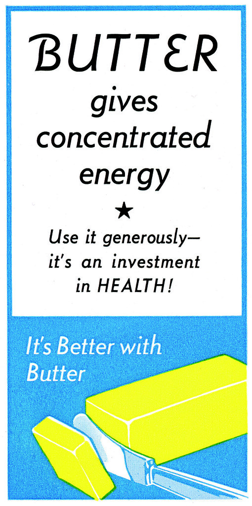
Top, above and below: R. Hunter Middleton, Tempo Medium Italic (1930-42), shown in Ludlow Typefaces, Chicago, CA. 1943.
The tails on the lowercase are very clever in the way they differentiate italic from roman in text (in fact, I ‘borrowed’ them when I designed Neutraface in 2002) but the swash caps are unconvincing, drawing undue attention to themselves in the fake ad for butter in the specimen book. Around 1967, Phil Martin’s Helvetica Flair would push this idea several steps further.
Christian Schwartz is the founder (with Paul Barnes) of Commercial Type.
Type Tuesday is our new weekly column on typography and type design, featuring a mixture of brand new articles and material from the extensive Eye archive. For more Type Tuesday articles, click here.
Eye is the world’s most beautiful and collectable graphic design journal, published quarterly for professional designers, students and anyone interested in critical, informed writing about graphic design and visual culture. It’s available from all good design bookshops and online at the Eye shop, where you can buy subscriptions, back issues and single copies of the latest issue. The latest issue is Eye 80.
Eye 62, which features ‘Back with a flourish’, is still available (just) from the back issues department.