
Tuesday, 10:01am
25 October 2011
Type Tuesday
Christian Schwartz and Paul Barnes deep in the archives: Venus 1907-27
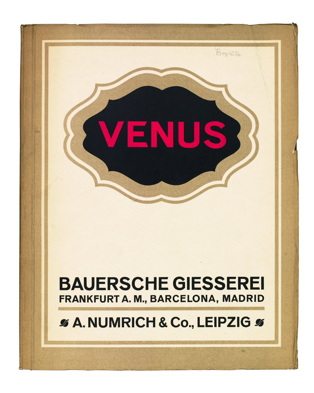
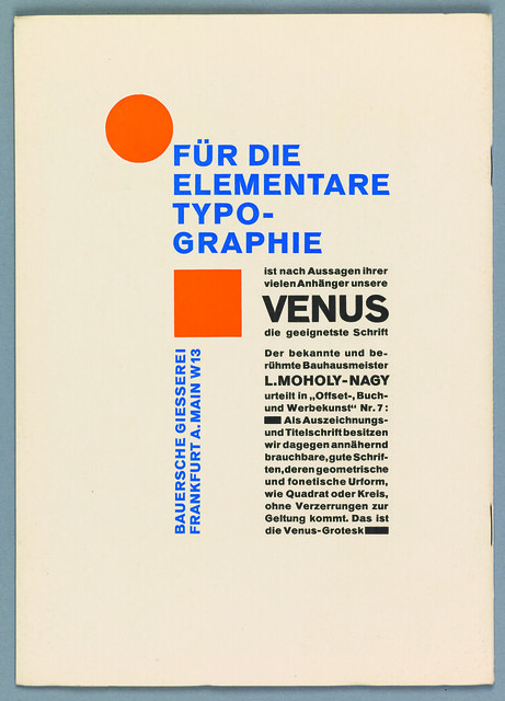
With each new development in typesetting, huge numbers of typefaces get left behind. You can see them in type specimens of old, but for the main part they remain artefacts to look at rather than typefaces to use. Venus is such a typeface.
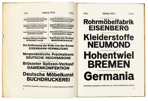
Issued by the Bauer type foundry, the sans serif was used widely in Germany in the early twentieth century: many early practitioners of the New Typography used it, not necessarily by choice, but through the printers’ limited selection. Coming in a wide range of weights and widths, it has a warmth and charm, but also eccentricity (note the unusually high cross bar of the ‘E’ and the small bowl of the cap ‘R’). Sadly it is now a shadow of itself, with a mere handful of weights available.
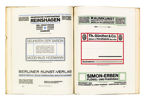
Above: Typefounder's specimen from the early 1920s. Collection of St Bride Printing Library.
Type Tuesday is our weekly column on typography and type design, featuring a mixture of brand new articles and material from the extensive Eye archive. For more Type Tuesday articles, click here.
'Deep in the Archives' by Christian Schwartz and Paul Barnes was commissioned for Eye 75, Spring 2010.
Eye is the world’s most beautiful and collectable graphic design journal, published quarterly for professional designers, students and anyone interested in critical, informed writing about graphic design and visual culture. It’s available from all good design bookshops and online at the Eye shop. For a taste of the new issue, see Eye before you buy on Issuu. Eye 81 has gone to press.