
Tuesday, 10:00am
3 May 2011
Type Tuesday
Visions of Joanna: Mark Thomson on Eric Gill’s Essay on Typography
It took me a while to find this book, writes Mark Thomson in Eye 62. Not that it is hard to buy a copy – it has hardly been out of print since 1931. But to find this book, this particular copy, was tough.
The content, Eric Gill’s ‘An Essay on Typography’, is well known, but it is the form of this copy, its extreme simplicity, its unique ordinariness, that makes it an inspiration.
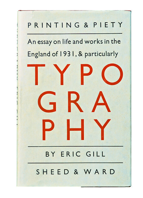
In many ways this is a complete work: Gill was author, typographer, type designer and, with René Hague, printer. The text pages are the first use of Gill’s new serif type Joanna; the dust jacket is beautifully set in Gill Sans (1927). The relationship between these types, maybe unintentionally, prefigures the sans/serif families of the early 1990s onwards – Martin Majoor, designer of Scala and Nexus, called Joanna ‘a sort of Gill Sans Avec’.
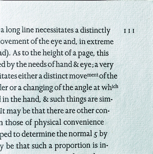
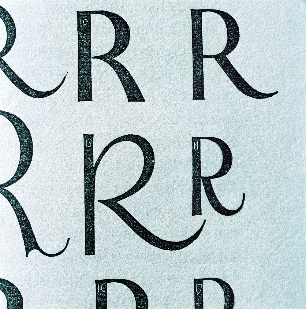
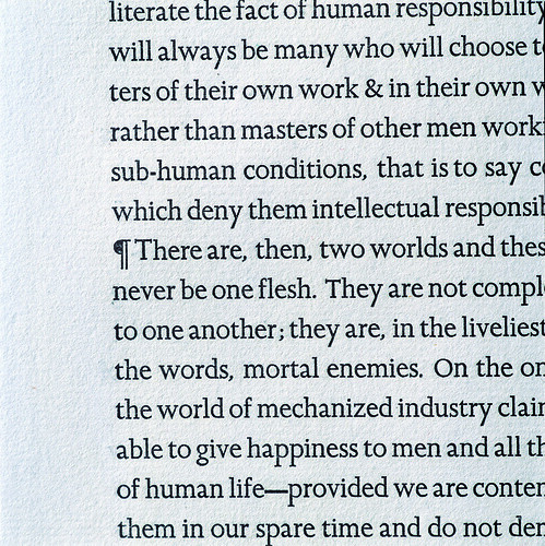
In 1931 Gill had only designed the roman Joanna – the italic came later and he never designed small capitals for it – so there is a restrained unity to the typographic voicing. When the text didn’t fit, he would begin a word in one size and complete it in another. The result is a kind of semi-justified setting, with more or less even lines and optically even word spacing. It is extremely clear, and very similar to a manuscript.
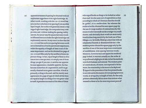
Gill’s approach to paragraphing is sober and minimal, and again has roots in the scriptorium. He uses pilcrows (paragraph marks) to express paragraphs, and a pilcrow on a new line to indicate changes of thought. He designed two sets of capitals for the original Joanna, one at ascender height and the other slightly shorter than normal; the big caps were used only for the initial letter of a paragraph, and the midi-caps for the beginning of sentences within paragraphs. This gave a fresh emphasis to the typographic voice, closer to the spoken word, with breaths, pauses and changes of inflection. The conventions of typesetting that we work with today are much less expressive.
The fifth edition (which was my first encounter with Gill’s essay), published by Lund Humphries in 1988, is a mere shadow of the original, with some of the worst features of machine production brought together in one place – as if to make Gill’s point. The poor setting of Christopher Skelton’s otherwise excellent introduction, in justified Linotron 202 Joanna, underlines by contrast both the strength of Gill’s typographic argument and the particular qualities of the type in which it was originally presented.
See also: Tarnished idol on the Eye blog.
Type Tuesday is our new weekly column on typography and type design, featuring a mixture of brand new articles and material from the extensive Eye archive. For more Type Tuesday articles, click here.
‘Visions of Joanna’ was originally published in Eye 62 (Winter 2006).
Eye is the world’s most beautiful and collectable graphic design journal, published quarterly for professional designers, students and anyone interested in critical, informed writing about graphic design and visual culture. It’s available from all good design bookshops and online at the Eye shop, where you can buy subscriptions, back issues and single copies of the latest issue. For a visual sample, see Eye before you buy on Issuu. The latest issue is Eye 79, a type special.