
Tuesday, 10:00am
6 December 2011
Type Tuesday
Stevens Titling from Linotype offers an unexpected brush with wildlife
Typefaces that strive to emulate the idiosyncrasies of hand-crafted letterforms have a patchy success rate, from the cold Brush Script MT (featuring on FastCo Design as one of ‘the world’s worst fonts’) to more considered approaches such as Underware’s Bello (‘If I was going to use this font, I would just draw it myself’ – see ‘Lust and Likeability’) – and that’s without even touching on the infamy of Comic Sans (the origins of which are detailed by Vincent Connare on his website).
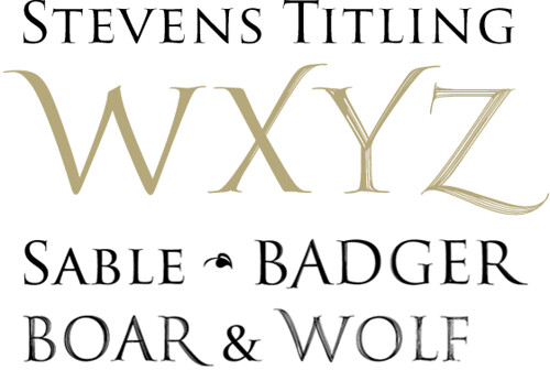
Above: Stevens Titling.
Once in a while though, typefaces designed with this rationale in mind come good (see ‘Mr Mistral’ in Eye 79). The latest example, from calligraphers John Stevens and Ryuichi Tateno, is Stevens Titling for Linotype.
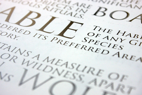
Above: Sable, the most formal style of Stevens Titling.
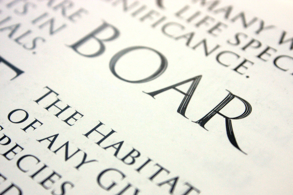
As well as having letters based on calligraphic forms, the typeface also aims to mimic the calligrapher’s brush. The four styles of the typeface (sable, badger, boar and wolf) range from clean to ragged respectively, with the brush strokes becoming ever more evident.
Above: Boar, a medium style of the Stevens Titling.
This is an interesting approach to the illusion. Where many other typefaces fall back to uneven printing and a ‘grunge’ aesthetic to give the impression of tactility, Stevens Titling incorporates its brushstrokes while retaining the elegance of its initial letterforms, and in so doing retains its usefulness beyond that of a novelty pastiche
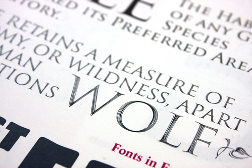
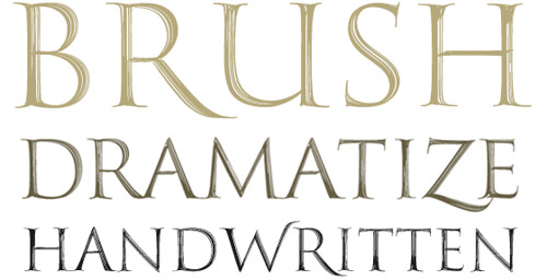
Above: Wolf, the loosest style of Stevens Titling.
Stevens Titling is out now, available from Linotype.
See also ‘Out of hand’ by David Crowley and ‘Different strokes’, Jonathan Parker’s profile of Alejandro Paul in Eye 80.
Type Tuesday is our weekly column on typography and type design, featuring a mixture of brand new articles and material from the extensive Eye archive. For more Type Tuesday articles, click here.
Eye is the world’s most beautiful and collectable graphic design journal, published quarterly for professional designers, students and anyone interested in critical, informed writing about graphic design and visual culture. It’s available from all good design bookshops and online at the Eye shop. For a taste of the new issue, see Eye before you buy on Issuu. Eye 81 is out now.