
Tuesday, 1:13pm
21 February 2012
Type Tuesday

Reflections of a typographer: Matthew Carter on Modern Typography
Modern Typography: An Essay in Critical History by Robin Kinross, now in its reprinted second edition, was the second book published by Kinross’s own Hyphen Press. Here (for the first time online), we publish Matthew Carter’s review of the book from Eye no. 7.
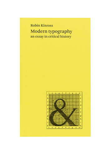
Below: cover of first edition, 1992.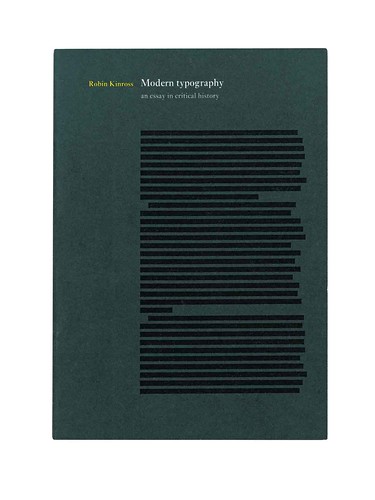
Like a number of words used by typographers, writes Matthew Carter, ‘modern’ can mean more than one thing. Two accepted uses are a particular style of typeface derived from eighteenth-century models, and the name of a typography of German origin carried by its exponents to the US in the 1930s. Modern Typography: An Essay in Critical History covers both these subjects as well, but as parts of a much broader and deeper redefinition of ‘modern’ as applied to typography.
Robin Kinross dates modernity – implicit in the very idea of printing – as an explicit attitude that began in about 1700, when printing began to be used as the means to describe itself. Here, ‘printing’ is the practice, ‘typography’ the ordering of that practice by instruction, and in the manuals of Moxon (1683-84) and Fertel (1723) typography became articulate and therefore modern. This ‘Essay in Critical History’ gives prominence to typography’s more rational and articulate practitioners, unapologetically, since its argument is that ‘typographers need to incorporate critical reflection into their own practice’. Some of the usual heroes get short shrift: Baskerville, Bodoni and most of the private presses are ignored because their books were ‘fine printing’, to be admired rather than read. Many of the illustrations are of functional typography: railway timetables, an invoice form, guide books, a paperbound novel, printers’ manuals, music, catalogues, a road sign. Jan Tschichold is quoted at the outset and sets the tone: ‘Standardization, instead of individualism. Cheap books, instead of private-press editions. Active literature, instead of passive leather bindings.’
Most histories of typography, particularly British ones, have been histories of traditional typography that treat Modernism as an aberration. Studies of Modernism, for their part, have tended to isolate it from contemporary traditional typography. This book aims to break down that separation by considering issues other than visual appearance, and by avoiding the ‘bibliophilic nostalgia’ so prevalent in typographic culture. This leads to some interesting reassessments, for example of nineteenth-century typography.
In the conventional, account, the industrialisation of printing caused a degeneration in typographic quality so severe that it took the ‘revival of printing’ movement at the end of the century to rescue it. The version here is more even-handed: it describes well William Morris’s reforming ‘typographical adventure’, inspired by a dreamlike view of an incunabular past in which all books were works of art. But it also gives due weight to the importance of lithography and photography, to a functional tradition as vigorous in typography as in engineering and building, and to the proliferation of typefaces that yielded, among others, sans serifs and boldfaces. Alongside the reformers of the Arts & Crafts movement, it puts the personification of the best of the trade values, the great American printer Theodore Low De Vinne.
There are excellent sections on the early twentieth-century printing reform movements, the ‘new traditionalism’ of Bruce Rogers and Stanley Morison, and the hegemonic influence on British typography of the Monotype Corporation, which had as its ideals historical authenticity and transparency to the reader. The cultures of printing in Germany and the Low Countries are also examined, but the heart of the book is in the chapters on the ‘new typography’ and the ‘emigration of the modern’. These describe brilliantly the ‘heroic’ period of Modernism in Central European typography, beginning at the end of the First World War, flourishing in the 1920s and 1930s, and surviving the dispersal of designers caused by the Nazi rise to power in Germany in 1933.
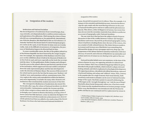
Top and below: Spreads from the first edition of Modern Typography (1992), designed by Kinross and typeset on a Macintosh SE30.
The origins of the new typography lay outside the world of printing and typography, in the coalescence of the ideas of the Futurists, Dadaists, the De Stijl group and the Russian Constructivists – essentially artistic movements. Jan Tschichold was its leading propagandist; his definition in 1925 of ‘elemental typography’, quoted here in full, emphasises order and organisation, the use of sans serif type, the rejection of capital letters and of ornament, and the adoption of the DIN standard paper formats. Tschichold – together with Paul Renner, designer of Futura, and Georg Trump – taught in Munich, not at the Bauhaus as is often thought (Kinross warns us against the careless assumption that ‘Bauhaus’ and ‘modern’ were the same thing in typography: the Bauhaus had no fully fledged typographers).
The Modernist designers, accused of cosmopolitanism, who were forced to emigrate from Central Europe from 1933 on, found refuge mostly in the English-speaking world. Many were assimilated into postwar American corporate culture as consultant designers, with profound and still evident effect. Tschichold worked for a time in England and seems to have begun there his abandonment of Modernism in favour of traditional design, a famous apostasy caused, he said, by the identification of Modernism with Germany hence with National Socialism, and by his disillusionment with the values of technical progress. These opinions were voiced in a debate in print with the Swiss designer Max Bill, staunch Modernist and father of the school of ‘Swiss typography’ that rejected traditional and early ‘elemental’ typography alike.
The historical account ends with the energy crisis of 1973, and with a plea for continuity of ‘the modern’ in a time of rapid technical change and postmodern pastiches. The 32 pages of illustrations, photographed for the book at a consistent reduction of one-third actual size, have good explanatory captions. At the end of the book is a commentary on sources, chapter by chapter, that amounts to a concise critical bibliography of the subject.
Robin Kinross wrote, designed, typeset and published this book. This puts him in the same rank as some of the typographers he most admires, such a one as Joseph Moxon defined more than 300 years ago, ‘who by his own judgment, from solid reasoning within himself, can either perform or direct others to perform from the beginning to the end, all the handy-works and physical operations relating to typographie’ – and can write the history too! As befits an advocate of rational and articulate design, he writes a clear and elegant English. This book is deliberately brief and has, therefore, no ambition to be exhaustive. As a brief history of typography it is difficult to think how it could be better. For professional typographers, students and the new lay audience of people introduced to typography by personal computers and desktop publishing, this is the best account of how modern typography got to be the way it is.
Modern Typography: An Essay in Critical History
Robin Kinross, Hyphen Press
First edition, 1992, reviewed by Matthew Carter in Eye no. 7 vol. 2.
Second edition available from HyphenPress.com
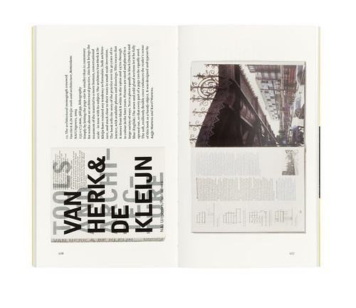
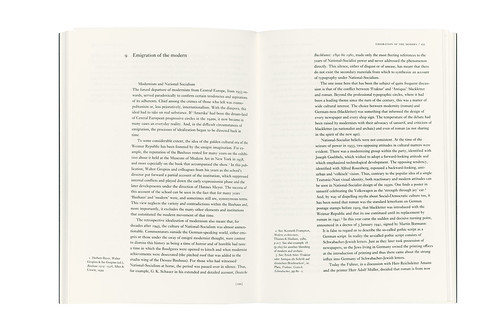
Above: cover and spreads from 2010 printing of the second edition of Modern typography (2004), designed by Françoise Berserik and set in Fred Smeijers’ Arnhem typeface. Second spread (above) shows a recent book designed by Karel Martens as (as Kinross explains in Eye 80), an ‘exemplification of the values that the book argues for.’
Matthew Carter’s review was originally published in Eye 7, 1992.
See also Rick Poynor’s Reputations interview with Robin Kinross in Eye 80.

Eye is the world’s most beautiful and collectable graphic design journal, published quarterly for professional designers, students and anyone interested in critical, informed writing about graphic design and visual culture. It’s available from all good design bookshops and online at the Eye shop, where you can buy subscriptions, back issues and single copies of the latest issue. Eye 81, has the theme of ‘Designers and clients’; Eye 82 will be on press any moment.