
Tuesday, 7:00am
31 May 2011
Type Tuesday
Back with a flourish #2. Christian Schwartz on swashes & ornamentation
Interest in swash characters has been rekindled by a growing acceptance from type designers and graphic designers of the OpenType font format and a resurgence of enthusiasm for ornamentation. In the light of this, Christian Schwartz takes a look at typographic embellishment.
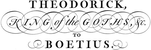
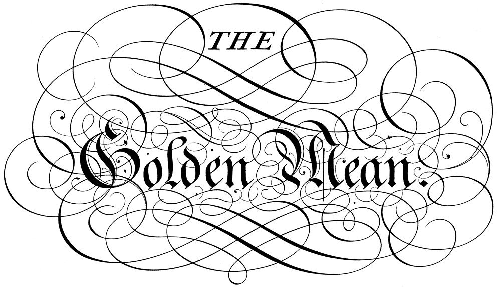
Above and top: George Bickham, from The Universal Penman, London, 1743.
George Bickham’s seminal set of engravings, published as The Universal Penman, demonstrates the blurry line between swashes and ornamental flourishes. Although these forms are just about impossible to replicate in type, they are undeniably related to the typographic style of the late eighteenth century. This is design that dances on the edge of being ‘too much’, yet Bickham’s level of control is extremely impressive. This level of visual balance is very difficult to achieve using such organic forms.
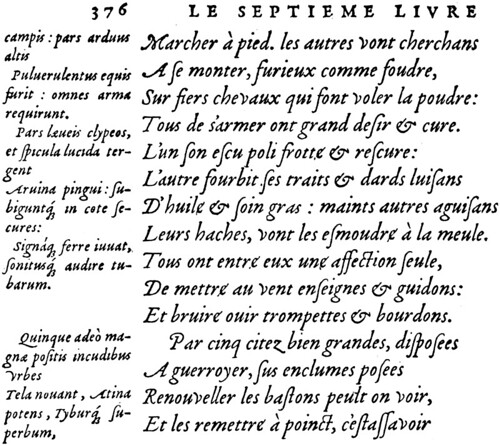
Above: Robert Granjon, Gros-romain italic ‘A’ (1547–), used in Vergilius, Enide, printed in Lyons by J. de Tournes, 1560. This sample from The Italics of Robert Granjon, Hendrik D. L. Vervliet, Typography Papers no. 3, 1998.
This sample shows the subtle way that Robert Granjon’s swashed characters can blend into a block of text, emphasising certain words and giving a very active texture. While the basic form of the italic shows punch-cutting at its most sculptural, the swashes have a strong calligraphic influence. The looping ‘M’, for example, flows from the hand very naturally but is not a practical form to cut into steel.
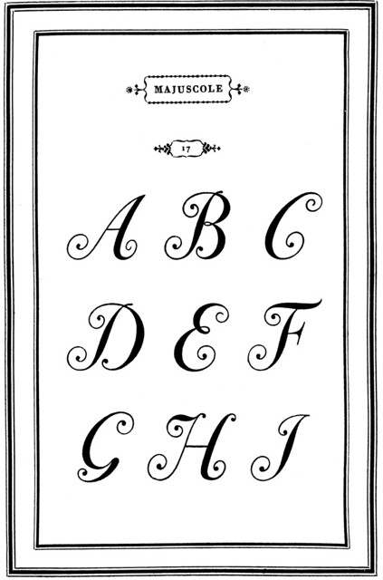
Above: Giambattista Bodoni, Majuscole no. 17 (ca. 1788), shown in his Manuale Tipografico, Volume I, Parma, 1818.
As calligraphy’s influence was overtaken by engraving, swash caps got really weird. While this set of caps is not as extravagantly decorated as Bickham’s work, no terminal goes unflourished here, showing Bodoni at his most exuberant. These were revived as an addition to the 72-point version of ITC Bodoni Italic, and while they do not seem to be quite the right fit with the lowercase, they do look great as drop caps.

Above: Janice Fishman, Holly Goldsmith, Jim Parkinson and Sumner Stone, ITC Bodoni 72 Italic Swash, published by International Typeface Corporation, 1994.
This is an extract from Christian Schwartz’s article ‘Back with a flourish’ in Eye 62, still available (but only just) as a back issue. See also ‘Back with a flourish #1’ on the Eye blog.
Type Tuesday is our new weekly column on typography and type design, featuring a mixture of brand new articles and material from the extensive Eye archive. For more Type Tuesday articles, click here.
Eye is the world’s most beautiful and collectable graphic design journal, published quarterly for professional designers, students and anyone interested in critical, informed writing about graphic design and visual culture. It’s available from all good design bookshops and online at the Eye shop, where you can buy subscriptions, back issues and single copies of the latest issue. The latest issue is Eye 79, a type special.